
Recommended
More Related Content
What's hot
What's hot (19)
Viewers also liked
Viewers also liked (20)
Similar to 4 principles of design 2
Similar to 4 principles of design 2 (20)
Recently uploaded
Recently uploaded (20)
4 principles of design 2
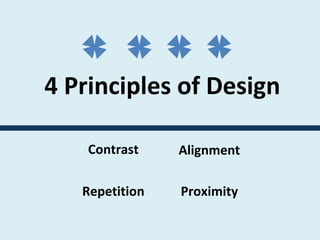
- 1. 4 Principles of Design Contrast Repetition Alignment Proximity
- 2. Contrast This is a heading This is a subheading This is lots of text. This is lots of text . This is lots of text. This is lots of text The type is only slightly different in style.
- 3. Contrast This is a heading This is a subheading This is lots of text. This is lots of text . This is lots of text. This is lots of text Don’t be wimpy – make things dramatically different! This is a heading This is a subheading This is lots of text. This is lots of text . This is lots of text. This is lots of text
- 4. Can you identify where contrast has been used on this design ?
- 5. Can you identify where contrast has been used on this design ? Contrast in size & type style
- 6. Can you identify where contrast has been used on this design ? Contrast in size & type style Contrast in size & color
- 7. Repetition Repeat an element to help create unity. Color Type Shape (bullets)
- 8. Repetition Repeat an element to help create unity. Color Type Shape (bullets)
- 9. Repetition Repeat an element to help create unity. Color Type Shape (bullets)
- 10. Alignment This is a heading This is a subheading This is body text. This is body text. This is body text. This is body text. This is body text. This is a heading This is a subheading This is body text. This is body text. This is body text. This is body text. This is body text. Avoid mixing different alignments. Choose one and stick to it.
- 11. Alignment This is a heading This is a subheading This is body text. This is body text. This is body text. This is body text. This is body text. This is a heading This is a subheading This is body text. This is body text. This is body text. This is body text. This is body text. Avoid mixing different alignments. Choose one and stick to it.
- 12. Can you pick the dominant alignment here?
- 13. Can you pick the dominant alignment here? Left
- 15. Proximity in a page layout might look like this…
- 16. Proximity in a page layout might look like this…
- 17. Which design uses Proximity more effectively?
- 18. Which design uses Proximity more effectively?
- 19. Can you think of a memorable ACRONYM for the 4 Principles of design? C ontrast R epetition A lignment P roximity
- 20. Can you think of a memorable ACRONYM for the 4 Principles of design? C ontrast R epetition A lignment P roximity can be improved with these principles of design!
Editor's Notes
- One of the most effective ways to add visual interest is contrast. Don’t be wimpy Contrast is created when 2 elements are different. If the two elements are only sort of different its’ not contrast but conflict.
- One of the most effective ways to add visual interest is contrast. Don’t be wimpy Contrast is created when 2 elements are different. If the two elements are only sort of different its’ not contrast but conflict.