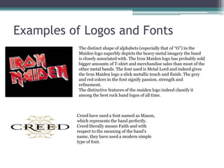
Logos and Fonts Analysis 
By: Shahrukh Hussain
Logos & Fonts 
• Logo is a graphic mark or design which represents a 
firm, band, etc. 
• A font is a specific typeface of a certain size and style. 
• Logo and fonts of a band depends on the genre of 
course, as all of the logos and the fonts cannot be used 
in every type of music. Rock bands uses a Gothic or 
simple type of font and logo, pop bands use fancy type 
of font and logo. It all depends on the music a band 
produces. I will use Gothic fonts and simple logos for 
my project.
Examples of Logos and Fonts 
The distinct shape of alphabets (especially that of “O”) in the 
Maiden logo superbly depicts the heavy metal imagery the band 
is closely associated with. The Iron Maiden logo has probably sold 
bigger amounts of T-shirt and merchandise sales than most of the 
other metal bands. The font used is Metal Lord and indeed gives 
the Iron Maiden logo a slick metallic touch and finish. The grey 
and red colors in the font signify passion, strength and 
refinement. 
The distinctive features of the maiden logo indeed classify it 
among the best rock band logos of all time. 
Creed have used a font named as Mason, 
which represents the band perfectly. 
Creed literally means Faith and with 
respect to the meaning of the band’s 
name, they have used a modern simple 
type of font.

4. logos and fonts analysis

  • 1.
    Logos and FontsAnalysis By: Shahrukh Hussain
  • 2.
    Logos & Fonts • Logo is a graphic mark or design which represents a firm, band, etc. • A font is a specific typeface of a certain size and style. • Logo and fonts of a band depends on the genre of course, as all of the logos and the fonts cannot be used in every type of music. Rock bands uses a Gothic or simple type of font and logo, pop bands use fancy type of font and logo. It all depends on the music a band produces. I will use Gothic fonts and simple logos for my project.
  • 3.
    Examples of Logosand Fonts The distinct shape of alphabets (especially that of “O”) in the Maiden logo superbly depicts the heavy metal imagery the band is closely associated with. The Iron Maiden logo has probably sold bigger amounts of T-shirt and merchandise sales than most of the other metal bands. The font used is Metal Lord and indeed gives the Iron Maiden logo a slick metallic touch and finish. The grey and red colors in the font signify passion, strength and refinement. The distinctive features of the maiden logo indeed classify it among the best rock band logos of all time. Creed have used a font named as Mason, which represents the band perfectly. Creed literally means Faith and with respect to the meaning of the band’s name, they have used a modern simple type of font.