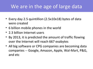
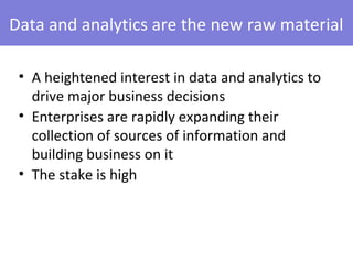
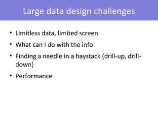
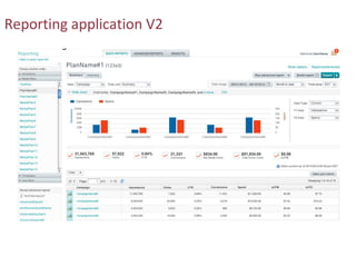
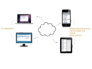
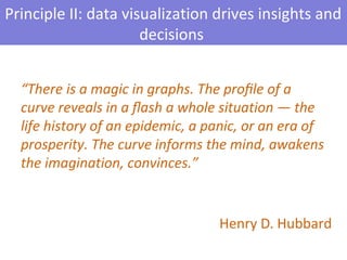
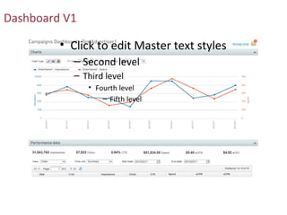
Application UI Design with Large
           Data Sets
       User Focus Conference 2012
                Cathy Lu
We are in the age of large data

• Every day 2.5 quintillion (2.5x10x18) bytes of data
  were created
• 6 billion mobile phones in the world
• 2.3 billion Internet users
• By 2013, it is predicted the amount of traffic flowing
  over the Internet will reach 667 exabytes
• All big software or CPG companies are becoming data
  companies -- Google, Amazon, Apple, Wal-Mart, P&G,
  and etc
Data and analytics are the new raw material

 • A heightened interest in data and analytics to
   drive major business decisions
 • Enterprises are rapidly expanding their
   collection of sources of information and
   building business on it
 • The stake is high
Large data design challenges

• Limitless data, limited screen
• What can I do with the info
• Finding a needle in a haystack (drill-up, drill-
  down)
• Performance
Principles for large data UI design

• ‘Push’ not ‘pull’
• Data visualization drives insights and decisions
• Create ‘stickiness’ in the UI
• Go wide and deep
Principle I: ‘push’ not ‘pull’


I can build my own reports? I don’t want to…
Reporting application V1
Reporting application V2
Principle II: data visualization drives insights and
                      decisions


  “There is a magic in graphs. The profile of a
  curve reveals in a flash a whole situation — the
  life history of an epidemic, a panic, or an era of
  prosperity. The curve informs the mind, awakens
  the imagination, convinces.”


                                  Henry D. Hubbard
Dashboard V1

         • Click to edit Master text styles
           – Second level
           – Third level
               • Fourth level
                   – Fifth level
Dashboard V2
Different visualization for different use
Visualization for decision making
Is data visualization always necessary?
 • Use for key metrics or summary-level data
 • Use when user actions can be guided
 • Use when users can draw an additional layer of insights and gain
   clarity from it
 • Use to present trends, patterns, complex relationships


 • Avoid
   -- ‘Eye candy’ visualization
   -- Inappropriate use of charts
   -- Visual overload
Principle III: create ‘stickiness’ in the UI

 Usability heuristic: flexibility and efficiency of use


 Accelerators – unseen by the novice user – may often speed up the interaction
 for the expert user such that the system can cater to both inexperienced and
 experienced users. Allow users to tailor frequent actions.
Recently accessed data
User customization
Principle IV: go wide and deep


“Above all else show the data.”


                                  Edward Tufte
Breadth and depth
The dilemma of multiple drill-down paths
Performance issue handling

• UI feedback
• Asynchronous client-side processes
• Data fetching on demand
• Module-level timeout messaging
Export visual cue (before)
Export visual cue (during)
Export visual cue (after)
On-demand fetching
Review
• ‘Push’ not ‘pull’
   -- Don’t ask users to curate and select what they want to see
• Data visualization helps
   -- It informs users to make sound decisions
• Create ‘stickiness’ in the UI
   -- A ‘sticky’ UI ‘remembers’ what users recently accessed and last customized
• Go wide and deep
   -- Large data sets require a flexible and intuitive UI approach that enables users to
reach a single data point in a wide span of data aggregation and across many levels
Q&A


      Cathy Lu
      •   cathyhasclu@gmail.com
      •   www.linkedin.com/in/cathylu
      •   User Experience Design
      •   Advertising.com Group

Application UI Design with Large Data Sets (Cathy Lu)

  • 1.
    Application UI Designwith Large Data Sets User Focus Conference 2012 Cathy Lu
  • 2.
    We are inthe age of large data • Every day 2.5 quintillion (2.5x10x18) bytes of data were created • 6 billion mobile phones in the world • 2.3 billion Internet users • By 2013, it is predicted the amount of traffic flowing over the Internet will reach 667 exabytes • All big software or CPG companies are becoming data companies -- Google, Amazon, Apple, Wal-Mart, P&G, and etc
  • 3.
    Data and analyticsare the new raw material • A heightened interest in data and analytics to drive major business decisions • Enterprises are rapidly expanding their collection of sources of information and building business on it • The stake is high
  • 4.
    Large data designchallenges • Limitless data, limited screen • What can I do with the info • Finding a needle in a haystack (drill-up, drill- down) • Performance
  • 5.
    Principles for largedata UI design • ‘Push’ not ‘pull’ • Data visualization drives insights and decisions • Create ‘stickiness’ in the UI • Go wide and deep
  • 6.
    Principle I: ‘push’not ‘pull’ I can build my own reports? I don’t want to…
  • 7.
  • 8.
  • 11.
    Principle II: datavisualization drives insights and decisions “There is a magic in graphs. The profile of a curve reveals in a flash a whole situation — the life history of an epidemic, a panic, or an era of prosperity. The curve informs the mind, awakens the imagination, convinces.” Henry D. Hubbard
  • 12.
    Dashboard V1 • Click to edit Master text styles – Second level – Third level • Fourth level – Fifth level
  • 13.
  • 14.
  • 15.
  • 16.
    Is data visualizationalways necessary? • Use for key metrics or summary-level data • Use when user actions can be guided • Use when users can draw an additional layer of insights and gain clarity from it • Use to present trends, patterns, complex relationships • Avoid -- ‘Eye candy’ visualization -- Inappropriate use of charts -- Visual overload
  • 17.
    Principle III: create‘stickiness’ in the UI Usability heuristic: flexibility and efficiency of use Accelerators – unseen by the novice user – may often speed up the interaction for the expert user such that the system can cater to both inexperienced and experienced users. Allow users to tailor frequent actions.
  • 18.
  • 19.
  • 20.
    Principle IV: gowide and deep “Above all else show the data.” Edward Tufte
  • 21.
  • 22.
    The dilemma ofmultiple drill-down paths
  • 23.
    Performance issue handling •UI feedback • Asynchronous client-side processes • Data fetching on demand • Module-level timeout messaging
  • 24.
  • 25.
  • 26.
  • 27.
  • 28.
    Review • ‘Push’ not‘pull’ -- Don’t ask users to curate and select what they want to see • Data visualization helps -- It informs users to make sound decisions • Create ‘stickiness’ in the UI -- A ‘sticky’ UI ‘remembers’ what users recently accessed and last customized • Go wide and deep -- Large data sets require a flexible and intuitive UI approach that enables users to reach a single data point in a wide span of data aggregation and across many levels
  • 29.
    Q&A Cathy Lu • cathyhasclu@gmail.com • www.linkedin.com/in/cathylu • User Experience Design • Advertising.com Group

Editor's Notes

  • #3 Large data can mostly be handled by traditional BI, reporting and analysis tools Big data is info in large quantity but also needs to be accessible at almost real-time. (Give Forbes) example: "When you walk through the airport and they take pictures of everybody in the security line to match every face through facial recognition, they have to do that almost in real-time. That becomes a big data problem. If I am a bank and looking at a vast number of credit scores and histories, and I don’t need to provide an answer in five seconds but can do it next day, then that is not a big data problem."
  • #4 2nd point supporting facts: Zillow, Google Maps, weather.com 3rd point supporting facts: weather forecast – an annual economic value of $10 billion, annual economic value of liquid health data $350 billion; in the online display marketing industry where I work in, whether programmatic buying in ad exchanges or premium campaigns, data and analytics is what moves the marketing dollars(~$20B+ in US) today.
  • #9 Understand your audience, guestimate what they need to know to save them from doing the analysis. Even further, give them the right tools and info to shine light on their problems so they can arrive at solutions with ease and feeling of control.
  • #11 cloud technology enabled cross-device instant sync (iCloud), another form of disseminating data to the end user
  • #15 Geo heat map by country tells where a campaign most of our user views across the world;
  • #17 Inappropriate use of charts include examples: no 3D charts, careful with pie charts, column charts for too many data points on the X axis, more than 5 line charts in one graph
  • #19 Provide quick access for users to return to the data they just viewed or submitted
  • #23 Key stakeholders report the feature (as designed) non-intuitive and confusing and asking for a simplified drill-down experience – we thought we were giving them more flexibility with two ways to drill down into the data grid.
  • #24 The strategy to handle this type of issues: have your design reviewed by technology as early as possible, ask about any potential performance risks, and work together to come up with mediation ways
  • #25 Step 1: tell your users what is about to happen.
  • #27 Details about how the export reports would be saved for 24 hours for download after users closing the popup