Download to read offline
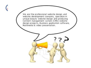
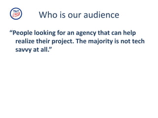
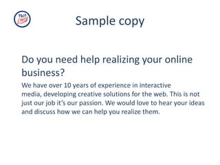
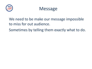
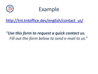
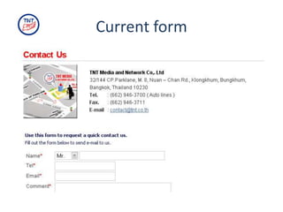
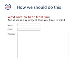
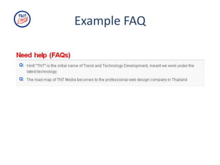
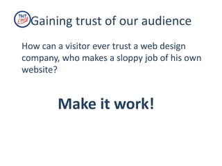
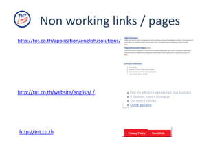
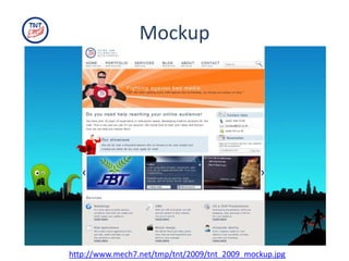

The document outlines a proposed makeover for the website of TNT to improve communication and personality. It identifies issues such as unclear messaging and missing concepts. The makeover aims to make TNT's message impossible to miss for its target audience by being creative, clear, passionate, effective, young and cool. Non-working links and pages would be removed and a superhero concept and mockup is proposed to engage visitors and gain their trust.


