Download as PDF, PPTX


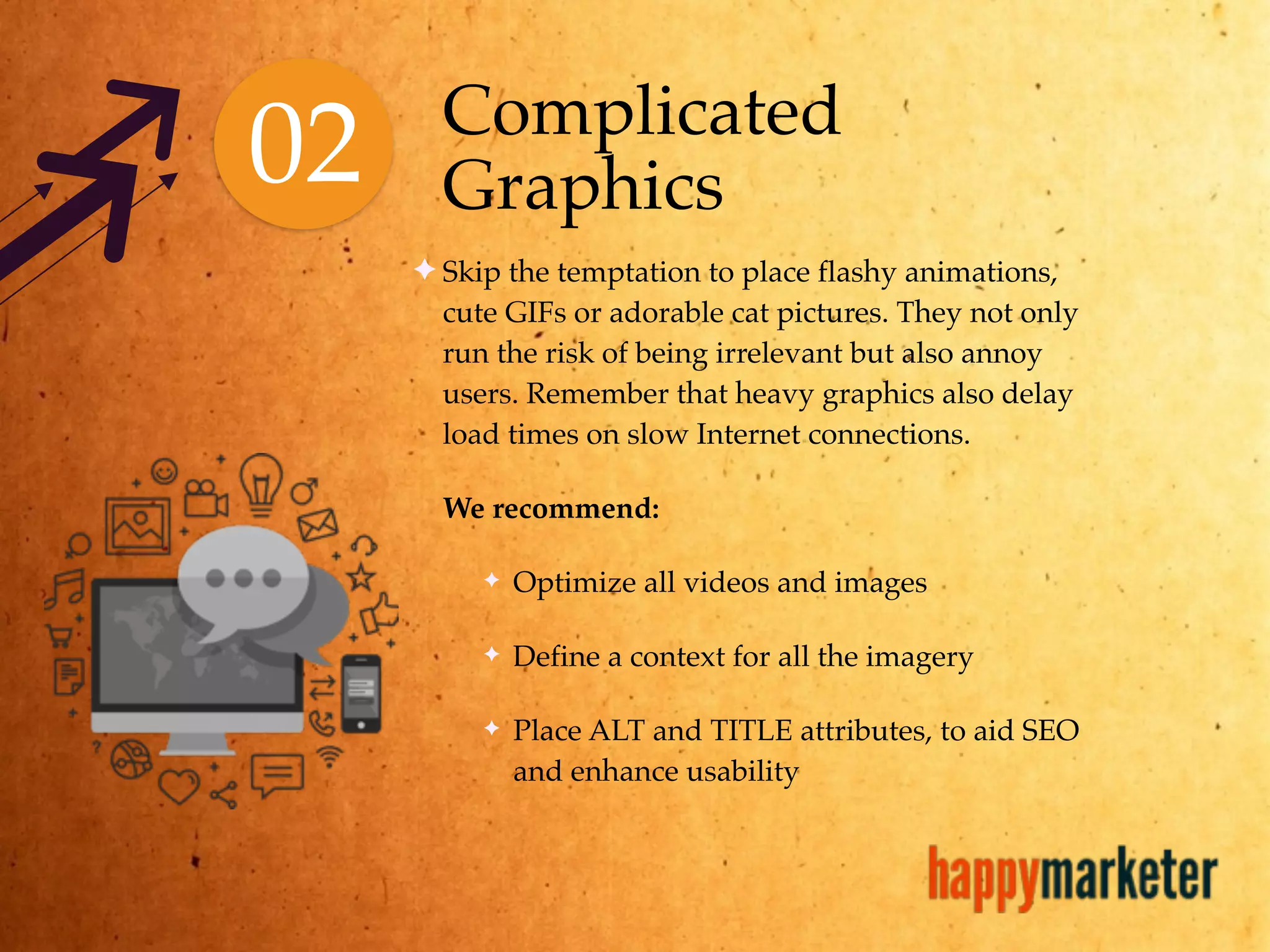
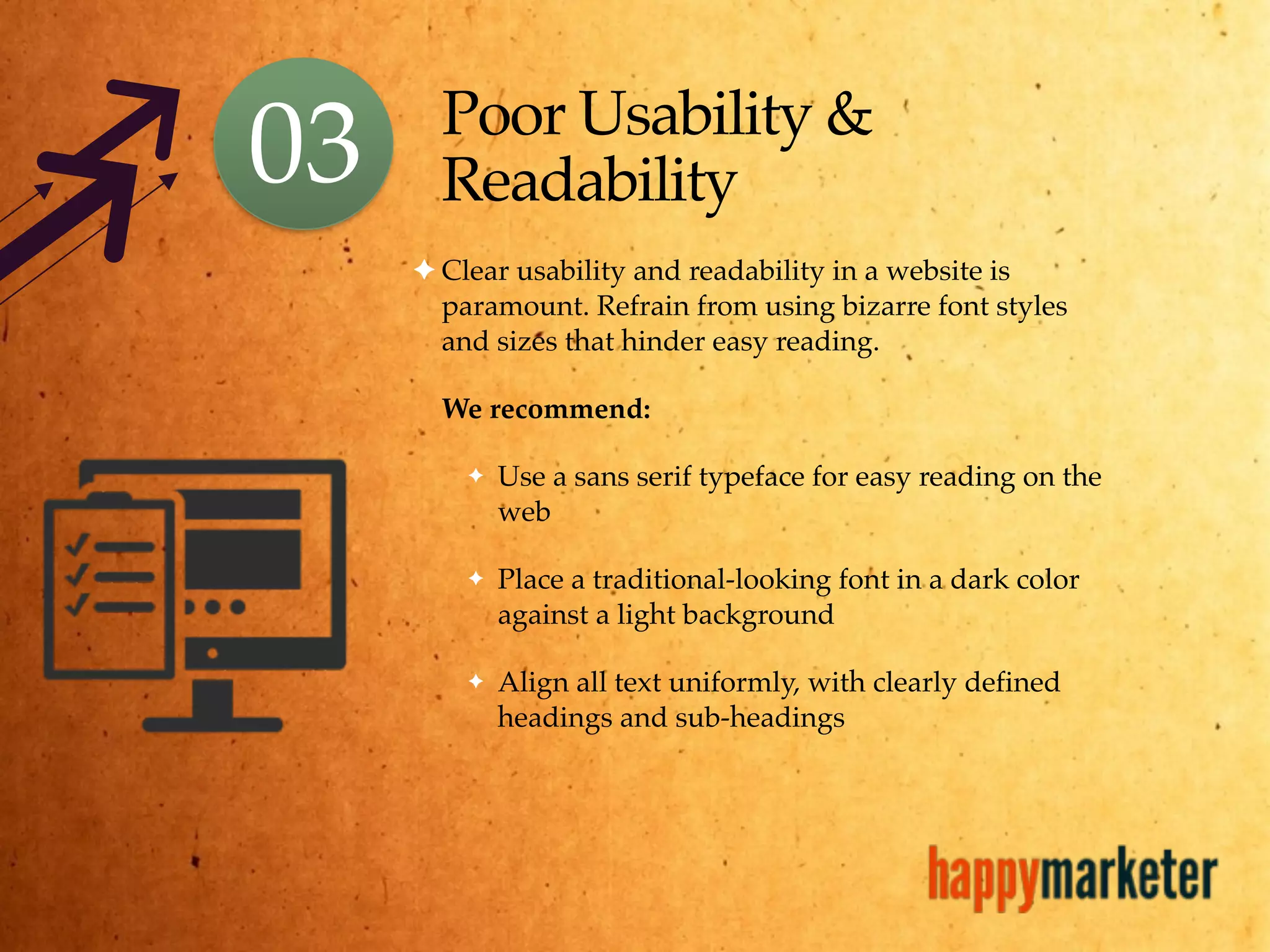
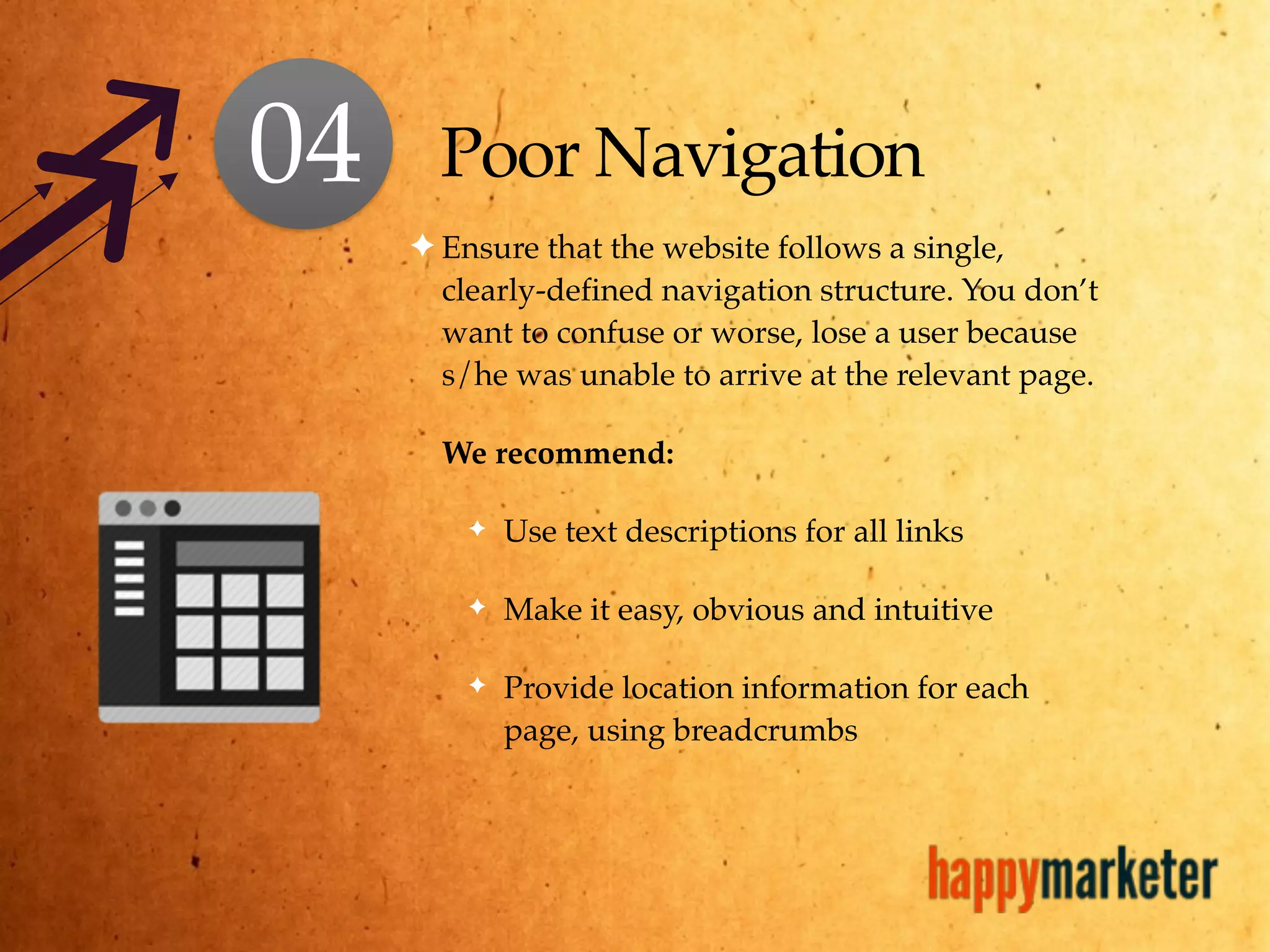

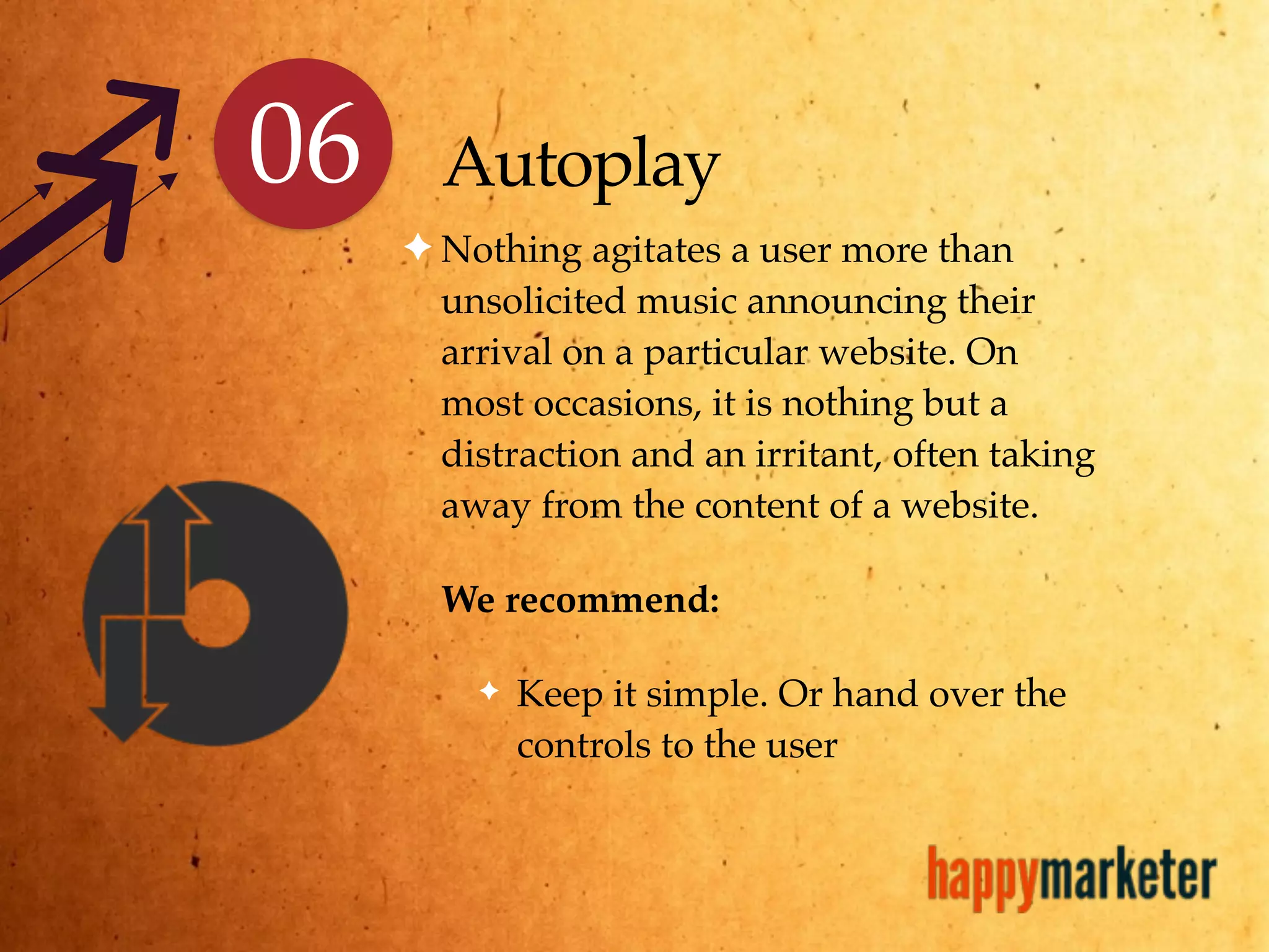
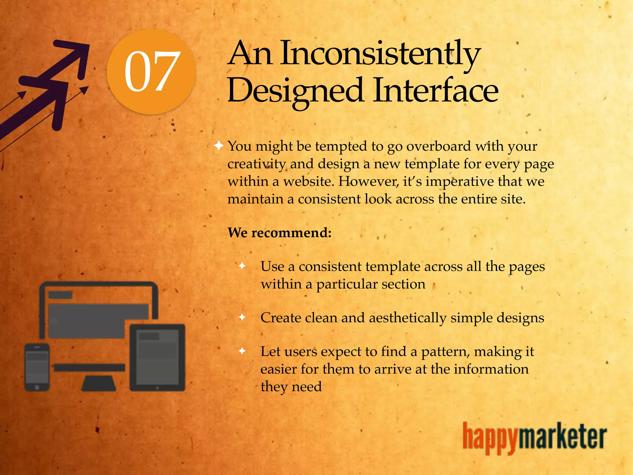


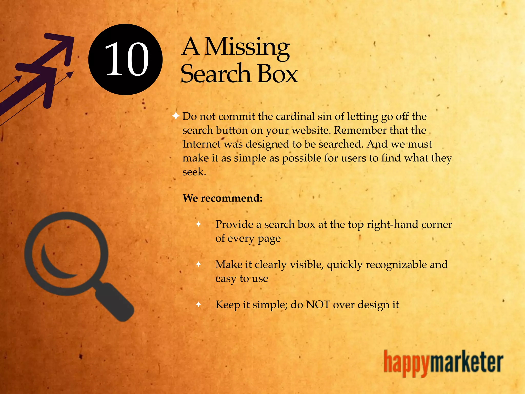


The document outlines 10 common web design mistakes to avoid for creating effective websites, including unclear content, complicated graphics, and poor usability. It recommends best practices such as maintaining consistency, optimizing images, and providing clear navigation to enhance user experience. Overall, the emphasis is on user-friendly design principles that prioritize clarity and accessibility.


![[Webinar] How to Incorporate Mobile Into Your Marketing Strategy](https://cdn.slidesharecdn.com/ss_thumbnails/unwebinarcgtemplatev2-150421142002-conversion-gate01-thumbnail.jpg?width=640&height=640&fit=bounds)


![Driver Easy Pro Key 7.1.0.2641 Full Mac Crack Free Activated Download [2026]....](https://cdn.slidesharecdn.com/ss_thumbnails/software-251207185324-b2fb71b4-thumbnail.jpg?width=640&height=640&fit=bounds)
![Wondershare Filmora 15.0.11 Crack for Mac Key Full Download [Latest] pptx](https://cdn.slidesharecdn.com/ss_thumbnails/software-251207184836-1d16ba16-thumbnail.jpg?width=640&height=640&fit=bounds)
![iStat Menus 7.20 Crack for MacOS 2026 Full Version [Latest] pptx](https://cdn.slidesharecdn.com/ss_thumbnails/softwareoverview-251207191544-22b737dc-thumbnail.jpg?width=640&height=640&fit=bounds)
![Soundtoys Mac v5.5.5.0 Crack for MacOS Full Version [Latest] pptx](https://cdn.slidesharecdn.com/ss_thumbnails/softwareoverview-251207193711-91d8ae6b-thumbnail.jpg?width=640&height=640&fit=bounds)


