Downloaded 160 times

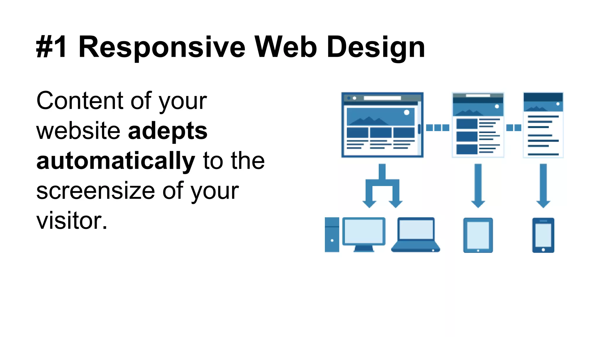
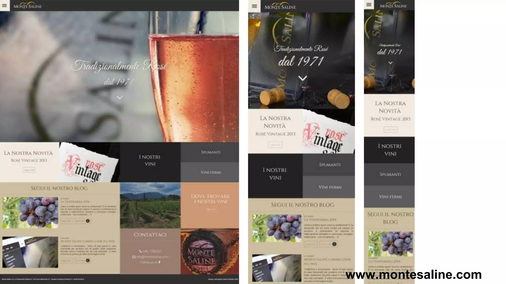
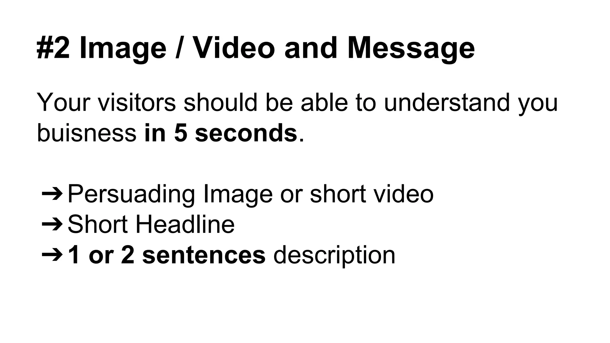
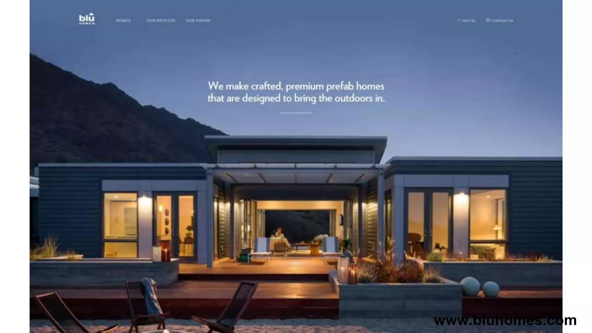
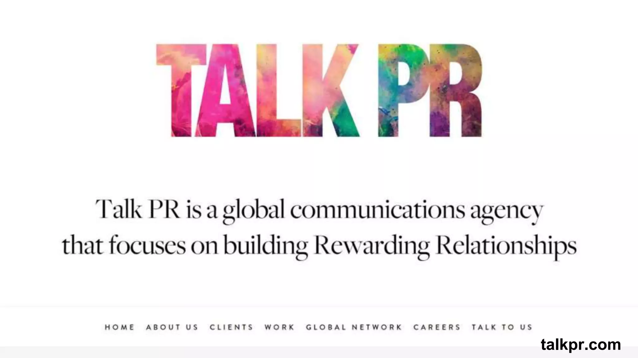

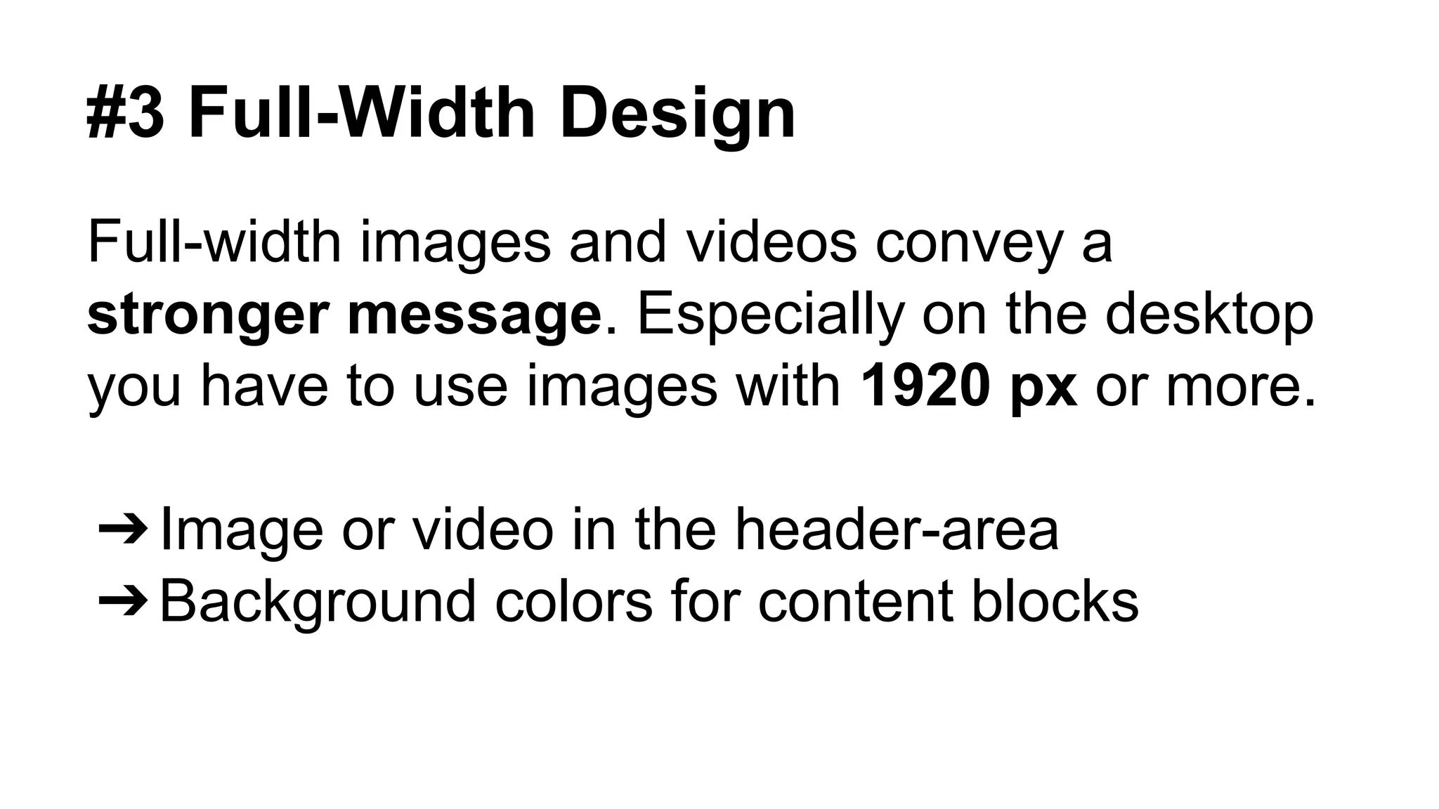
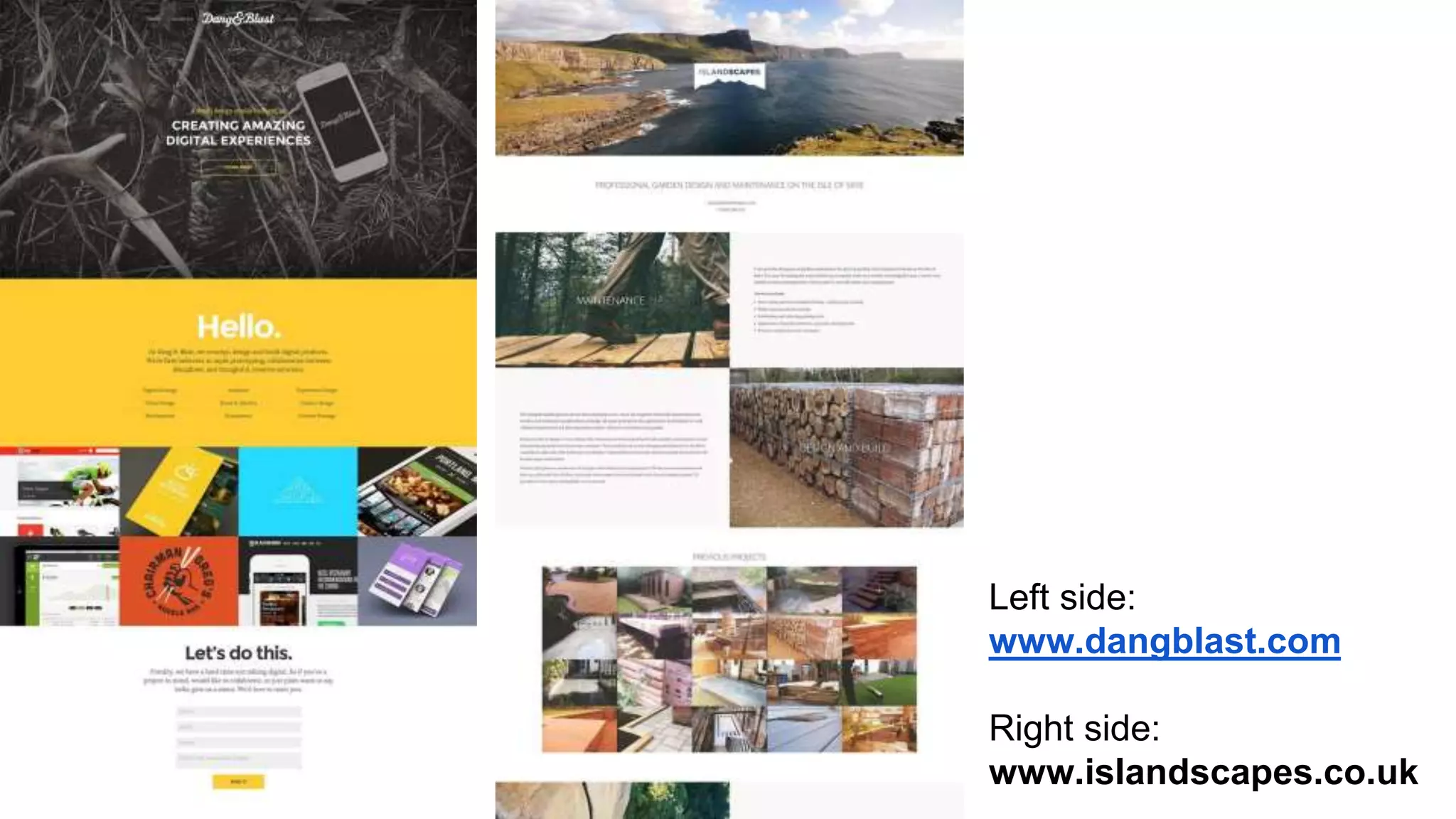
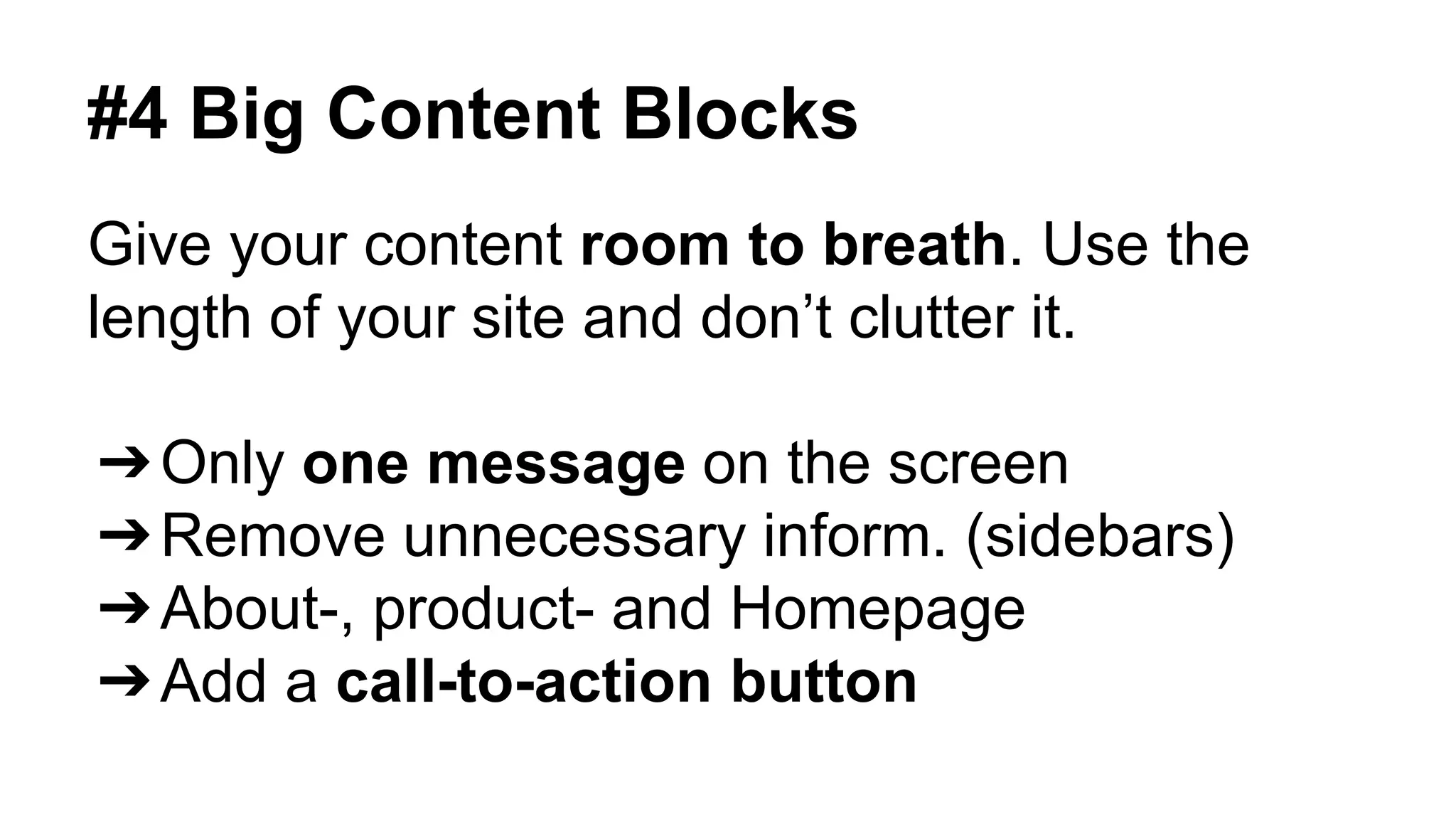
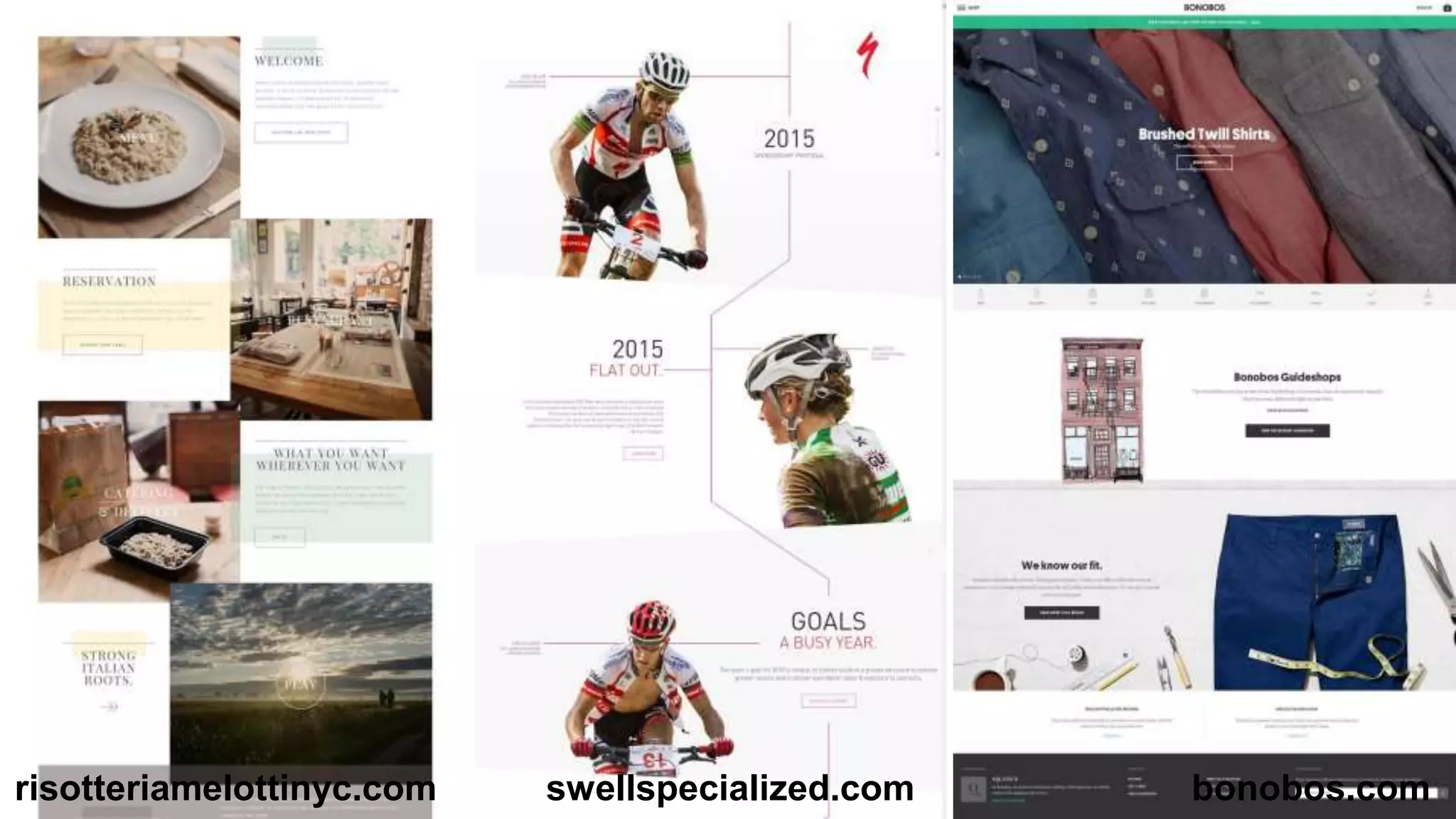
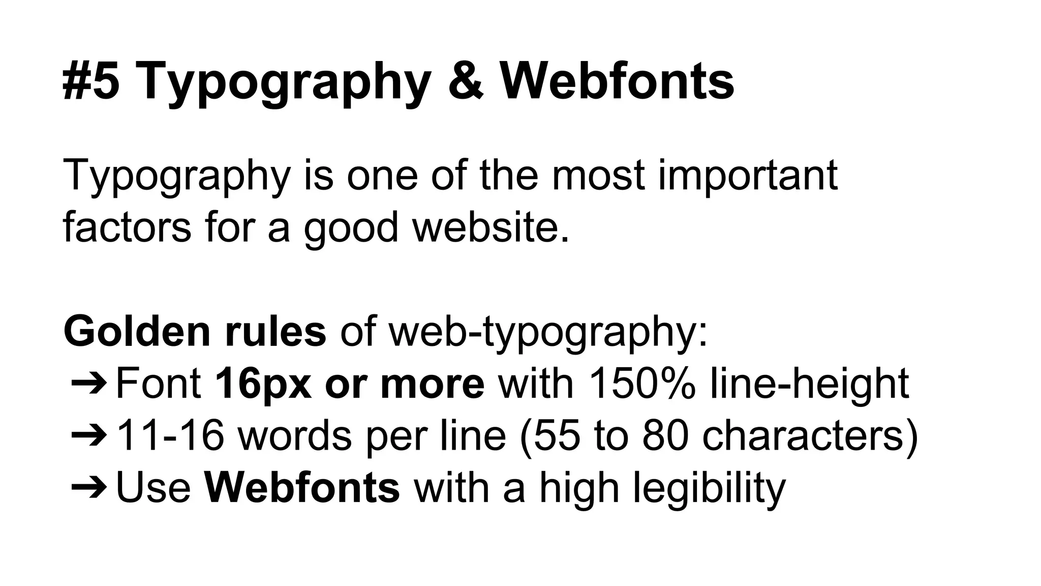
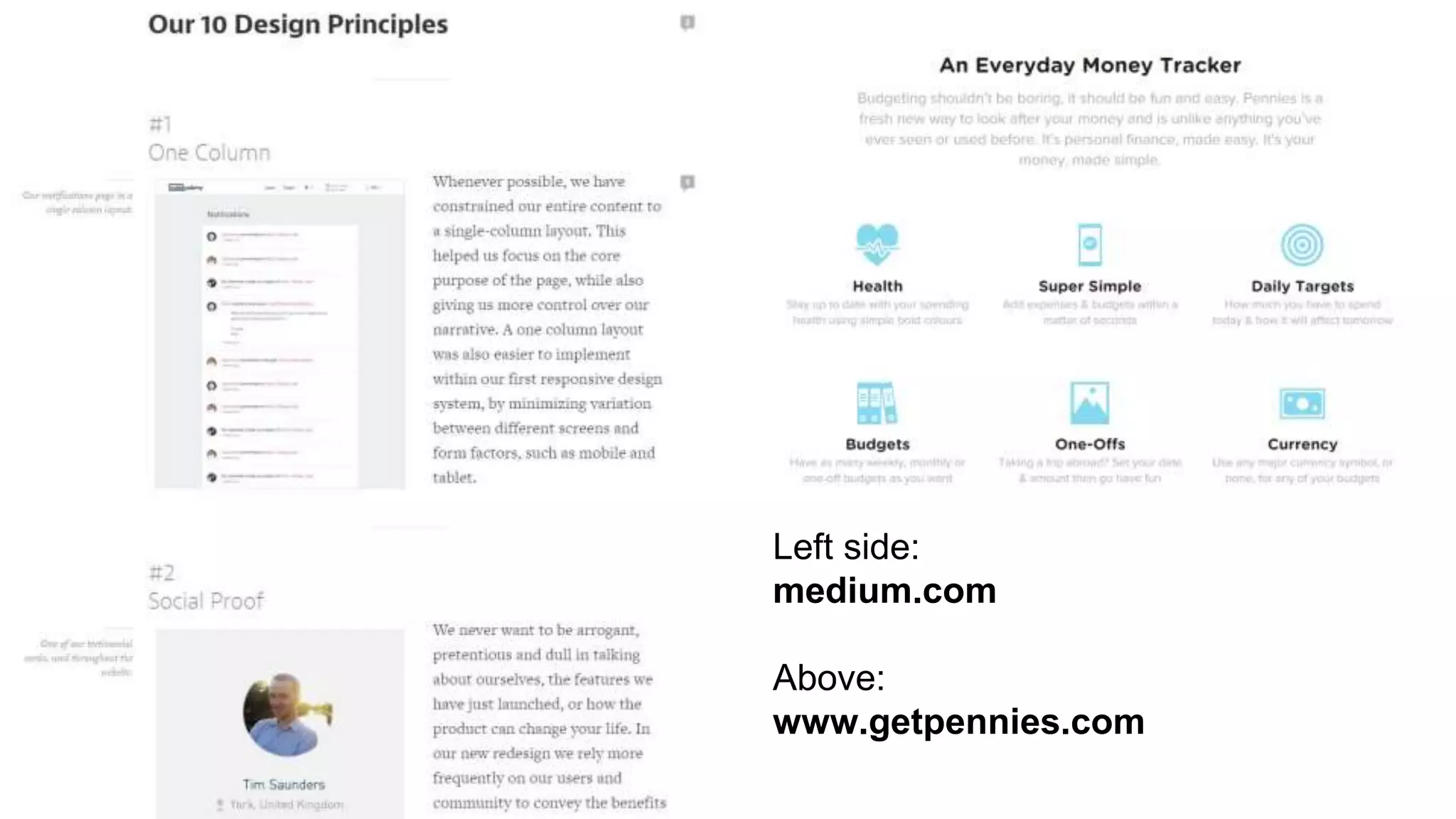
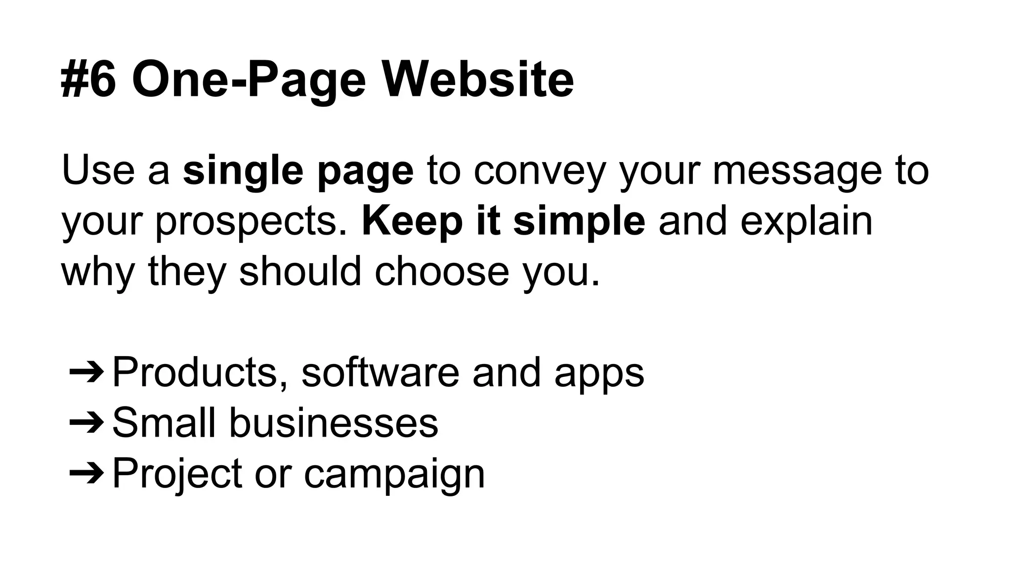
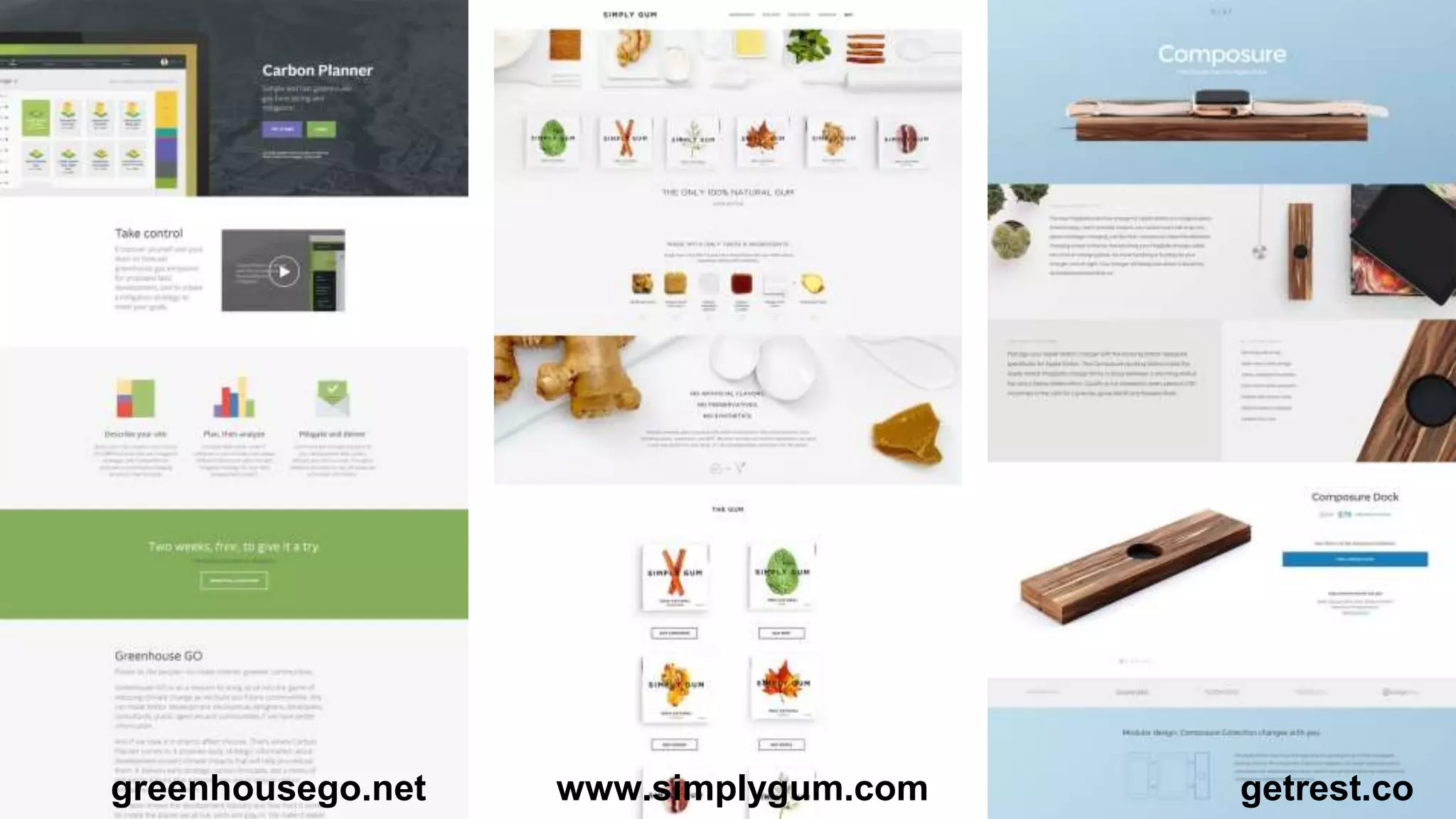
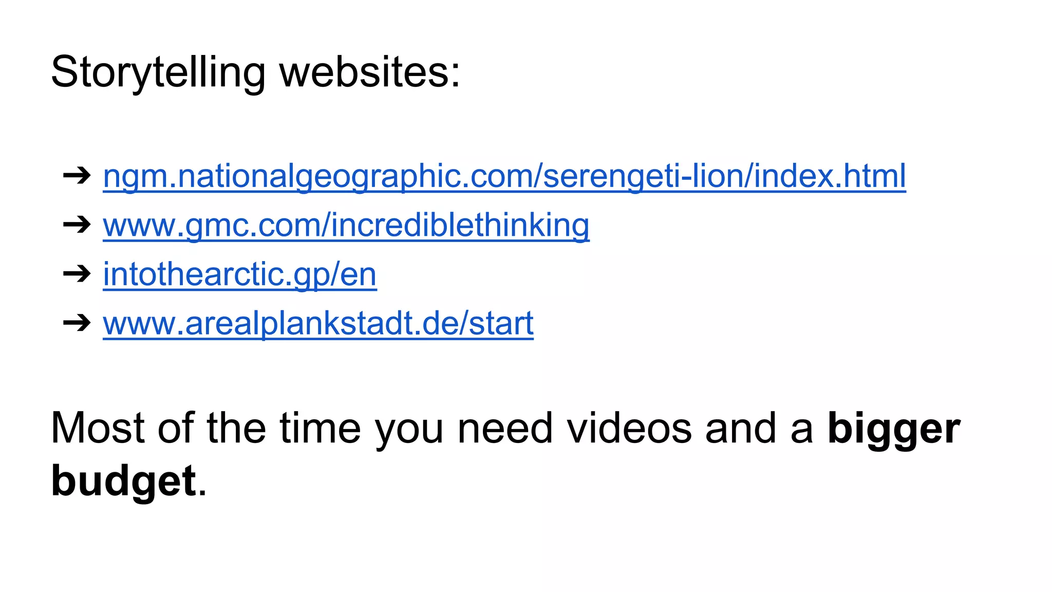
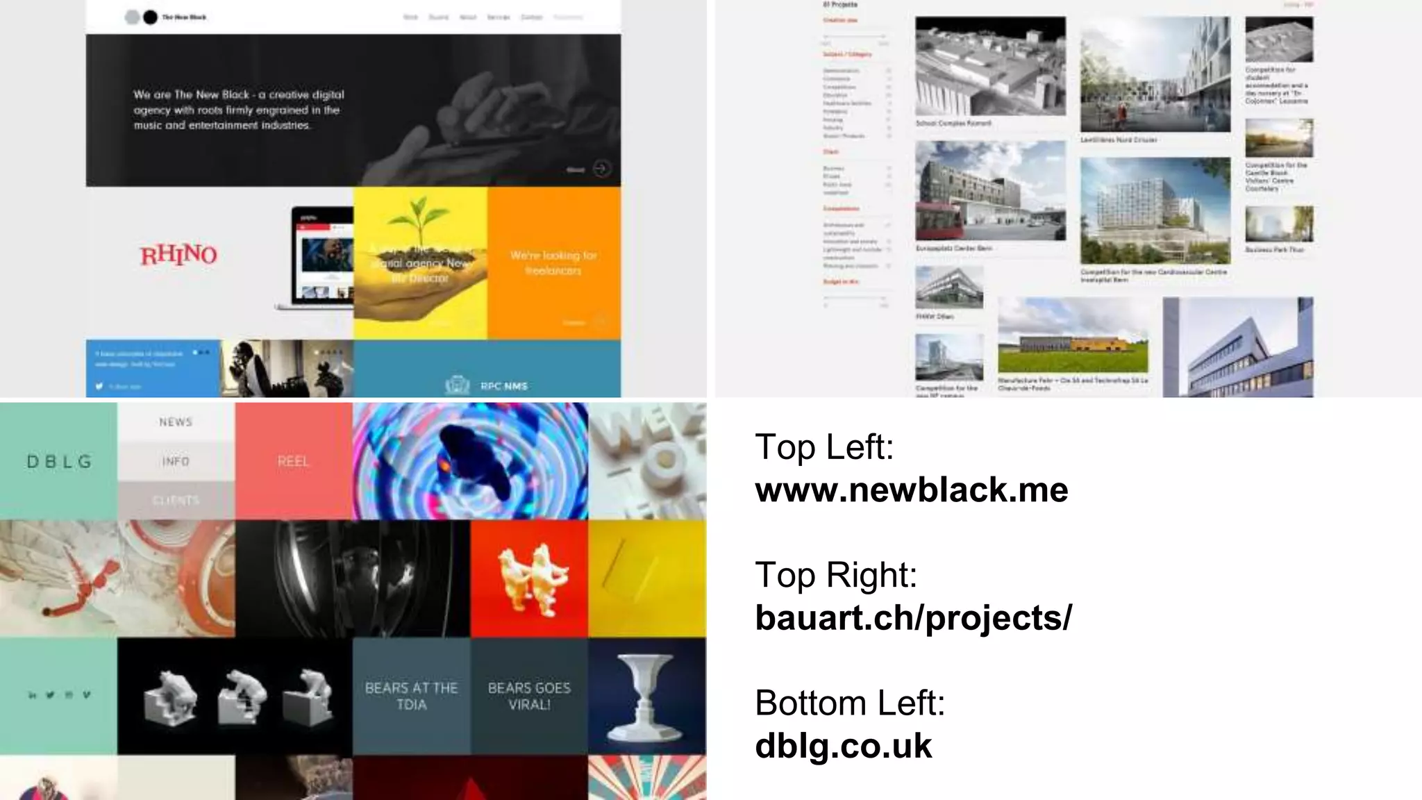
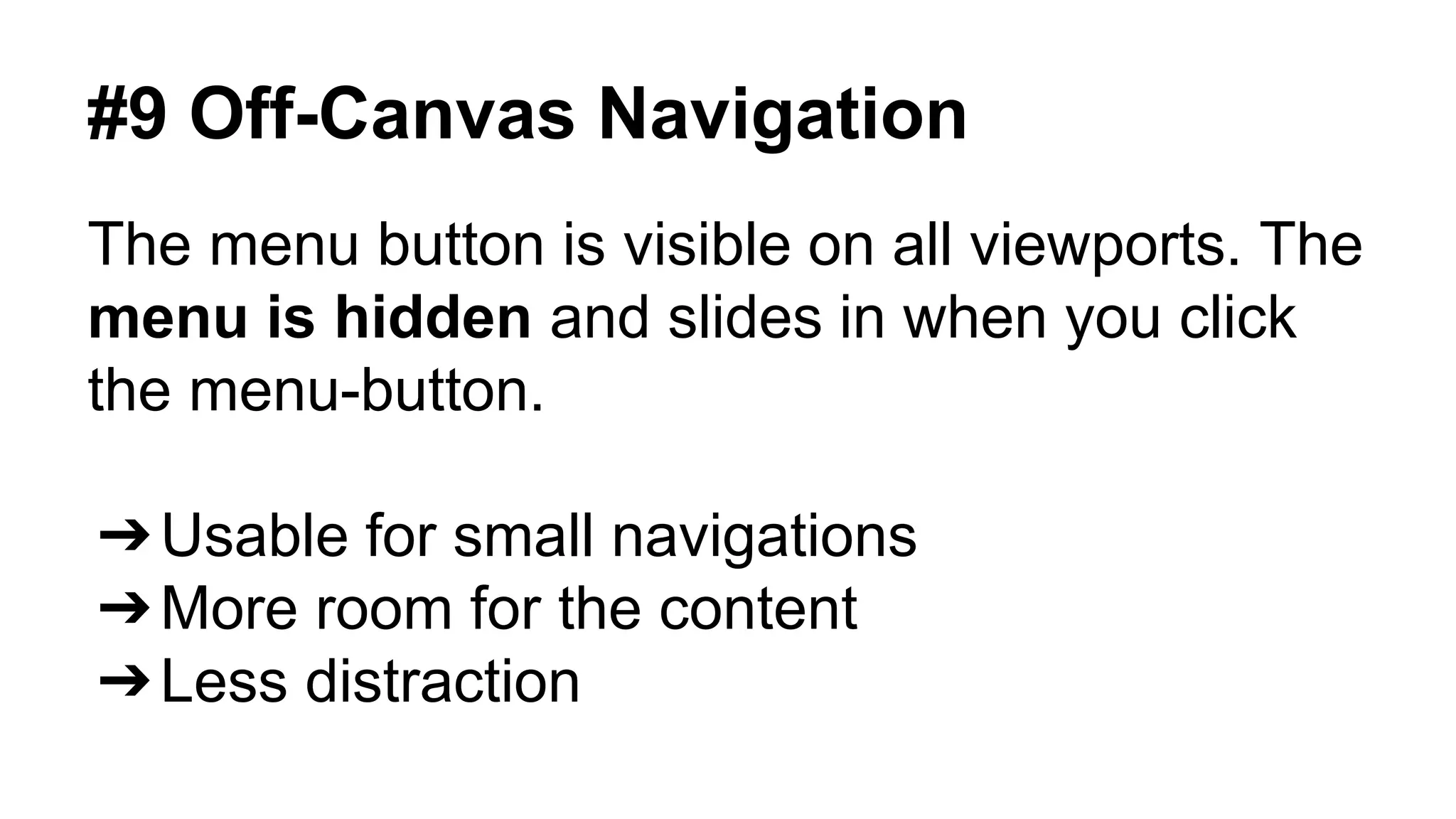
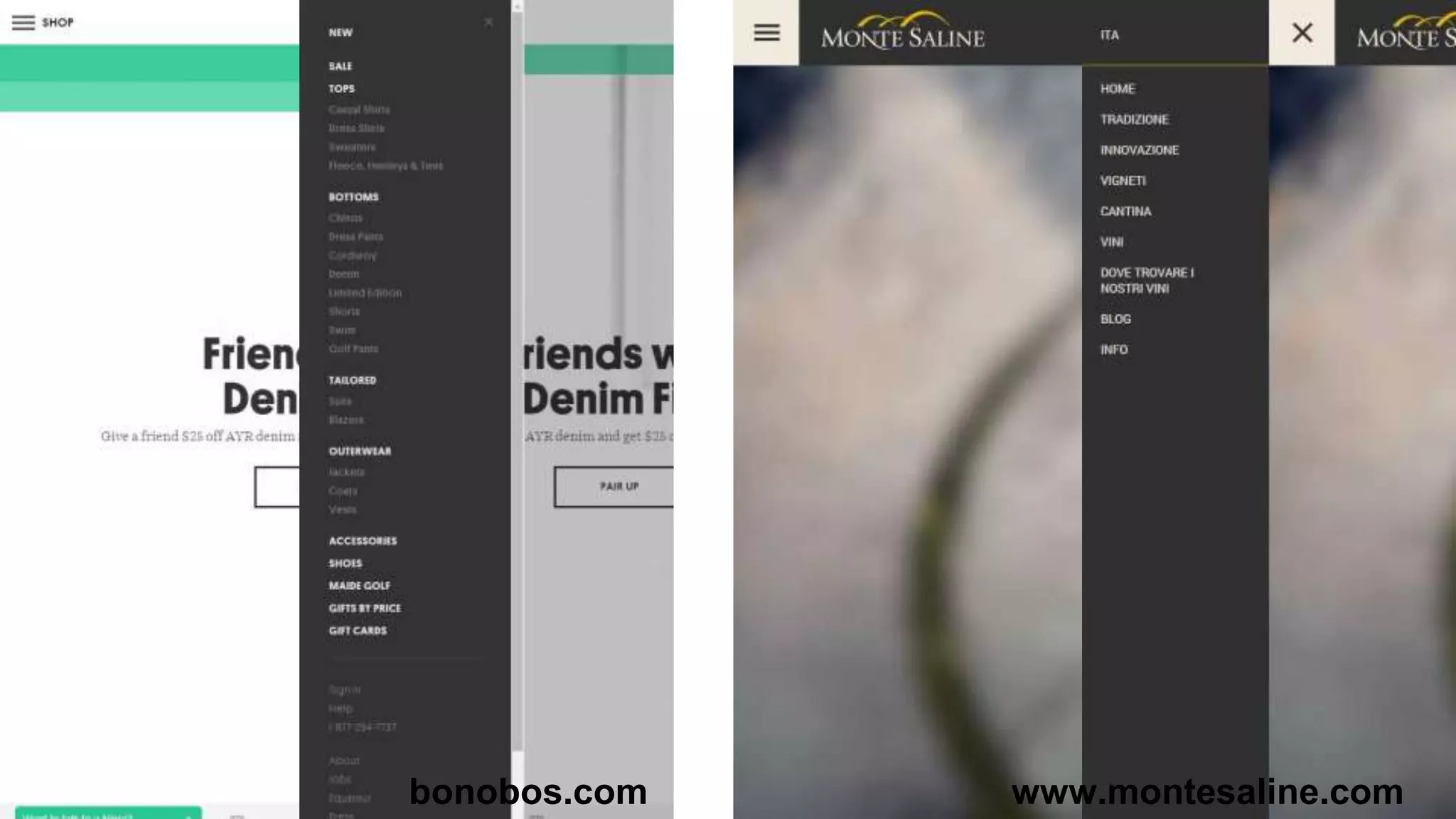
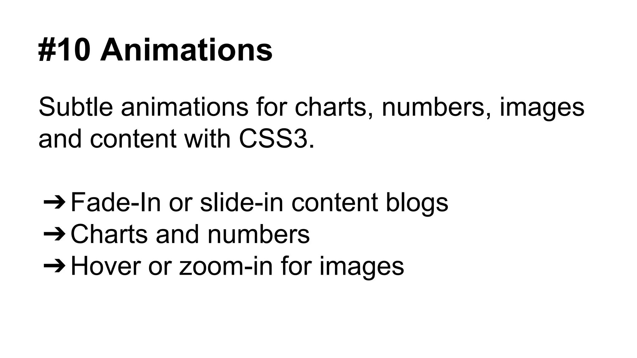
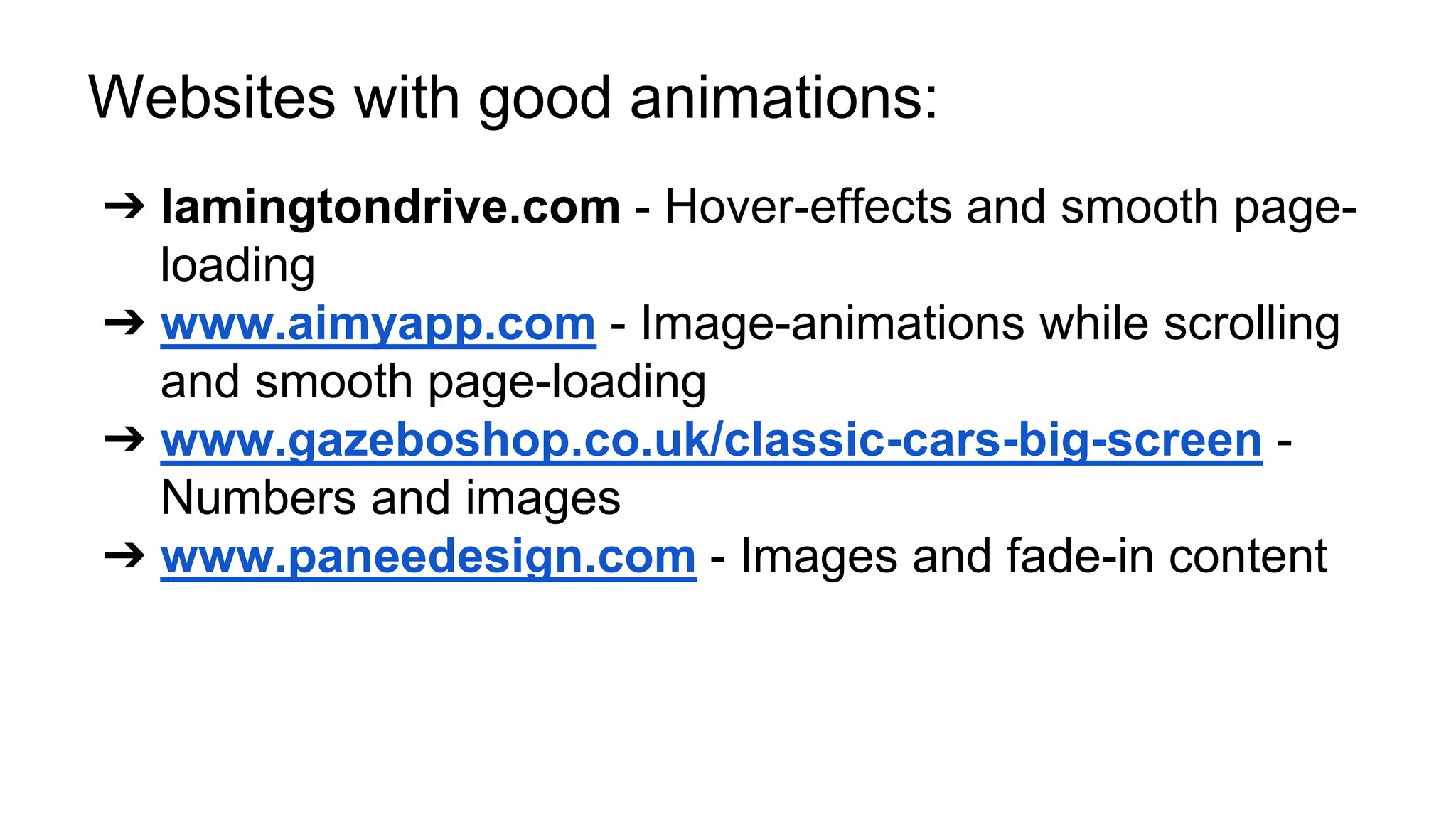


The document outlines the top web design trends for 2015, emphasizing the importance of responsive design, clear communication through visuals, and effective layout strategies. Key trends include using full-width designs, big content blocks, and storytelling to enhance user engagement. Additionally, it highlights the use of modern typography, one-page websites, grid layouts, off-canvas navigation, and subtle animations to improve overall user experience.


![[Webinar] How to Incorporate Mobile Into Your Marketing Strategy](https://cdn.slidesharecdn.com/ss_thumbnails/unwebinarcgtemplatev2-150421142002-conversion-gate01-thumbnail.jpg?width=640&height=640&fit=bounds)


![[BROCHURE] Italy Tour Project | @SlideON](https://cdn.slidesharecdn.com/ss_thumbnails/brochure8-251215152319-2805af68-thumbnail.jpg?width=640&height=640&fit=bounds)


