General Principles of Intellectual Property: Concepts of Intellectual Proper...
Landscape Horror Poster Analysis
1. Landscape Horror Poster Analysis
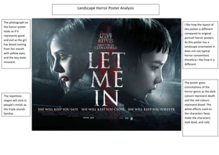
The photograph on
I like how the layout of
the horror poster
this poster is different
looks as if it
compared to original
represents good
portrait horror posters.
and evil as the girl
As this poster has a
has blood coming
landscape orientation it
from her mouth
does not use typical
with yellow eyes,
horror conventions
and the boy looks
therefore I like how it is
innocent.
different.
The poster gives
connotations of the
horror genre as the dark
The repetitive colours represent death
slogan will stick in and the red colours
people’s minds as represent blood. The
the triple sounds white effects used on
familiar. the characters faces
make the characters
look dead, and cold.