
Recommended
More Related Content
What's hot
What's hot (20)
Similar to Advertisment for album release
Similar to Advertisment for album release (20)
Recently uploaded
Recently uploaded (20)
Advertisment for album release
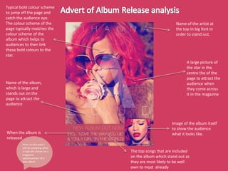
- 1. Name of the artist at the top in big font in order to stand out. A large picture of the star in the centre the of the page to attract the audience when they come across it in the magazine Image of the album itself to show the audience what it looks like. The top songs that are included on the album which stand out as they are most likely to be well own to most already When the album is released. Name of the album, which is large and stands out on the page to attract the audience Typical bold colour scheme to jump off the page and catch the audience eye. The colour scheme of the page typically matches the colour scheme of the album which helps to audiences to then link these bold colours to the star. Intro: on this post I will be analysing what is typically shown on a magazine advertisement of a new album
- 2. Name of the artist in bold and in the centre to catch the audience eye. Images of the star in the centre again to stand out. Additional information like features and info about what is included on the album. Image of the album to show what it looks like Name of the album quite big to stand out on the page. Colour scheme of the advert typically matches the colour of the album so everything looks the same and all images are associated with the album. Conclusion: from this, I have learned the typical conventions of a magazine advertisement of a new album and therefore I am able to then take this into consideration when making my own for my album.