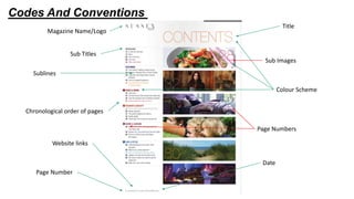
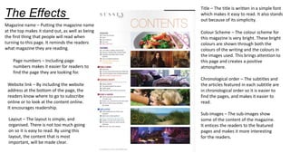
Contents page
Deconstruction – Sussex
Style
By Sophie Smith
Codes And Conventions
Title
Sub Images
Sub Titles
Page Numbers
Chronological order of pages
Colour Scheme
Magazine Name/Logo
Sublines
Date
Website links
Page Number
The Effects
Title – The title is written in a simple font
which makes it easy to read. It also stands
out because of its simplicity.
Colour Scheme – The colour scheme for
this magazine is very bright. These bright
colours are shown through both the
colours of the writing and the colours in
the images used. This brings attention to
this page and creates a positive
atmosphere.
Magazine name – Putting the magazine name
at the top makes it stand out, as well as being
the first thing that people will read when
turning to this page. It reminds the readers
what magazine they are reading.
Chronological order – The subtitles and
the articles featured in each subtitle are
in chronological order so it is easier to
find the pages, and makes it easier to
read.
Sub-images – The sub-images show
some of the content of the magazine.
It entices the readers to the featured
pages and makes it more interesting
for the readers.
Page numbers – Including page
numbers makes it easier for readers to
find the page they are looking for.
Website link – By including the website
address at the bottom of the page, the
readers know where to go to subscribe
online or to look at the content online.
It encourages readership.
Layout – The layout is simple, and
organised. There is not too much going
on so it is easy to read. By using this
layout, the content that is most
important, will be made clear.

Sussex Style Deconstruction Contents Page

  • 1.
    Contents page Deconstruction –Sussex Style By Sophie Smith
  • 2.
    Codes And Conventions Title SubImages Sub Titles Page Numbers Chronological order of pages Colour Scheme Magazine Name/Logo Sublines Date Website links Page Number
  • 3.
    The Effects Title –The title is written in a simple font which makes it easy to read. It also stands out because of its simplicity. Colour Scheme – The colour scheme for this magazine is very bright. These bright colours are shown through both the colours of the writing and the colours in the images used. This brings attention to this page and creates a positive atmosphere. Magazine name – Putting the magazine name at the top makes it stand out, as well as being the first thing that people will read when turning to this page. It reminds the readers what magazine they are reading. Chronological order – The subtitles and the articles featured in each subtitle are in chronological order so it is easier to find the pages, and makes it easier to read. Sub-images – The sub-images show some of the content of the magazine. It entices the readers to the featured pages and makes it more interesting for the readers. Page numbers – Including page numbers makes it easier for readers to find the page they are looking for. Website link – By including the website address at the bottom of the page, the readers know where to go to subscribe online or to look at the content online. It encourages readership. Layout – The layout is simple, and organised. There is not too much going on so it is easy to read. By using this layout, the content that is most important, will be made clear.