The document summarizes the key design elements of a magazine contents page, including:
The masthead is positioned at the top right of the page in a large, bold, white font to stand out. Important information like the date, page number, and website links are positioned at the bottom right.
The contents text is brief and lists the subheadings and page numbers for each section in a simple vertical list to inform readers of what is inside. Numbers are used frequently to indicate page numbers for each item.
Images are also included and positioned throughout the layout among the text. The composition balances text and images with a layered, image-led approach. Color is kept simple with mostly white text against the backdrop of
1. Contents Page – Deconstruction
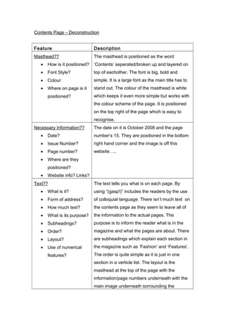
Feature Description
Masthead??
• How is it positioned?
• Font Style?
• Colour
• Where on page is it
positioned?
The masthead is positioned as the word
‘Contents’ seperated/broken up and layered on
top of eachother. The font is big, bold and
simple. It is a large font as the main title has to
stand out. The colour of the masthead is white
which keeps it even more simple but works with
the colour scheme of the page. It is positioned
on the top right of the page which is easy to
recognise.
Necessary Information??
• Date?
• Issue Number?
• Page number?
• Where are they
positioned?
• Website info? Links?
The date on it is October 2008 and the page
number’s 15. They are positioned in the bottom
right hand corner and the image is off this
website…..
Text??
• What is it?
• Form of address?
• How much text?
• What is its purpose?
• Subheadings?
• Order?
• Layout?
• Use of numerical
features?
The text tells you what is on each page. By
using “(gasp!)” includes the readers by the use
of colloquial language. There isn’t much text on
the contents page as they seem to leave all of
the information to the actual pages. The
purpose is to inform the reader what is in the
magazine and what the pages are about. There
are subheadings which explain each section in
the magazine such as ‘Fashion’ and ‘Features’.
The order is quite simple as it is just in one
section in a verticle list. The layout is the
masthead at the top of the page with the
information/page numbers underneath with the
main image underneath sorrounding the
2. information. There is a constant use of numbers
in the contents as it tells you what pages there
are and what is on each page.
Font??
• What font is used?
• Are there different
font styles?
• Why is this?
• Colour?
• Are italics used?
Where? How?
• Bold text?
Images??
• How many?
• What size?
• What are they of?
• Are the images
anchored? (i.e. by a
caption?)
• Is there writing over
any of the images?
• Positioning of
images?
Composition??
• Framing?
• Layout?
• Layering?
• Relation of text to
images?
• Image led?
• Text led?
3. Linguistic features??
• Rhetorical
questions?
• Alliteration?
• Assonance?
• Enigma Codes?
• Puns?
• Anything else of
note?
• Effect of linguistic
features?
Colour??
• How many colours
are used for text?
• Colours of images?
• Effect of colours?