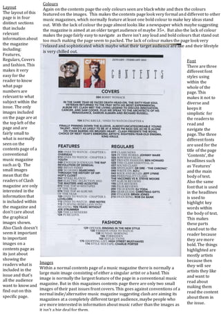
The document analyzes the contents page of the Clash magazine. It notes that the page lacks color, unlike most music magazines, giving it a sophisticated but relaxed look aimed at an older audience. The layout is divided into clear sections about features, regulars, covers, and fashion, making the content easy to navigate. Images are small compared to other music magazines, suggesting Clash readers prioritize information over visuals. The font uses three styles for titles, headlines, and body text, with headlines highlighting artists to draw readers to those sections. In contrast to most music magazines, Clash has only small cover images rather than a large featured image, further indicating its audience values information over visuals.