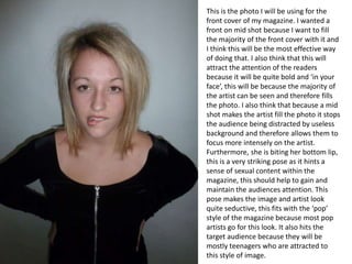
1. This is the photo I will be using for the
front cover of my magazine. I wanted a
front on mid shot because I want to fill
the majority of the front cover with it and
I think this will be the most effective way
of doing that. I also think that this will
attract the attention of the readers
because it will be quite bold and ‘in your
face’, this will be because the majority of
the artist can be seen and therefore fills
the photo. I also think that because a mid
shot makes the artist fill the photo it stops
the audience being distracted by useless
background and therefore allows them to
focus more intensely on the artist.
Furthermore, she is biting her bottom lip,
this is a very striking pose as it hints a
sense of sexual content within the
magazine, this should help to gain and
maintain the audiences attention. This
pose makes the image and artist look
quite seductive, this fits with the ‘pop’
style of the magazine because most pop
artists go for this look. It also hits the
target audience because they will be
mostly teenagers who are attracted to
this style of image.
2. This photo will be used on the contents
page of my magazine. This image contains
more of the artist, for example in the
image the tops of her legs can be seen. I
have done this so that she fills the
majority of one side of the page. I want to
do this so that on the other half text
explaining features and contents of the
magazine can be displayed. By doing this
little of the text should overlap the image
meaning it will be easier to read and
therefore the magazine can maintain the
audiences attention easier. Furthermore,
by showing the tops of the artists legs it
again hints a sense of sexual content
within the magazine, without using the
same pose as before, this stops the
magazine looking repetitive whilst still
giving the same impression to the
audience. The artists head is slightly tilted
and she is shaking her hair with her hand,
this gives a new perspective of the artist
and overall makes the image look more
interesting.
3. This photo will be used on the double
page spread of my magazine. This is
another image of the artist just to help
the audience build up an image of the
artist. Her body is slightly tilted and she is
‘pouting’ her lips, this is to again give a
new perspective of the artist and to make
the magazine seem more interesting, by
changing the pose it should also stop the
magazine looking to repetitive and
unprofessional. The fact that her hair isn’t
perfectly presented is also important
because this will make the image feel
more ‘real’ and personal as it shows the
artist in the way she actually looks.
4. This photo will be used on the double
page spread of my magazine. This is
another image of the artist just to help
the audience build up an image of the
artist. It is a mid shot like the one that will
be used on the front of my magazine, it
shows the artist as the focus of the image
because she fills the majority of the
photo. It is different to the image that will
be used on the front as she is not pulling
a seductive pose, this makes the image
feel more real, and lets the audience see
what the artist looks naturally.
5. This photo will be used on the double page spread of my magazine. This is another image of the artist just to
help the audience build up an image of the artist. She is holding her hair with both hands and has her mouth
open as if she is saying something. This makes the image and overall the magazine feel more interesting as it
is a different pose to the other photos. I also feel that this photo feels more real, and looks less faked. I think
this will make the image feel more personal and also make the audience feel like they have seen the ‘real’
artist, I think this is very important. This image is also more landscape than the other images, this will look
effective when it is in contrast with other vertical images and vertical columns of text. It ultimately adds a
different shape to the magazine.
6. This photo will be used on the double page spread of my magazine. This is another image of the artist just to
help the audience build up an image of the artist. She is sat on the floor and is smiling very naturally, this is
good because it makes her look very real, and not fake at all. This will make the magazine article feel more
personal. Furthermore, she is sat down because it gives a new perspective and angle that isn't shown in the
other photos, this will make the magazine article feel more interesting. The fact she is sat on the floor also
implies the artists ‘down to earth’ nature, this will be very effective in my double page spread.
7. Overall I think that the variety of different photos that I have taken will enable me to
make my magazine look very effective. By showing her in different poses and at
different angles it will stop the photos looking repetitive and will sustain the audiences
attention. Furthermore, I think that the way that some of the photos are slightly
seductive, is really effective because it links with both the magazine style and the
target audience. This will also stop the magazine looking boring and make it look
professional.