1. Film magazine analysis
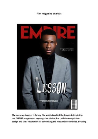
My magazine is cover is for my film which is called the lesson. I decided to
use EMPIRE magazine as my magazine choice due to their recognisable
design and their reputation for advertising the most modern movies. By using
2. a label that is widely known, it not only adds realism to the cover but also
portrays the film as a blockbuster.
The image I decided to use is a mid shot, showing the characters upper body
and face. By having this type of image I am able to show the characters facial
features which appear menacing and so associate with the movie. I also
wanted to show the characters uniform which includes a blazer to make his
profession as a teacher clear to the audience and associating with the
headline “the lesson” this is easy for the reader to understand.
I decided to make the models face slightly blurred, giving a cartoon-like
effect which makes it appear like a comic. I did this to imitate ideas similar to
that of frank millers “sin city” in which characters appear comic like yet the
film contains very gory and violent scenes. His head covers some of the
magazines title, however this is acceptable due to the magazines popularity,
being easily recognised by the genre specific audience.
Continuing on the comic theme, I decided to have the headline in a font
where the text appears scratched. Not only does this appear comic like, but it
also links to the school theme as it is constructed similar to writing that
would appear on a chalk board. The copy is large and centred, being easily
recognised as important along with the magazines title.