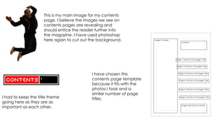
1. This is my main image for my contents
page. I believe the images we see on
contents pages are revealing and
should entice the reader further into
the magazine. I have used photoshop
here again to cut out the background.
I have chosen this
contents page template
because it fits with the
photos I took and a
similar number of page
I had to keep the title theme titles.
going here as they are as
important as each other.
2. Having a quick brainstorm of the titles of
articles I could include on my contents page: Creating a new page
Following the front page; ‘Polled: the top 10 required a new type of font;
ways to manage exam stress chosen by you’ one that clings the attention
Opinions: improving your area of the readers and also using
Stories of the term a what looks common and
Agony aunt
somewhat can feel collegy. I
Events: inside and out chose the font Contra from
Lunch menu for upcoming weeks cooltext.com for this.
Everybody loves DISCOUNTS
How to improve your cv
I think the ideal font style would be quite
simple but it has to be bold and perhaps a
well known font but adjusted.
I have also used the ‘..#’ to indicate the
page number as I think this would be
easily interpreted.
3. Using the same
image text block for
the ‘win!’ sign can
help readers identify
which parts they
need to read in
which has drawn
their attention.
This photo is to go with one of my article
titles, I cut the background out on
photoshop again. I thought about what
kind of photos I could take and use for
an article and a concentrating but
convincing pose.