SlideShare a Scribd company logo
1 of 6
By Priscilla and Chloe

- Certain fonts were either too cracked which
made it hard to read, or too slanted which also
made the readability questionable.

- These were the
possible fonts that we
choose to be our final
branded font for our
trailer.
INSANITY
•

These were the possible fonts that we as a group explored, as a way of linking all of
our ancillary text. This is because our audience to recognise straight away that they
are all part of the same film. This is essential in gaining popularity and therefore
engaging more of our target audience,e.g those aged 15 and above.

•

We gained audience feedback on what fonts looked the most effective, as well as
connoting the split personality of Flora. It was evident that they preferred the
“Skratch Punk ” font, this is due to the fact that it reflects our narrative really well in
terms of the dysfunctional family and also reinforces the idea that Flora is not quite
right. We used this through out all three ancillary texts to make sure there was a
clear link between all our products, so that it was easier for the audience to see the
similarities straight away without them having to work hard to find the similarities.
This is an important element in the postproduction stage, as it helps the audience to
recognise the film as well as the poster and magazine which promote it. This is a
unique selling point for our group, as this will make it easier when we are marketing
and distributing our products.

•

We changed the colour of the text (which is originally black) in Photoshop to red
using the “quick magic wand”. Here we carefully selected the area we wanted to
change the colour, this made it easier when we used a solid colour in filling in the
gaps within the text. We had some difficulties in terms of selecting some areas as
the computer often crashed which meant that it was harder for us to save the
newer version when the colour had been changed to red. Another a difficulty was
that the fact that it was a black colour is that it was harder to change it, this meant
that we had to change it to white and then later to red.
Positioning of text (POSTER)
•

Priscilla has the role of editing the poster, which meant she had to make creative
decisions. Originally we were planning to place “Insanity” vertically down the side
of our main image, however we decided to try make it a little to the side to
symbolise Flora’s sanity.

•

I subverted the convention of text going down on the poster, this is because if it
was going across it would be harder to see the crack which is an important
element of the poster as it illustrates Flora’s dual personalities. Once positioned I
had to change the colour to red using the “bucket tool” along with the “magic
wand tool”. Although I subverted some elements of the text, I followed some other
elements e.g. I followed the convention of text reinforcing the Horror genre as it is
“jagged” and gives the appearance of being shattered. (Showing Flora’s mentality
once more as we want to make it clear to our audience that she is not like other
little girls).

•

In terms of readable fonts we tried using “Egyptian710BT” font on PhotoShop,
however this font looked too simplistic and had wide gaps in between which made
it look odd due to the positioning as it was placed in between the crack. This made
it hard to read some elements of the text.
The Trailer
• Within the trailer we made several changes to the text as
previously explored, e.g. the use of red to symbolise the
death of James Flora’s father which is a key part of our
narrative. We also used the same “Skratch Punk ” font
from Dafont to maintain cohesion within our pieces.
• For the trailer we found it difficult to find the “right” red
as the font was either too dark or too light. This
appeared unprofessional and looked “grainy” when
added to our trailer which is why we then decided to use
a different font in our final production.
The MAGAZINE
• On the magazine we choose to use black for the word “Insanity”
which is our branded title, instead of having the text red. We made
this decision due to the fact that the red looked odd and didn’t
come across effective. It also clashed with the other colours
presented on our magazine e.g. grey and black.
• Using red for the brand name would have also went against the
conventions in terms of colour for magazines, as typically 3 colours
are used as one is either black or white.
• In terms of sub fonts we used a grey readable font which was a
similar font to the thin white fonts used on our poster and at the
end of our trailer. This meant that we were able to maintain a sense
of cohesion within our pieces. The fonts were slightly different
styles due to the fact that not every platform had the same fonts,
e.g. I Movie had different fonts from Photoshop.

More Related Content

What's hot

EVALUATION QUESTION 1 AS MEDIA
EVALUATION QUESTION 1 AS MEDIAEVALUATION QUESTION 1 AS MEDIA
EVALUATION QUESTION 1 AS MEDIAbethanybradleyx
 
Codes and Conventions Evaluation Question
Codes and Conventions Evaluation QuestionCodes and Conventions Evaluation Question
Codes and Conventions Evaluation Questionanitahasani123
 
Review of Pre-lim Tast
Review of Pre-lim TastReview of Pre-lim Tast
Review of Pre-lim Tastrosy_emmerich
 
Evaluation question 2
Evaluation question 2Evaluation question 2
Evaluation question 2dm6443
 
Question 2
Question 2Question 2
Question 2Colahyp
 
Ancillary Product: Poster Research
Ancillary Product: Poster ResearchAncillary Product: Poster Research
Ancillary Product: Poster Researchtesfah
 
Final research
Final researchFinal research
Final researchposhbo
 

What's hot (17)

Dfsdgs
DfsdgsDfsdgs
Dfsdgs
 
Poster analysis
Poster analysisPoster analysis
Poster analysis
 
EVALUATION QUESTION 1 AS MEDIA
EVALUATION QUESTION 1 AS MEDIAEVALUATION QUESTION 1 AS MEDIA
EVALUATION QUESTION 1 AS MEDIA
 
Font analysis
Font analysisFont analysis
Font analysis
 
Codes and Conventions Evaluation Question
Codes and Conventions Evaluation QuestionCodes and Conventions Evaluation Question
Codes and Conventions Evaluation Question
 
Fonts
FontsFonts
Fonts
 
Review of Pre-lim Tast
Review of Pre-lim TastReview of Pre-lim Tast
Review of Pre-lim Tast
 
Magazine pp
Magazine ppMagazine pp
Magazine pp
 
Evaluation question 2
Evaluation question 2Evaluation question 2
Evaluation question 2
 
Magazine cover pp
Magazine cover ppMagazine cover pp
Magazine cover pp
 
Magazine pp 2
Magazine pp 2Magazine pp 2
Magazine pp 2
 
Question 2
Question 2Question 2
Question 2
 
Ancillary Product: Poster Research
Ancillary Product: Poster ResearchAncillary Product: Poster Research
Ancillary Product: Poster Research
 
Analysis of titles
Analysis of titlesAnalysis of titles
Analysis of titles
 
Presentation1
Presentation1Presentation1
Presentation1
 
Final research
Final researchFinal research
Final research
 
Typography
TypographyTypography
Typography
 

Similar to Possible fonts for insanity

Creating horror poster (Insanity)
Creating horror poster (Insanity)Creating horror poster (Insanity)
Creating horror poster (Insanity)Princess Priscilla
 
Final research pp
Final research ppFinal research pp
Final research ppimunoztorre
 
Final research
Final researchFinal research
Final researchhgrinham
 
Creating credits powerpoint
Creating credits powerpointCreating credits powerpoint
Creating credits powerpointChloe Alexandria
 
Evaluation 5
Evaluation 5Evaluation 5
Evaluation 5Tayla233
 
Evaluation 5
Evaluation 5Evaluation 5
Evaluation 5Tayla233
 
Evaluation question 2.
Evaluation question 2.Evaluation question 2.
Evaluation question 2.dm6443
 
Font research
Font researchFont research
Font researchelsxox
 
Horror film poster research
Horror film poster researchHorror film poster research
Horror film poster researchCaitlin French
 
Creation of poster
Creation of posterCreation of poster
Creation of posterMatt Hooper
 
Creation of poster
Creation of posterCreation of poster
Creation of posterMatt Hooper
 
Evaluation for media
Evaluation for mediaEvaluation for media
Evaluation for media79sean
 

Similar to Possible fonts for insanity (20)

Creating horror poster (Insanity)
Creating horror poster (Insanity)Creating horror poster (Insanity)
Creating horror poster (Insanity)
 
Final research pp
Final research ppFinal research pp
Final research pp
 
Final research
Final researchFinal research
Final research
 
Creating credits powerpoint
Creating credits powerpointCreating credits powerpoint
Creating credits powerpoint
 
Evaluation 5
Evaluation 5Evaluation 5
Evaluation 5
 
Evaluation 5
Evaluation 5Evaluation 5
Evaluation 5
 
Playing around with effects
Playing around with effectsPlaying around with effects
Playing around with effects
 
Evaluation question 2.
Evaluation question 2.Evaluation question 2.
Evaluation question 2.
 
Q2
Q2Q2
Q2
 
Planning
Planning Planning
Planning
 
Planning pw
Planning pwPlanning pw
Planning pw
 
Q1 eveluation
Q1 eveluationQ1 eveluation
Q1 eveluation
 
Font research
Font researchFont research
Font research
 
5. pre production
5. pre production5. pre production
5. pre production
 
Assignment 52
Assignment 52Assignment 52
Assignment 52
 
Horror film poster research
Horror film poster researchHorror film poster research
Horror film poster research
 
Creation of poster
Creation of posterCreation of poster
Creation of poster
 
Creation of poster
Creation of posterCreation of poster
Creation of poster
 
Media powerpoint film
Media powerpoint film Media powerpoint film
Media powerpoint film
 
Evaluation for media
Evaluation for mediaEvaluation for media
Evaluation for media
 

More from Princess Priscilla

Evaluation 1: in what ways does your media product use, challenge or develop ...
Evaluation 1: in what ways does your media product use, challenge or develop ...Evaluation 1: in what ways does your media product use, challenge or develop ...
Evaluation 1: in what ways does your media product use, challenge or develop ...Princess Priscilla
 
IN WHAT WAYS DOES YOUR MEDIA PRODUCT USE, DEVELOP OR CHALLENGE FORMS AND CONV...
IN WHAT WAYS DOES YOUR MEDIA PRODUCT USE, DEVELOP OR CHALLENGE FORMS AND CONV...IN WHAT WAYS DOES YOUR MEDIA PRODUCT USE, DEVELOP OR CHALLENGE FORMS AND CONV...
IN WHAT WAYS DOES YOUR MEDIA PRODUCT USE, DEVELOP OR CHALLENGE FORMS AND CONV...Princess Priscilla
 
Prop character types (A2 media studies)
Prop character types (A2 media studies)Prop character types (A2 media studies)
Prop character types (A2 media studies)Princess Priscilla
 
Updated version location and that
Updated version location and thatUpdated version location and that
Updated version location and thatPrincess Priscilla
 
Media language, Ferdinand Saussure the signifer and signified
Media language, Ferdinand Saussure the signifer and signifiedMedia language, Ferdinand Saussure the signifer and signified
Media language, Ferdinand Saussure the signifer and signifiedPrincess Priscilla
 

More from Princess Priscilla (10)

Evaluation 1: in what ways does your media product use, challenge or develop ...
Evaluation 1: in what ways does your media product use, challenge or develop ...Evaluation 1: in what ways does your media product use, challenge or develop ...
Evaluation 1: in what ways does your media product use, challenge or develop ...
 
IN WHAT WAYS DOES YOUR MEDIA PRODUCT USE, DEVELOP OR CHALLENGE FORMS AND CONV...
IN WHAT WAYS DOES YOUR MEDIA PRODUCT USE, DEVELOP OR CHALLENGE FORMS AND CONV...IN WHAT WAYS DOES YOUR MEDIA PRODUCT USE, DEVELOP OR CHALLENGE FORMS AND CONV...
IN WHAT WAYS DOES YOUR MEDIA PRODUCT USE, DEVELOP OR CHALLENGE FORMS AND CONV...
 
Prop character types (A2 media studies)
Prop character types (A2 media studies)Prop character types (A2 media studies)
Prop character types (A2 media studies)
 
creating horror poster
creating horror poster creating horror poster
creating horror poster
 
Casts for our horror trailer
Casts for our horror trailer Casts for our horror trailer
Casts for our horror trailer
 
Updated version location and that
Updated version location and thatUpdated version location and that
Updated version location and that
 
Media language, Ferdinand Saussure the signifer and signified
Media language, Ferdinand Saussure the signifer and signifiedMedia language, Ferdinand Saussure the signifer and signified
Media language, Ferdinand Saussure the signifer and signified
 
The final girl
The final girlThe final girl
The final girl
 
The theory of male gaze
The theory of male gazeThe theory of male gaze
The theory of male gaze
 
Evalution 7
Evalution 7Evalution 7
Evalution 7
 

Recently uploaded

Roles & Responsibilities in Pharmacovigilance
Roles & Responsibilities in PharmacovigilanceRoles & Responsibilities in Pharmacovigilance
Roles & Responsibilities in PharmacovigilanceSamikshaHamane
 
Presiding Officer Training module 2024 lok sabha elections
Presiding Officer Training module 2024 lok sabha electionsPresiding Officer Training module 2024 lok sabha elections
Presiding Officer Training module 2024 lok sabha electionsanshu789521
 
EPANDING THE CONTENT OF AN OUTLINE using notes.pptx
EPANDING THE CONTENT OF AN OUTLINE using notes.pptxEPANDING THE CONTENT OF AN OUTLINE using notes.pptx
EPANDING THE CONTENT OF AN OUTLINE using notes.pptxRaymartEstabillo3
 
Types of Journalistic Writing Grade 8.pptx
Types of Journalistic Writing Grade 8.pptxTypes of Journalistic Writing Grade 8.pptx
Types of Journalistic Writing Grade 8.pptxEyham Joco
 
Software Engineering Methodologies (overview)
Software Engineering Methodologies (overview)Software Engineering Methodologies (overview)
Software Engineering Methodologies (overview)eniolaolutunde
 
Final demo Grade 9 for demo Plan dessert.pptx
Final demo Grade 9 for demo Plan dessert.pptxFinal demo Grade 9 for demo Plan dessert.pptx
Final demo Grade 9 for demo Plan dessert.pptxAvyJaneVismanos
 
Pharmacognosy Flower 3. Compositae 2023.pdf
Pharmacognosy Flower 3. Compositae 2023.pdfPharmacognosy Flower 3. Compositae 2023.pdf
Pharmacognosy Flower 3. Compositae 2023.pdfMahmoud M. Sallam
 
ECONOMIC CONTEXT - LONG FORM TV DRAMA - PPT
ECONOMIC CONTEXT - LONG FORM TV DRAMA - PPTECONOMIC CONTEXT - LONG FORM TV DRAMA - PPT
ECONOMIC CONTEXT - LONG FORM TV DRAMA - PPTiammrhaywood
 
Biting mechanism of poisonous snakes.pdf
Biting mechanism of poisonous snakes.pdfBiting mechanism of poisonous snakes.pdf
Biting mechanism of poisonous snakes.pdfadityarao40181
 
Alper Gobel In Media Res Media Component
Alper Gobel In Media Res Media ComponentAlper Gobel In Media Res Media Component
Alper Gobel In Media Res Media ComponentInMediaRes1
 
Capitol Tech U Doctoral Presentation - April 2024.pptx
Capitol Tech U Doctoral Presentation - April 2024.pptxCapitol Tech U Doctoral Presentation - April 2024.pptx
Capitol Tech U Doctoral Presentation - April 2024.pptxCapitolTechU
 
Full Stack Web Development Course for Beginners
Full Stack Web Development Course  for BeginnersFull Stack Web Development Course  for Beginners
Full Stack Web Development Course for BeginnersSabitha Banu
 
How to Configure Email Server in Odoo 17
How to Configure Email Server in Odoo 17How to Configure Email Server in Odoo 17
How to Configure Email Server in Odoo 17Celine George
 
Introduction to ArtificiaI Intelligence in Higher Education
Introduction to ArtificiaI Intelligence in Higher EducationIntroduction to ArtificiaI Intelligence in Higher Education
Introduction to ArtificiaI Intelligence in Higher Educationpboyjonauth
 
Painted Grey Ware.pptx, PGW Culture of India
Painted Grey Ware.pptx, PGW Culture of IndiaPainted Grey Ware.pptx, PGW Culture of India
Painted Grey Ware.pptx, PGW Culture of IndiaVirag Sontakke
 
Meghan Sutherland In Media Res Media Component
Meghan Sutherland In Media Res Media ComponentMeghan Sutherland In Media Res Media Component
Meghan Sutherland In Media Res Media ComponentInMediaRes1
 
Computed Fields and api Depends in the Odoo 17
Computed Fields and api Depends in the Odoo 17Computed Fields and api Depends in the Odoo 17
Computed Fields and api Depends in the Odoo 17Celine George
 
KSHARA STURA .pptx---KSHARA KARMA THERAPY (CAUSTIC THERAPY)————IMP.OF KSHARA ...
KSHARA STURA .pptx---KSHARA KARMA THERAPY (CAUSTIC THERAPY)————IMP.OF KSHARA ...KSHARA STURA .pptx---KSHARA KARMA THERAPY (CAUSTIC THERAPY)————IMP.OF KSHARA ...
KSHARA STURA .pptx---KSHARA KARMA THERAPY (CAUSTIC THERAPY)————IMP.OF KSHARA ...M56BOOKSTORE PRODUCT/SERVICE
 

Recently uploaded (20)

Roles & Responsibilities in Pharmacovigilance
Roles & Responsibilities in PharmacovigilanceRoles & Responsibilities in Pharmacovigilance
Roles & Responsibilities in Pharmacovigilance
 
Presiding Officer Training module 2024 lok sabha elections
Presiding Officer Training module 2024 lok sabha electionsPresiding Officer Training module 2024 lok sabha elections
Presiding Officer Training module 2024 lok sabha elections
 
EPANDING THE CONTENT OF AN OUTLINE using notes.pptx
EPANDING THE CONTENT OF AN OUTLINE using notes.pptxEPANDING THE CONTENT OF AN OUTLINE using notes.pptx
EPANDING THE CONTENT OF AN OUTLINE using notes.pptx
 
Types of Journalistic Writing Grade 8.pptx
Types of Journalistic Writing Grade 8.pptxTypes of Journalistic Writing Grade 8.pptx
Types of Journalistic Writing Grade 8.pptx
 
Software Engineering Methodologies (overview)
Software Engineering Methodologies (overview)Software Engineering Methodologies (overview)
Software Engineering Methodologies (overview)
 
Final demo Grade 9 for demo Plan dessert.pptx
Final demo Grade 9 for demo Plan dessert.pptxFinal demo Grade 9 for demo Plan dessert.pptx
Final demo Grade 9 for demo Plan dessert.pptx
 
Pharmacognosy Flower 3. Compositae 2023.pdf
Pharmacognosy Flower 3. Compositae 2023.pdfPharmacognosy Flower 3. Compositae 2023.pdf
Pharmacognosy Flower 3. Compositae 2023.pdf
 
ECONOMIC CONTEXT - LONG FORM TV DRAMA - PPT
ECONOMIC CONTEXT - LONG FORM TV DRAMA - PPTECONOMIC CONTEXT - LONG FORM TV DRAMA - PPT
ECONOMIC CONTEXT - LONG FORM TV DRAMA - PPT
 
Biting mechanism of poisonous snakes.pdf
Biting mechanism of poisonous snakes.pdfBiting mechanism of poisonous snakes.pdf
Biting mechanism of poisonous snakes.pdf
 
Alper Gobel In Media Res Media Component
Alper Gobel In Media Res Media ComponentAlper Gobel In Media Res Media Component
Alper Gobel In Media Res Media Component
 
Capitol Tech U Doctoral Presentation - April 2024.pptx
Capitol Tech U Doctoral Presentation - April 2024.pptxCapitol Tech U Doctoral Presentation - April 2024.pptx
Capitol Tech U Doctoral Presentation - April 2024.pptx
 
Model Call Girl in Bikash Puri Delhi reach out to us at 🔝9953056974🔝
Model Call Girl in Bikash Puri  Delhi reach out to us at 🔝9953056974🔝Model Call Girl in Bikash Puri  Delhi reach out to us at 🔝9953056974🔝
Model Call Girl in Bikash Puri Delhi reach out to us at 🔝9953056974🔝
 
Full Stack Web Development Course for Beginners
Full Stack Web Development Course  for BeginnersFull Stack Web Development Course  for Beginners
Full Stack Web Development Course for Beginners
 
How to Configure Email Server in Odoo 17
How to Configure Email Server in Odoo 17How to Configure Email Server in Odoo 17
How to Configure Email Server in Odoo 17
 
Introduction to ArtificiaI Intelligence in Higher Education
Introduction to ArtificiaI Intelligence in Higher EducationIntroduction to ArtificiaI Intelligence in Higher Education
Introduction to ArtificiaI Intelligence in Higher Education
 
Painted Grey Ware.pptx, PGW Culture of India
Painted Grey Ware.pptx, PGW Culture of IndiaPainted Grey Ware.pptx, PGW Culture of India
Painted Grey Ware.pptx, PGW Culture of India
 
Meghan Sutherland In Media Res Media Component
Meghan Sutherland In Media Res Media ComponentMeghan Sutherland In Media Res Media Component
Meghan Sutherland In Media Res Media Component
 
Computed Fields and api Depends in the Odoo 17
Computed Fields and api Depends in the Odoo 17Computed Fields and api Depends in the Odoo 17
Computed Fields and api Depends in the Odoo 17
 
KSHARA STURA .pptx---KSHARA KARMA THERAPY (CAUSTIC THERAPY)————IMP.OF KSHARA ...
KSHARA STURA .pptx---KSHARA KARMA THERAPY (CAUSTIC THERAPY)————IMP.OF KSHARA ...KSHARA STURA .pptx---KSHARA KARMA THERAPY (CAUSTIC THERAPY)————IMP.OF KSHARA ...
KSHARA STURA .pptx---KSHARA KARMA THERAPY (CAUSTIC THERAPY)————IMP.OF KSHARA ...
 
TataKelola dan KamSiber Kecerdasan Buatan v022.pdf
TataKelola dan KamSiber Kecerdasan Buatan v022.pdfTataKelola dan KamSiber Kecerdasan Buatan v022.pdf
TataKelola dan KamSiber Kecerdasan Buatan v022.pdf
 

Possible fonts for insanity

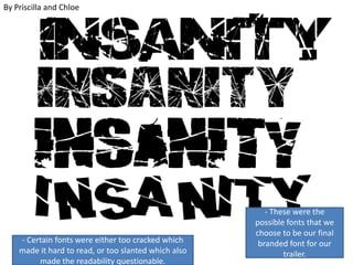
  • 1. By Priscilla and Chloe - Certain fonts were either too cracked which made it hard to read, or too slanted which also made the readability questionable. - These were the possible fonts that we choose to be our final branded font for our trailer.
  • 3. • These were the possible fonts that we as a group explored, as a way of linking all of our ancillary text. This is because our audience to recognise straight away that they are all part of the same film. This is essential in gaining popularity and therefore engaging more of our target audience,e.g those aged 15 and above. • We gained audience feedback on what fonts looked the most effective, as well as connoting the split personality of Flora. It was evident that they preferred the “Skratch Punk ” font, this is due to the fact that it reflects our narrative really well in terms of the dysfunctional family and also reinforces the idea that Flora is not quite right. We used this through out all three ancillary texts to make sure there was a clear link between all our products, so that it was easier for the audience to see the similarities straight away without them having to work hard to find the similarities. This is an important element in the postproduction stage, as it helps the audience to recognise the film as well as the poster and magazine which promote it. This is a unique selling point for our group, as this will make it easier when we are marketing and distributing our products. • We changed the colour of the text (which is originally black) in Photoshop to red using the “quick magic wand”. Here we carefully selected the area we wanted to change the colour, this made it easier when we used a solid colour in filling in the gaps within the text. We had some difficulties in terms of selecting some areas as the computer often crashed which meant that it was harder for us to save the newer version when the colour had been changed to red. Another a difficulty was that the fact that it was a black colour is that it was harder to change it, this meant that we had to change it to white and then later to red.
  • 4. Positioning of text (POSTER) • Priscilla has the role of editing the poster, which meant she had to make creative decisions. Originally we were planning to place “Insanity” vertically down the side of our main image, however we decided to try make it a little to the side to symbolise Flora’s sanity. • I subverted the convention of text going down on the poster, this is because if it was going across it would be harder to see the crack which is an important element of the poster as it illustrates Flora’s dual personalities. Once positioned I had to change the colour to red using the “bucket tool” along with the “magic wand tool”. Although I subverted some elements of the text, I followed some other elements e.g. I followed the convention of text reinforcing the Horror genre as it is “jagged” and gives the appearance of being shattered. (Showing Flora’s mentality once more as we want to make it clear to our audience that she is not like other little girls). • In terms of readable fonts we tried using “Egyptian710BT” font on PhotoShop, however this font looked too simplistic and had wide gaps in between which made it look odd due to the positioning as it was placed in between the crack. This made it hard to read some elements of the text.
  • 5. The Trailer • Within the trailer we made several changes to the text as previously explored, e.g. the use of red to symbolise the death of James Flora’s father which is a key part of our narrative. We also used the same “Skratch Punk ” font from Dafont to maintain cohesion within our pieces. • For the trailer we found it difficult to find the “right” red as the font was either too dark or too light. This appeared unprofessional and looked “grainy” when added to our trailer which is why we then decided to use a different font in our final production.
  • 6. The MAGAZINE • On the magazine we choose to use black for the word “Insanity” which is our branded title, instead of having the text red. We made this decision due to the fact that the red looked odd and didn’t come across effective. It also clashed with the other colours presented on our magazine e.g. grey and black. • Using red for the brand name would have also went against the conventions in terms of colour for magazines, as typically 3 colours are used as one is either black or white. • In terms of sub fonts we used a grey readable font which was a similar font to the thin white fonts used on our poster and at the end of our trailer. This meant that we were able to maintain a sense of cohesion within our pieces. The fonts were slightly different styles due to the fact that not every platform had the same fonts, e.g. I Movie had different fonts from Photoshop.