Evaluation 1: in what ways does your media product use, challenge or develop forms and conventions of real media products?
•Download as PPTX, PDF•
0 likes•480 views


Recommended
Recommended
More Related Content
What's hot
What's hot (18)
Viewers also liked
Similar to Evaluation 1: in what ways does your media product use, challenge or develop forms and conventions of real media products?
Similar to Evaluation 1: in what ways does your media product use, challenge or develop forms and conventions of real media products? (20)
More from Princess Priscilla
More from Princess Priscilla (10)
Recently uploaded
Recently uploaded (20)
Evaluation 1: in what ways does your media product use, challenge or develop forms and conventions of real media products?
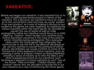
- 1. Narrative: Before we began our narrative, it was important for us to look at existing real media product in terms of the narrative. This is because we wanted to have an insight as to the conventions used and how we could present it our own product, as a way of making it obvious to our audience the genre we were targeting. By exploring the various narrative within the horror genre we decided to subvert the use of adults as well as male protagonists, rather our narrative would focus on a child killer e.g. ‘Orphan’ which tackles such sensitive issue. Further subversion would be in the case of focusing on ethnic minorities being protagonists. This is because often within the horror genre they either play the comical role or are the first to be killed off (Alvarado et al), we thus wanted to subvert this portrayal of ethnic groups. Nevertheless we would conform to some of the conventions often explored in horror narrative, such as creating a sense of enigma ( theory by Roland Barthes)creating a sense of mystery as to who the killer is and other unexplained events (in our narrative). Such technique is apparent in horror narrative as such ‘Turn of the Screw', 'Hide and Seek’, ‘Childish Games’ and ‘Scream’ hence why we decided to include this in our own narrative as a way of reinforcing the horror genre.
- 2. • The use of Iconography: blood Following the horror convention, we as a group decided to use blood as a way of reinforcing the horror genre. This is because we decided to follow the slasher genre, which often uses blood as a way of evoking a reaction from their audience due to horror often playing on society’s fears hence why blood is often used and the idea of someone being assassinated. We thus thought that by using blood would be an easier way for our audience to see the genre we were targeting, and thus more likely to connect with our products due to their interest in horror films, rather than us targeting those who do not watch horror films. This therefore meant that the use of blood was a significant aspect of our production, as it enabled us to link our products to existing real media products within the horror industry.
- 3. Iconography: knife • • Due to us following the slasher genre, we decided that a sharp object would be ideal use of weapon for our villain, as demonstrated in real media product such as ‘Halloween’ (1978). originally we were going to use ribbon as the murder weapon, as a way of making it obvious that Flora was the villain. However we thought that this did not reflect the slasher hence why we decided not to use it in the final edit of our trailer. Additionally by using the ribbon as a weapon would be far too obvious as to who the villain was which is not conventional within the slasher genre, as the villain are often hinted not given away to the audience. We feared that if we were to give away the identity of the villain through the use of weapon, our audience may not bother to watch our trailer if it was to be in the cinema, due to there not being any mystery.
- 4. Iconography: mask (subverted) • Subverting the slasher genre which often has iconography of a mask e.g. ‘Halloween’ (1978), we chose not to include this due to the fact that we wanted our audience to be aware of who the villain was. This comes down to the fact that in ‘Orphan’ (2013), ‘Hide and Seek’ (2005) and ‘Childish Games’ (2012) none of these real media product, which were our influence do not use mask hence why we also decided not to use mask in our own production.
- 5. • • Setting Following the convention, we decided to include an isolated setting where Megan (one of our protagonist) would be escaping from the villain who is in pursuit of her. By incorporating such scene our aim was to evoke a reaction from our audience due to the sense of panic it creates. Furthermore following the early stages of gothic literature ‘Turn Of The Screw’ (1960) which is where horror initially started, we chose to include an isolated setting where the murder of James (Flora’s father) would take place in a house. By making such event take place in the house our aim was a way of asserting panic amongst our audience due to the fact that it made our trailer look more realistic as if the murder was taking place in the audience own homes. This is done in existing slasher films such as ‘Psycho’ (1960), ‘Halloween’ (1978) ‘Hide and Seek’ (2005).
- 6. Music/sound • • This is an essential aspect of horror trailers as it has the ability to either ease the audience into the narrative (slow romantic music- often used at the beginning of the trailer), or evoke a reaction by putting the audience on edge through the use of atmospheric music/ sound. In terms of music we chose to use various music as a way of suiting with the shot used, as well as evoking a reaction. However we used ‘Creepy Little Girl Talking’ which consists of various songs (edited by Sarah Engel- ‘YouTube’) more often than other. We found out that this suited the paste of our trailer really well due to the lullaby reflecting Flora with ‘I can see you...’ , which we used in climatic scene when Megan was banging on the door wanting to escape the torture of Flora.
- 7. Final girl/heroes • We subverted the characteristic of final girl (who according to Carol Clover) is the victim who defeats the villain. • In our production (Insanity), we chose to have Flora as the final girl instead. We wanted to subvert the idea of the villain being defeated. However we kept some element of this theory in terms of the such character moving the narrative forward- through Flora events begin to unfold for audience.
- 8. Religion • We conformed to this convention by using religion (Christianity) in a ‘twisted’ manner to suite the dark element of horror. A prime example of this is demonstrated in ‘Carrie’ which relay heavily on religion in moving the narrative forward. This is what ultimately makes ‘Carrie’ to become deviant and perhaps criminal, taking matters into her own hands. Likewise we also used religion in our narrative where Flora often refers to this throughout as a way of justifying her actions through language such as ‘If we confess our sins, he’s faithful to forgive us our sin’.
- 9. Fast cuts and editing • Initially when we showed our rough cut, the shots in which we had used were exceptionally long (35 seconds) which was not conventional within the horror industry. This is because by having longer shots tells too much of the story, which is what we as editors wanted to avoid as it told too much of the story and with little enigma for the audience. • However with our final edit we ensure to follow the convention of fast cuts often used in horror trailers as a way of building suspense e.g. ‘Insidious 2’ (2012) which influenced us in terms of the paste of our editing.
- 10. The crack • Furthermore using ‘Carrie’ (2013) as an inspiration we would also include a crack going through half of Flora’s face- this will again be done through post production.
- 11. Blood used on magazine front cover • The use of blood- will be used as a tear drop on the magazine front cover (on our protagonist- Flora). This was influenced by ‘Carrie’ (2013), which also uses blood- although present on the horror poster we would subvert this by using the inspiration for our magazine front cover image. Here through post production we would add tear coming from one eye and blood coming out of the other. The blood was to reflect the horrendous crimes Flora had committed, whilst the tear was a reflection of the pain she’s going through due to her father’s death. Although its ironic that she would cry due to her killing her father, however she was close to her father (James), hence the tear. • However we ended up not using this blood, nor the crack going through her face on the magazine front cover due to it not looking professional, hence why we decided not to use this on our final edit of the magazine.
- 12. • • • • ‘TUrn of The Screw’ (1960) influence: characteristics Due to horror initially started as a result of gothic literature, we thought this would be appropriate for us to play on the themes explored in this particular novel. Our major influence from this novel was the characteristics of Flora, just like in ‘Turn Of The Screw’ (TOTS) we decided to use the young character’s name (Flora), due to the fact that we wanted to play with the audience perception. This is because upon hearing and seeing the little girl, the audience are straight away intrigued by her ‘loveliness’ enabling them to view her in a much more positive manner. Additionally her name connotes innocence and something precious which in effect make her likeable to the audience- likeable personality is present in ‘Psycho’ (1960)- Norman Bathes. This is why we thought it would be beneficial for our group to use such name for our protagonist and just like Flora in ‘TOTS’ we will ensure to make her sinister contrasting the audience pervious perception of her. Additionally we were inspired by the mature language and behaviour that Flora display in ‘TOTS’ which is shocking for the readers, as this is not expected of such ‘innocent’ and ‘adorable’ character. We thus thought by giving such characteristics to Flora (Insanity), this will impact the audience as much as it does when reading the novel, this will ensure that our audience becomes distant from Flora which is conventional in horror films ( audience being emotionally distant from the villain). Lastly by incorporating some of the themes addressed in ‘TOTS’ (sinister children), we aimed to make our narrative more interesting for our audience due to child villains now being portrayed differently than they were in the past. A prime example is that in contemporary times, where child villains are presented in a darker image (more sinister). With this in mind we decided to make Flora (Insanity) much more menacing, however whilst having trait of likeability which Flora from ‘TOTS’ has.
- 13. ‘TUrn of The Screw’ (1960): mise-en scene • • • Following the convention of classic gothic literature we chose to address Flora in Victorian style clothing, contrasting mise-en scene used in contemporary diction of young villains e.g. ‘Hide and Seek’ (Emily). However we believed by using such mise-en scene it would reinforce the idea of her being different from other girls her age which is reflected in our narrative. This is apparent in media product e.g. ‘Carrie’ (2013) where due to her dysfunctional family where religion and abuse is at the focus point makes her be an outcast amongst her peers. The issue of alienation is also evident within the horror genre which arguable is what makes such characters become deviant and criminals within society e.g. ‘Norman Bates’‘Psycho’ (1960), ‘Orphan’- ‘Esther’ (2009) and ‘Michael Myers’. Although the mise-en scene surrounding Flora (Insanity) is rather old fashioned, we incorporated some modern element e.g. red lipstick. Through media language we wanted to reinforce the idea of Flora (Insanity) behaving quiet maturely for her age, connoting sexual desires-lust. Furthermore we chose to use ribbon as a way of reinforcing her innocence and childlike qualities, appearing to make her be the least of a suspect. ‘Orphan’
- 14. ‘hide and Seek’ (2005) in terms of trailer • • • This media product influenced as in a sense that just like the film where a psychiatrist scene is used-‘Emily’ drawing a picture, we also incorporated this in our own trailer. This comes down to the fact that we wanted it to reflect her childlike characteristic which would ease the audience into our narrative. This would however change when the police man (in ‘Hide and Seek’) questions Emily as to what she’s drawing with her stating ‘You...dying...slowly’. We thought that this was effective due to the fact that from such an innocent looking girl, the audience do not expect such shocking statement from such likeable character. In the same way in our own trailer we also used similar shocking statement where Flora behaviour rapidly change when the psychiatrist questions her whilst drawing ‘what happened to your father Flora?’ leading her to reply ‘You wouldn’t want to know...’ (she then angrily throws down her crayon). Similarly we chose to use various camera angles in this scene, consisting of P.O.V and high angle which are conventional not only in this particular film but horror film in genre e.g. ‘Halloween’ (1978) relay heavily on P.O.V shots. Although we chose to conform to some element of this film, we also subverted it e.g. by having an ethnic minority who is slightly older than ‘Emily’. Our aim by having an ethnic minority here was a way of engaging with our other audience who may be of an ethnic minority background, where ethnic minorities are not often portrayed within the horror genre as demonstrated in ‘Hide and Seek’ where there are no ethnic minority playing a protagonist role.
- 15. ‘hide and Seek’ (2005) in TermS of trailer (continued) • Through post production (Using Adobe Premiere) we also added tilts ‘Run because she’s coming’ as a way of revealing some element of our narrative to our audience without giving too much away. Although some light of our narrative were shared to our audience, we also ensured that we followed Roland Barthes ‘Enigma code’ (who argues that element of mystery must be incorporated within that particular piece as a way of intriguing the audience). Furthermore we also included the similar credits which appeared at the end of that particular trailer e.g. in ‘Hide and Seek’ the credits consisted of date the film will be released ’January 28th’, website address ‘www.HideandSeekthemovie.com’ and copyright. We thought that this particular credit was much more effective than the other credits we had seen in trailers, this is because the credits also reflected the narrative well (fast flashy text- symbolic of ‘Charlie’ being powerful and quick to be seen by others to be accused of the horrendous crimes he had supposedly committed). We followed this convention by also having a website displayed at the end of our trailer ‘www,insidethemindofachild.com’, where the audience will be able to find more information if needed. Lastly we also made the motion of the text reflect our own narrative- in our case we chose to incorporate ‘Block dissolve’ symbolising the idea of her having two different personality and thus not being ‘quite right’- distancing the audience.
- 16. ‘orphan’ (2012) • • • Followed the convention in terms of her (Flora) being portrayed in a similar manner to ‘Esther’ e.g. cute upon first glance (exterior) however undertone of bitter inside(interior). In the same way, both her and Flora dresses in a similar manner (bows and Victorian style dresses). In the case of the mise-en scene both ‘Esther’ and Flora wear similar contrasting colours of white and black to reinforce their conflicting personalities. In the case of Flora, we chose to make her wear white when playing an innocent part e.g. her spinning with her doll in the park signifying an innocent carefree child, contrasting the torment she faces after killing her own father. Conversely during darker scenes e.g. washing the blood off her hands she’s seen to be in a black attire reinforcing the sinister things such little girl of that age is capable of doing. Similarly ‘Esther’ also wears black attire when she pushes a child off a playing ground equipment, leading the victim to be crippled. Overall the use of media language (Saussure and Barthes) enabled us to develop conventions suited for our horror trailer, as a way of linking our product to existing media product in the horror industry.
- 17. Trailer how we challenged conventions? • One of the major and obvious subversion was the fact that all our casts were of ethnic minorities. This is because we felt that such ethnic groups were not presented fairly within the horror industry- they often don’t have diverse roles within the horror films. As previously stated we felt that ethnic minorities were given the role of either being comical or they were the ones to be killed off first. We as Postmodernist film markers however wanted to subvert this hence why we chose to only cast ethnic minorities, where they were given more roles e.g. protagonists. • Following on from there, in terms of subverting the roles, we also chose to give more roles to women (in our trailer women play the protagonists). This contrast the conventional horror trailers where women are sexualised through characters such as ‘the slut trop’. Although we used some element of the male gaze (Laura Mulvey) in sexualising Megan, we ensure to subvert her where we also portrayed her as intelligent, which is not conventional within the horror genre as such characters are always portrayed to be less intelligent- typically ‘blonde’ stereotype.
- 18. Quick analyse of our poster Arguably we conformed to the idea of the villain not being seen by the audience. In our poster this is demonstrated with the audience only seen half of her face, which adds to the mystery as the audience cannot see all aspect of her face and thus cannot see the meaning behind her eyes. This makes her appear to be menacing as the audience cannot guess her character, and thus opposing the question ‘who is she?’ and ‘what is she looking at?’.
- 19. • • Quick analyse of our magazine Originally we wanted to conform of the style of shot (mid shot) which are often used on magazine front covers. This was because we wanted to tell aspect of our narrative through the body language of Flora. However we decided against it due to the fact that we thought a mid close up along with angle of gaze would reflect our narrative far better, as a way of the audience engaging with Flora. This gives the illusion of Flora starring directly at the audience, which is chilling, giving the impression that she’s coming after them next (audience). We subverted certain element of the horror magazine cover- in our case we chose to have ethnic minority on the front cover which is unconventional. This is because we wanted to engage with ethnic minority audience who may feel that they are not presented within the horror genre- we wanted to promote ethnic minority potential and acting ability, which felt needed to be highlighted.