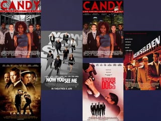
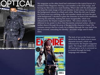
This document summarizes how the media products conform to and challenge conventions of real media. The trailer conforms to heist film conventions through use of suits, shots of locations and items, and character types. However, the poster challenges conventions by making the female the central focus, which is uncommon. The title and color scheme were also unconventional choices influenced by other heist films. The magazine cover conforms to typical layouts but makes the background black and white to make the character stand out. It is influenced by other magazines and conveys the character as a criminal through poses and costume, conforming to heist film conventions.
1. {
Question 1
In what ways does your media product use, develop, or
challenge forms and conventions of real media products?
2. My trailer conforms to the heist genre in ways that it share the same icons as other heist films,
such as the use of suits for clothing, shots of the item(s) they are after, shots of the location of
the heist and having character stock types which include the “greaseman,” and the
“explosives expert.” My poster however, challenges the conventions through the use of the
female as the central focus of the poster itself, as well as having the ensemble behind her.
Other than that, I chose to keep the conventions of having a mid shot of the characters, placed
in an ensemble, which is seen in posters such as Reservoir Dogs and Oceans 11.
We chose to have a female in the cast as other heist films such as the Oceans franchise and
Now You See Me, have involved a female role who is involved in the heist. It suggests how the
character is an unconventional stereotypical female as she takes part in the action of the film,
portraying her bravery; an attribute of a stereotypical male. The use of a female character
conveyed how modern our trailer is, and looking at other trailers such as Now You See Me
had influenced the idea of including a female in the cast.
The name of our film (Candy) can be seen as an unconventional title for a heist film. We
decided to use this as a title because it would seem clever in relation to a heist film; the tagline
“Like taking candy from a baby,” helped the title work even more than it did because it tells
the audience that the “goods,” in the film are easy to steal. It was used as a metaphor for what
the “goods,’ in the film actually were, which were jewelry and money, two conventional items
that are featured in other heist films. The colour scheme of my poster was highly influenced
by Reservoir Dogs which explains the colours of red, white and black.
3.
4. My magazine on the other hand had conformed to the typical layout of a
standard Film Magazine: Having a cast member as the main image, and
having my film name as a main heading. What I did with the photograph
was keep the main image of the cast member in full colour, but changing
the background colours to a black and white. What this did was it made
my Front cover eye-catching as the cast member stands out from the grey
scale background. I decided to place the character in front of the masthead,
showing his authority, making him more recognizable, which was
influenced by the Empire magazine below. The colour scheme was
different to my poster to show that this movie contained action, which is
further shown through the prop of the gun in the character’s hand. His
costume conveys that he is ready for a robbery through the way half of his
face is covered, concealing his identity – an iconic image used in heist
films.
The lack of text on the front cover
shows how the front cover is more
character focused, which was
influenced by the Empire magazine
again. The image itself conforms to
the heist genre as he is conveyed as
a criminal through his body
language and costume.