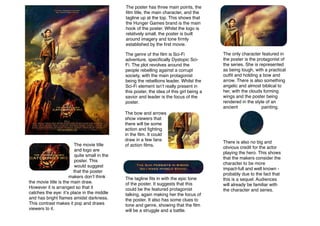
1. The poster has three main points, the
film title, the main character, and the
tagline up at the top. This shows that
the Hunger Games brand is the main
hook of the poster. Whilst the logo is
relatively small, the poster is built
around imagery and tone firmly
established by the first movie.
The genre of the film is Sci-Fi
adventure, specifically Dystopic SciFi. The plot revolves around the
people rebelling against a corrupt
society, with the main protagonist
being the rebellions leader. Whilst the
Sci-Fi element isnʼt really present in
this poster, the idea of this girl being a
savior and leader is the focus of the
poster.
The movie title
and logo are
quite small in the
poster. This
would suggest
that the poster
makers donʼt think
the movie title is the main draw.
However it is arranged so that it
catches the eye: itʼs place in the middle
and has bright flames amidst darkness.
This contrast makes it pop and draws
viewers to it.
The bow and arrows
show viewers that
there will be some
action and fighting
in the film. It could
draw in a few fans
of action films.
The tagline fits in with the epic tone
of the poster. It suggests that this
could be the featured protagonist
talking, again making her the focus of
the poster. It also has some clues to
tone and genre, showing that the film
will be a struggle and a battle.
The only character featured in
the poster is the protagonist of
the series. She is represented
as being tough, with a practical
outfit and holding a bow and
arrow. There is also something
angelic and almost biblical to
her, with the clouds forming
wings and the poster being
rendered in the style of an
ancient
painting.
There is also no big and
obvious credit for the actor
playing the hero. This shows
that the makers consider the
character to be more
impact-full and well known probably due to the fact that
this is a sequel. Audiences
will already be familiar with
the character and series.