1. How is the brand identity consistent across all three of my products?
In order to keep my brand identity consistent throughout my products, I used the same
colour schemes and fonts. My digipack and advert both carry a slightly washed out, dull
selection of colours and a bold font in pale colours to carry connotations of simplicity
and authenticity.
2. I not only used the same font throughout my print work
but I also used it on the title on my video so that the video
is also identifiable within my overall package.
Similarly with Ben Howards magazine advert, I
did not include any reviews or too much
information but simply the name of the artist
with the iTunes logo below, alerting the
tech-savvy audience where to get the album
from.
3. I used the same actor throughout my
products to reinforce the idea of him
being a solo artist and to build up the
relationship between the audience and
the musician. However, in the digipack
and advert I made sure there was no
breaking of the fourth wall with him
looking into the camera to show that he
is not a mainstream artist who needs to
meet demands of a large production
company.
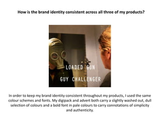
In my opinion, the most important thing for keeping
my brand identity consistent throughout my three
products was to keep the theme/visual motif of the
gas mask prominent.
I had to show the audience that the gas mask was a
metaphor for the man’s darker side and I did this in
the video and on the digipack. I used a split screen
effect in Adobe Premier Pro to show this throughout
the video and I used Photoshop to create the effect
to the right where he looks into the mirror and sees
the mask looking back at himself.