TataKelola dan KamSiber Kecerdasan Buatan v022.pdf
My Music Magazine Evaluation
1. 1. In what ways does your media product use, develop or
challenge forms and conventions of real media products?
By using a magazine with a similar audience age and genre, I used ideas and developed
them in order to make the conventions of my magazine suitable for the genre.
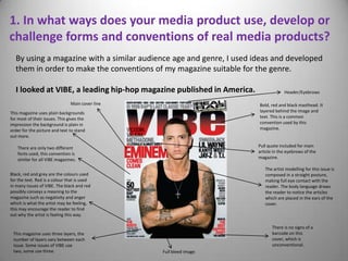
I looked at VIBE, a leading hip-hop magazine published in America. Header/Eyebrows
Main cover line Bold, red and black masthead. It
This magazine uses plain backgrounds layered behind the image and
for most of their issues. This gives the text. This is a common
impression the background is plain in convention used by this
order for the picture and text to stand magazine.
out more.
There are only two different Pull quote included for main
fonts used, this convention is article in the eyebrows of the
similar for all VIBE magazines. magazine.
The artist modelling for this issue is
Black, red and grey are the colours used composed in a straight posture,
for the text. Red is a colour that is used making full eye contact with the
in many issues of VIBE. The black and red reader. The body language draws
possibly conveys a meaning to the the reader to notice the articles
magazine such as negativity and anger which are placed in the ears of the
which is what the artist may be feeling, cover.
this may encourage the reader to find
out why the artist is feeling this way.
There is no signs of a
This magazine uses three layers, the barcode on this
number of layers vary between each cover, which is
issue. Some issues of VIBE use unconventional.
two, some use three. Full bleed image
2. Pull quote also included for
main article Header is included.
Masthead included, similar to VIBE.
The capitals and bold colours look
appealing, also I thought using the Cover line
colours black and purple could be
associated with both boys and girls,
this is important as my target
audience is based for both genders. Eye contact with a serious
expression. This conveys a
sense of seriousness which
may intrigue the audience
to read the article, the same
I positioned my model in this way expression is used by the
as the gesture would attract the model on VIBE.
eyes of the audience to look in
the direction that the hand is
pointing. By placing the main
article in this area if the By using a grey and white blended
eyebrows, it signifies to the background, I found it made the
audience the importance of that image and text stand out more. This
article, this will encourage them is effective for a cover and plain
to read it. backgrounds are also a common
choice with VIBE magazine.
Similar to VIBE, I only used two different Full bleed image
fonts. I made this decision as I wanted to
keep my style simple, also by using a
certain font for the majority of the
magazine will help the audience Unlike the sample VIBE cover, I
familiarise themselves with the style of added a barcode. This convention
the magazine. This is a convention that is significant to any magazine
VIBE also uses, as it is common for there when being purchased.
to be a main font or colours in their
magazine. The model is dressed in casual but trendy
clothes, as hip hop artists are usually dressed in
contemporary clothing.
3. Example of a contents page from VIBE magazine
There is no header The contents is written in a
included in this black and cold format. It is
contents, this may come common for VIBE to use three
across as unconventional. lines for their contents. This
convention could be used to
make the magazine more
original to the audience.
The use of a plain background
creates more focus on the image
and text, the artist on the contents
must be the main attraction as that
is what the audience will be looking
This contents used a
for.
variety of fonts, this
makes the page look
presentable.
The model has a straight posture, the
eye contact with the audience, also
the clothes are contemporary which is Each page number has
significant to hip hop, as celebrities been made bold, this is
usually dress in latest fashion within an effective convention
the hip hop industry. Also the body that many magazines
language suggests this magazine use so it is clear for the
portrays a sense of confidence. The audience to read.
audience may feel they can trust the
magazines content.
4. Unlike VIBE’s contents, I included a header
The use of the masthead being and a footer to make it more conventional.
used in the contents effective so I challenged the conventions VIBE
the reader is still familiar with the magazine by making my contents
magazine. This is slightly headline more simple. I still used
different to VIBE as they included the idea of making it bold, but I
just the ‘V’ in the background. thought the plainer design would
make it look more formal and
easier to read.
One of the main conventions of
any magazine is making the page
numbers stand out. Seeing as the
text is mostly black, by changing
the numbers to a purple colour and The model is making eye contact
making them bold this will make it but rather then standing straight I
easy for the reader to see it. decided a crouching position
would be effective. I highlighted
the text on the image to show
this is the main article in the
magazine.
Separate sections were
used, this is so the audience
know what parts of the
magazine are articles and what
parts aren’t. This is a
convention used in VIBE
magazine, as different titles
are used for different sections
in the magazine.
I created a box out for this
contents to highlight the benefits
that this issue is giving to the
I stuck to my main colours of audience. This isn’t found within
black and purple, this helps the the VIBE contents page on the
audience familiarise themselves previous slide.
with the design of the magazine.
5. Example of a double page spread from VIBE There are two main images in
this article, one of them do
Pull quote not include a caption which
Image constrained by may come across as
margin like the text. unconventional to some
people.
Drop cap
Black and white
image gives out a
formal or classical
impression. This
could be because
the artist is trying
to convey his
music will be
around for a long
Copy/text time, just like the
olden day music is
still around today.
Plain white
background, this
is so the focus is
not taken away
from the imagery
Gutters
or text.
The artist is looking down in this
picture, although there is no eye
contact the fact he is smiling gives the No page number, this
impression this interview is a positive may also come across
and happy one. as unconventional.
6. Unlike my cover, I chose not the edit the background of these
images. This is because I wanted the reader to feel they have
Header
engaged with the star and his work, so by showing images within
Title the studio the reader will feel they have had a proper insight to
what the producer does.
Stand first
Unlike the
example from
VIBE, I placed
captions for
both images. I
felt this was
more
conventional.
I highlighted the
questions to a different
colour from the
answers, this was to
make it clearer to the
audience what were the
questions and what were
the answers. Also the
colours portrayed the
two different people, the
purple being the
interviewer and the
black text is the person
being interviewed. This
was not shown in the
VIBE double page I included page numbers in
Pull quotes
spread. my magazine. Without
Gutters them the reader would
have difficulty trying to
find the article.
7. 2. How does your media product represent particular
social groups?
The age group I am targeting is 16-24 year olds. I wanted the magazine to relate to both boys and girls, which was done
through the colours. By using purple and black, I felt this could apply to both sexes, rather then using a more feminine
colour like pink or a more masculine colour like blue. My magazine is to be distributed in the UK and the USA; as if
successful this will generate a good profit for the magazine. The genre I chose was specifically Hip-Hop, which I used
samples from leading magazine brands such as VIBE.
One way I have tried to target my audience is by the clothing. The model I used is wearing casual but seemingly fashionable
clothing, as many males wear similar clothing to this. Although my main article is focusing on a male star, other articles
which are mentioned on the cover and contents include interviews from female ‘stars’ too, so this balanced between
genders of my audience.
I wanted my magazine to appeal to all ethnic backgrounds, the use of an Asian star means that the audience doesn’t have a
specific cultural focus. All the artists included in my magazine are of diverse backgrounds, so anyone of any race can feel
involved and comfortable to read my magazine. Also because my magazine focuses on a sound producer rather then an
artist, I feel that people who want to enter the music business but not necessarily want to sing or dance can be encouraged
to try get involved with other important roles within the music industry, as the production of music is highly significant and
people tend to forget artists do not generally write or produce their own songs or backing tracks.
The main article focuses on an 18 year old sound engineer, which can relate to the target audience as people who are 16
may find interest in this career, also people over the age of 18 may find they want to get involved with the star’s work.
The amount of advertisement I included in my magazine is significant to my audience. Because I am basing this magazine
for teenagers/ young adults, I felt there should be less advertisement as teenagers aren’t generally loaded with money, and
most young adults would have only just started full time work. By using less advertisement, this appealed more to the
younger audience as they aren’t going to be buying a large amount or highly expensive products.
8. 3. What kind of media institution might distribute your
media product and why?
Because I want my magazine to be distributed in both the UK and the USA, I think well established
institutions such as IPC could sell my magazine as it distributes other magazines such as NME. Seeing as
NME is a rock based magazine, I feel my magazine as a unique selling point (USP) as it doesn’t just focus
on artists; it focuses on the production of the music and the important first stages in the making of the
music before it is passed onto the singers.
Another institution that could sell my magazine is Bauer, as it sells magazines such as Empire. Although
Bauer is originally UK based, it is a worldwide institution and sells over 300 magazines. This is beneficial
for my magazine as it can be distributed to the countries that I want it to be sold in, which includes the UK
and USA.
The main distributor of my magazine would be newsagents and supermarkets, as those are common
places for people to look for magazines. These locations are effective as people of all ages are found in
these retail shops everyday, so the magazine would be in a place where many people can notice it and
take interest in purchasing it.
9. 4. Who would be the audience for your media
product?
The target audience I chose for my media product is people between the ages of 16-24. Bearing in mind
this is quite a young audience, I assumed a lot of the people who want to buy my magazine won’t be
earning a relatively high disposable income, as many teenagers or young adults may not even have a job.
I priced my magazine at £2.50, which is an affordable and reasonable price to charge. Less
advertisement will increase the cost of the magazine as the production cost will be higher. Because of
the lack of adverts, the magazine may not sell as well in its early stages of release.
I think my magazine can inspire people who want to get involved with the music industry, as the main
article includes an interview from a sound engineer who has worked his way into producing tracks for
various stars such as Tinchey Stryder. Considering the teenager is just eighteen, stories like these could
influence people of any age or gender to take their music passion and make an ambition out of it. I feel
that people who read magazines forget where the music actually comes from, and the process right from
the lyric making to the backing track is all created by different people working within the industry.
Despite this, my magazine does have articles that include interviews with artists, as people enjoy reading
about the latest gossip of their favourite stars too.
10. 5. How did you attract/address your audience?
Cover Contents Page Double Page Spread
I used a range of techniques to attract and address my audience. For example, the content uses informal language, as a
younger audience can relate to the way it is written as the majority of people in the younger generation use informal
language in everyday life. Also, my magazine uses a reasonable amount of imagery rather then text, as teenagers or
young adults may not be willing to read a large amount of text. By using a variety of sections in the contents and
contrasting the colours, I felt this made it look more appealing to my audience. I kept my layout simple, by doing this I
used a specific font (Calibri) so my audience can familiarise themselves with the style of the magazine. Also, taking into
consideration the magazine is targeted for both boys and girls, I used the colours purple and black. This avoided the
layout seeming like it is based to a certain gender. My backgrounds are plain for all sections of my magazine, as I wanted
my audience to focus on the main attractions which are the images and text. I felt the grey background on the cover
made this effective, so the audience would notice my cover if they were to purchase it in the shops.
11. 6. What have you learnt about technologies from the
process of constructing this product?
During this task, I used a variety of skills with different software's. For example, to manipulate pictures and crop them into the
right measurements I was required to use Photoshop. By changing the height, width and resolution when cropping the image I
was able to turn my image into an A4 one, this was essential as magazines are usually an A4 size. I can now manipulate images
and export or place them into other software’s without decreasing the quality, which was always an issue for me when I would
edit images before. Although the process of editing the image was reasonably easy, I found more difficulty in actually taking
the pictures. Using hardware such as a professional digital camera, I was faced with the problem of making sure my camera
was focused before taking any pictures. Because of this error, I had to retake my pictures twice which was time consuming.
Now I am aware that the focus of the camera must be adjusted beforehand or the images will turn out blurry. Once I
connected the USB from the camera onto the computer, I could easily open my images and locate them within my documents
when using Photoshop. After manipulating my image and sizing them correctly, I had to press ‘save as’ rather then save, just to
make sure my original pictures were safe if I were to make a mistake.
Another software that I used in the process of constructing my magazine was Adobe InDesign. This was used to place text onto
my image, which would make it look more realistic for a cover. I placed my image onto a plain A4 document, which was easy as
I had already edited the size in Photoshop. I found that adding the text was clear and straightforward, as I just had the make
the decision of what fonts and sizes I would use. Adding text boxes were pretty self explanatory, as the icons were clear to see.
Once I had completed my cover in Abode InDesign, I had to export my cover in order to make it a JPEG image. The reason for
doing this was because all my work had to be placed on Wordpress. This site is specifically made for people to blog, which was
what we used to upload all our work. Using Wordpress was simple, the only issue I had was making separate categories for
each section of my magazine. I can now upload any image onto this blog which may come in handy to me if I were to use it in
the future.
Not only am I able to manipulate the size of an image, I can now edit the background by using the quick selection tool and
selecting any background I wanted to get rid off. Once I had selected everything, I then erased it to make everything around
the image white. I could then manipulate the colour of the background by clicking the gradient tool. In the future I would like
to learn how to airbrush images as that is a useful skill to have when editing images or using Photoshop.
12. 7. Looking back at your preliminary task, what do you
feel you have learnt in the progression from it to the
full product?
I am now able to manipulate the background of my image, which I was not aware I could do when doing my preliminary
task. I have knowledge of how to use software’s such as Photoshop, Adobe InDesign, Wordpress and Slide Share to a
good standard. I can create different styles of mastheads or colour text by mixing them together and changing the
width of the first layers of text. This creates bold borders and make the text stand out more.
I am able to save any image and manipulate it without decreasing the quality of the image, although I was taught how
to do this in the preliminary task, I always forgot to click maximum pixel quality when saving image. I am now aware of
this and can create professional images using Photoshop. I have interacted with the audience by understanding the
people buying my magazine may not be able to afford or buy a lot of expensive products, which is why I made the
decision to add less advertisement. However, I should expand the name of the brand by getting more companies to
notice my magazine and publish their adverts in it. This will help reduce the price of the production for my magazine
and hopefully reduce the original price in the future; this will attract more customers if people notice the cheaper price
and the good content.
Preliminary Task Final Magazine Cover