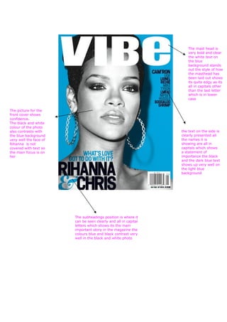
1. The mast head is
very bold and clear
the white text on
the blue
background stands
out the style of how
the masthead has
been laid out shows
its quite edgy as its
all in capitals other
than the last letter
which is in lower
case
The picture for the
front cover shows
confidence.
The black and white
colour of the photo
also contrasts with the text on the side is
the blue background clearly presented all
very well the face of the names it is
Rihanna is not showing are all in
covered with text so capitals which shows
the main focus is on a statement of
her importance the black
and the dark blue text
shows up very well on
the light blue
background
The subheadings position is where it
can be seen clearly and all in capital
letters which shows its the main
important story in the magazine the
colours blue and black contrast very
well in the black and white photo