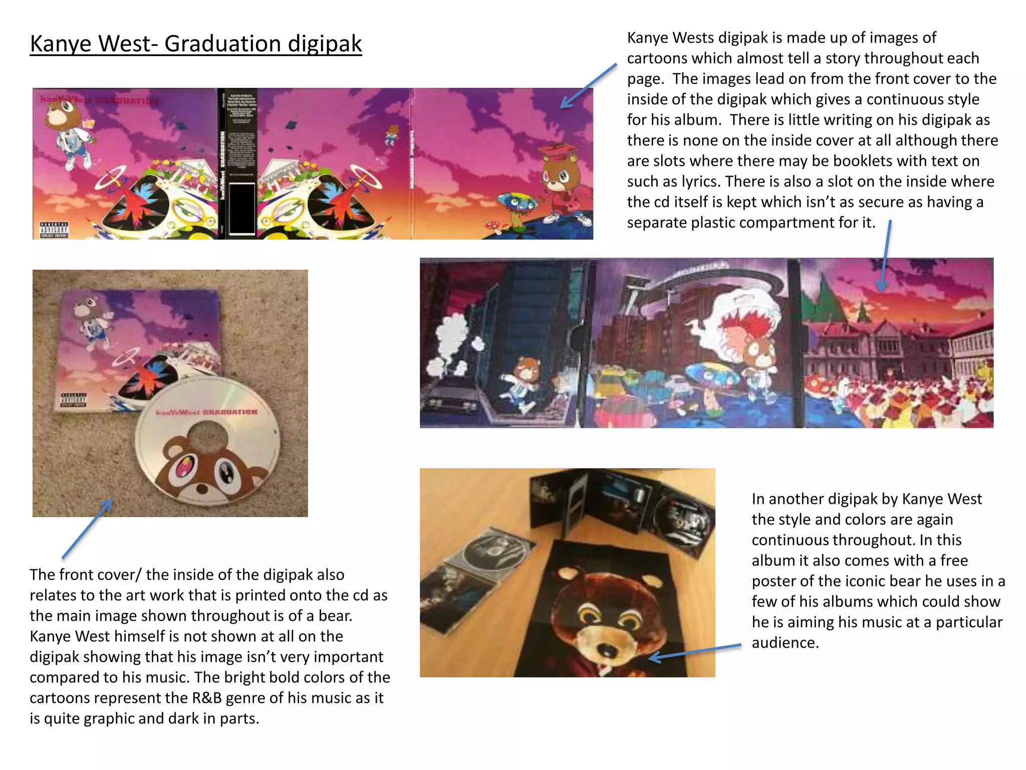
Kanye West- Graduation digipak Kanye Wests digipak is made up of images of
cartoons which almost tell a story throughout each
page. The images lead on from the front cover to the
inside of the digipak which gives a continuous style
for his album. There is little writing on his digipak as
there is none on the inside cover at all although there
are slots where there may be booklets with text on
such as lyrics. There is also a slot on the inside where
the cd itself is kept which isn’t as secure as having a
separate plastic compartment for it.
The front cover/ the inside of the digipak also
relates to the art work that is printed onto the cd as
the main image shown throughout is of a bear.
Kanye West himself is not shown at all on the
digipak showing that his image isn’t very important
compared to his music. The bright bold colors of the
cartoons represent the R&B genre of his music as it
is quite graphic and dark in parts.
In another digipak by Kanye West
the style and colors are again
continuous throughout. In this
album it also comes with a free
poster of the iconic bear he uses in a
few of his albums which could show
he is aiming his music at a particular
audience.
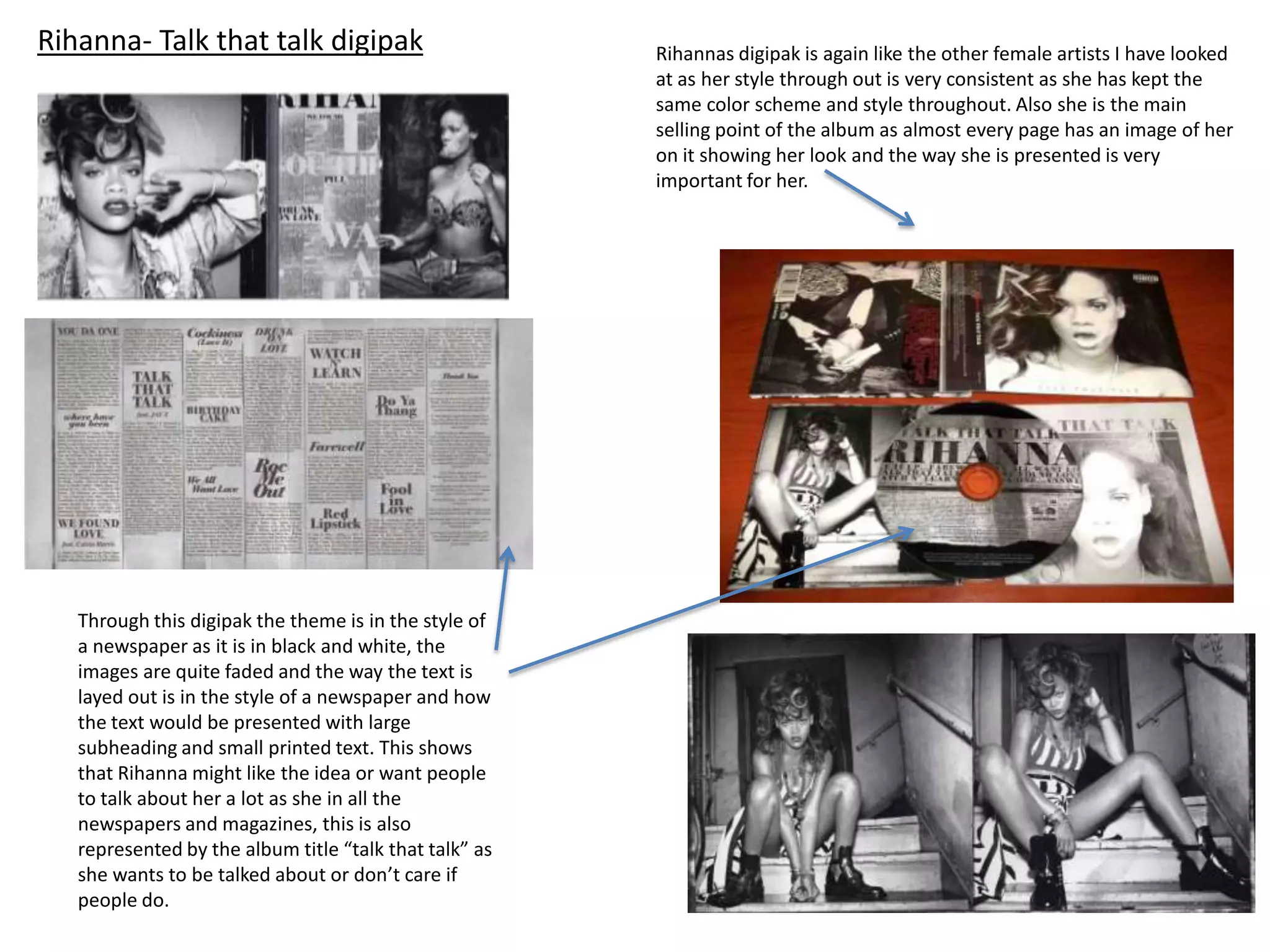
Rihanna- Talk that talk digipak Rihannas digipak is again like the other female artists I have looked
at as her style through out is very consistent as she has kept the
same color scheme and style throughout. Also she is the main
selling point of the album as almost every page has an image of her
on it showing her look and the way she is presented is very
important for her.
Through this digipak the theme is in the style of
a newspaper as it is in black and white, the
images are quite faded and the way the text is
layed out is in the style of a newspaper and how
the text would be presented with large
subheading and small printed text. This shows
that Rihanna might like the idea or want people
to talk about her a lot as she in all the
newspapers and magazines, this is also
represented by the album title “talk that talk” as
she wants to be talked about or don’t care if
people do.
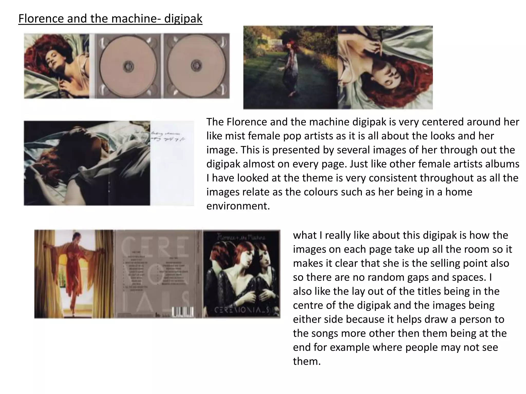
Florence and the machine- digipak
The Florence and the machine digipak is very centered around her
like mist female pop artists as it is all about the looks and her
image. This is presented by several images of her through out the
digipak almost on every page. Just like other female artists albums
I have looked at the theme is very consistent throughout as all the
images relate as the colours such as her being in a home
environment.
what I really like about this digipak is how the
images on each page take up all the room so it
makes it clear that she is the selling point also
so there are no random gaps and spaces. I
also like the lay out of the titles being in the
centre of the digipak and the images being
either side because it helps draw a person to
the songs more other then them being at the
end for example where people may not see
them.
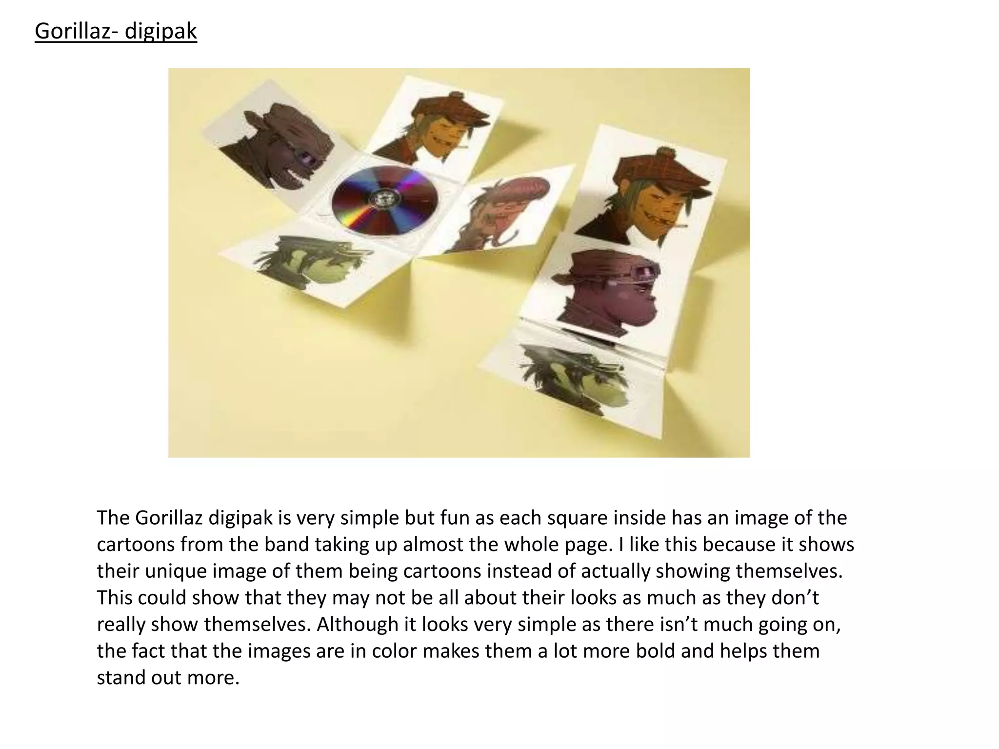
Gorillaz- digipak
The Gorillaz digipak is very simple but fun as each square inside has an image of the
cartoons from the band taking up almost the whole page. I like this because it shows
their unique image of them being cartoons instead of actually showing themselves.
This could show that they may not be all about their looks as much as they don’t
really show themselves. Although it looks very simple as there isn’t much going on,
the fact that the images are in color makes them a lot more bold and helps them
stand out more.
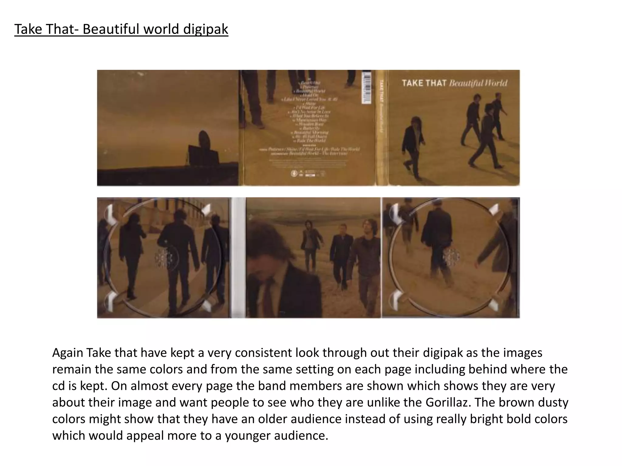
Take That- Beautiful world digipak
Again Take that have kept a very consistent look through out their digipak as the images
remain the same colors and from the same setting on each page including behind where the
cd is kept. On almost every page the band members are shown which shows they are very
about their image and want people to see who they are unlike the Gorillaz. The brown dusty
colors might show that they have an older audience instead of using really bright bold colors
which would appeal more to a younger audience.

Digipak pres

  • 1.
    Kanye West- Graduationdigipak Kanye Wests digipak is made up of images of cartoons which almost tell a story throughout each page. The images lead on from the front cover to the inside of the digipak which gives a continuous style for his album. There is little writing on his digipak as there is none on the inside cover at all although there are slots where there may be booklets with text on such as lyrics. There is also a slot on the inside where the cd itself is kept which isn’t as secure as having a separate plastic compartment for it. The front cover/ the inside of the digipak also relates to the art work that is printed onto the cd as the main image shown throughout is of a bear. Kanye West himself is not shown at all on the digipak showing that his image isn’t very important compared to his music. The bright bold colors of the cartoons represent the R&B genre of his music as it is quite graphic and dark in parts. In another digipak by Kanye West the style and colors are again continuous throughout. In this album it also comes with a free poster of the iconic bear he uses in a few of his albums which could show he is aiming his music at a particular audience.
  • 2.
    Rihanna- Talk thattalk digipak Rihannas digipak is again like the other female artists I have looked at as her style through out is very consistent as she has kept the same color scheme and style throughout. Also she is the main selling point of the album as almost every page has an image of her on it showing her look and the way she is presented is very important for her. Through this digipak the theme is in the style of a newspaper as it is in black and white, the images are quite faded and the way the text is layed out is in the style of a newspaper and how the text would be presented with large subheading and small printed text. This shows that Rihanna might like the idea or want people to talk about her a lot as she in all the newspapers and magazines, this is also represented by the album title “talk that talk” as she wants to be talked about or don’t care if people do.
  • 3.
    Florence and themachine- digipak The Florence and the machine digipak is very centered around her like mist female pop artists as it is all about the looks and her image. This is presented by several images of her through out the digipak almost on every page. Just like other female artists albums I have looked at the theme is very consistent throughout as all the images relate as the colours such as her being in a home environment. what I really like about this digipak is how the images on each page take up all the room so it makes it clear that she is the selling point also so there are no random gaps and spaces. I also like the lay out of the titles being in the centre of the digipak and the images being either side because it helps draw a person to the songs more other then them being at the end for example where people may not see them.
  • 4.
    Gorillaz- digipak The Gorillazdigipak is very simple but fun as each square inside has an image of the cartoons from the band taking up almost the whole page. I like this because it shows their unique image of them being cartoons instead of actually showing themselves. This could show that they may not be all about their looks as much as they don’t really show themselves. Although it looks very simple as there isn’t much going on, the fact that the images are in color makes them a lot more bold and helps them stand out more.
  • 5.
    Take That- Beautifulworld digipak Again Take that have kept a very consistent look through out their digipak as the images remain the same colors and from the same setting on each page including behind where the cd is kept. On almost every page the band members are shown which shows they are very about their image and want people to see who they are unlike the Gorillaz. The brown dusty colors might show that they have an older audience instead of using really bright bold colors which would appeal more to a younger audience.