
Recommended
More Related Content
What's hot
What's hot (15)
Viewers also liked
Viewers also liked (11)
Similar to Using VIBE Magazine as Inspiration for Magazine Layout and Design
Similar to Using VIBE Magazine as Inspiration for Magazine Layout and Design (20)
Recently uploaded
Recently uploaded (20)
Using VIBE Magazine as Inspiration for Magazine Layout and Design
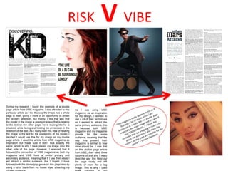
- 1. During my research I found this example of a double page article from VIBE magazine. I was attracted to this particular article as I like the way the image has a whole page to itself, giving it more of an opportunity to attract the readers’ attention. But mainly, I like that way that the model in the image is posing in a way that is relating to the text on the other page; he is looking like he is shocked, while facing and holding his arms open in the direction of the text. As I really liked this idea of relating the image to the text by the positioning of the model, I decided I would use this for my image on my double page article. I used this article from VIBE magazine as inspiration but made sure it didn’t look exactly the same, which is why I have placed my image onto the other side of the page. However, I ensured that it followed the convention of VIBE magazine as both my magazine and VIBE have a similar primary and secondary audience, meaning that if I use their ideas I will attract a similar audience, like I hoped. I have followed with the dance/pop genre on this page also by using a lot of black from my house style, attracting my RISK V VIBE As I was using VIBE magazine as an inspiration for my design, I wanted to use a lot of their techniques as I wanted to attract the same primary audience, this is because both VIBE magazine and my magazine provide for the same audience; meaning that the way they present their magazine is similar to how mine should be. I saw that on this double page article from VIBE, they used three columns of text and I really liked the way this filled out the page nicely and left plenty of room for a big image. This is why I used
- 2. RISK V VIBE The only thing I asked my model to wear was a jacket, this was so we could use it to help with the edgy feel of my magazine; this was created by the model covering part of her face with the jacket. I also wanted to use this as I thought it created a sense of mystery to the magazine, which would attract a bigger audience. After looking at VIBE magazine, which is similar to mine, I was mainly attracted to the images of Nicki Minaj as she is wearing really bright make up and her hair is such a vibrant colour. I decided to use this as inspiration for my magazine and therefore edited my image for my double page article in Photoshop. I manipulated the image to make her hair brighter, her eyes brighter and added some lipstick. Not only does this make the image and article look a lot more interesting, it also connotes fun and supports the music genre as the bright colours are up-beat, like the music.
- 3. RISK V VIBE For all of my images for my magazine, I took them all in a photography studio. I wanted my front cover image to be set on a white screen background as this looks professional and is also suitable for a front cover as the white space leaves a lot of space for sub headings. I looked at other magazines such as VIBE, NME and Elektro only to see that all of those magazines use close ups for their front cover images. I wanted to use this technique for my magazine but also wanted to be original, so I used a medium close up for my image as this shows more of the model and their outfit. I got my model to wear a jacket as a prop as I wanted her to hide part of her face, which connotes mystery to the magazine and will therefore tempt the audience to buy and read it. My model has red hair but when I was editing the image in Photoshop, I changed the levels of vibrancy so that her hair has brighter in order to stand out more to the audience and also follow the edgy connotations I was trying to create throughout the magazine. I was also influenced to brighten up the models hair as on one of the VIBE magazine front covers, Nicki Minaj has bright hair and I thought this was a great way of attracting your target audience. As the genre of my magazine is dance/pop music I thought that brightening the hair and eyes of the model would add to the upbeat feel of this kind of music. However due to the way the dance music scene is rather edgy, I asked my model to cover part of her face with the jacket she was wearing; again, creating and edgy and mysterious feel.