1. As well as their cover and contents page, the Q magazine has used black red and white for
their colour scheme in this double page spread. These three colours match the ‘Q’ logo.
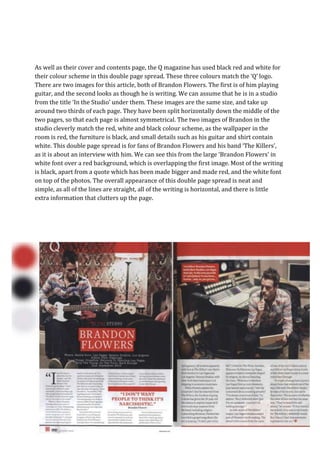
There are two images for this article, both of Brandon Flowers. The first is of him playing
guitar, and the second looks as though he is writing. We can assume that he is in a studio
from the title ‘In the Studio’ under them. These images are the same size, and take up
around two thirds of each page. They have been split horizontally down the middle of the
two pages, so that each page is almost symmetrical. The two images of Brandon in the
studio cleverly match the red, white and black colour scheme, as the wallpaper in the
room is red, the furniture is black, and small details such as his guitar and shirt contain
white. This double page spread is for fans of Brandon Flowers and his band ‘The Killers’,
as it is about an interview with him. We can see this from the large ‘Brandon Flowers’ in
white font over a red background, which is overlapping the first image. Most of the writing
is black, apart from a quote which has been made bigger and made red, and the white font
on top of the photos. The overall appearance of this double page spread is neat and
simple, as all of the lines are straight, all of the writing is horizontal, and there is little
extra information that clutters up the page.