Young & Hot ℂall Girls Hazira 8849756361 WhatsApp Number Best Rates of Surat ...
Vibe cover
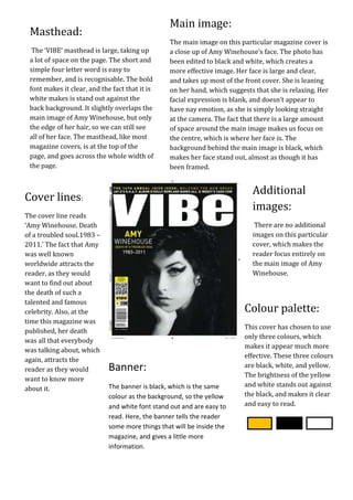
1. Main image:
Masthead:
The main image on this particular magazine cover is
The+++
‘VIBE’ masthead is large, taking up a close up of Amy Winehouse’s face. The photo has
a lot of space on the page. The short and been edited to black and white, which creates a
simple four letter word is easy to more effective image. Her face is large and clear,
remember, and is recognisable. The bold and takes up most of the front cover. She is leaning
font makes it clear, and the fact that it is on her hand, which suggests that she is relaxing. Her
white makes is stand out against the facial expression is blank, and doesn’t appear to
back background. It slightly overlaps the have nay emotion, as she is simply looking straight
main image of Amy Winehouse, but only at the camera. The fact that there is a large amount
the edge of her hair, so we can still see of space around the main image makes us focus on
all of her face. The masthead, like most the centre, which is where her face is. The
magazine covers, is at the top of the background behind the main image is black, which
page, and goes across the whole width of makes her face stand out, almost as though it has
the page. been framed.
Additional
Cover lines:
images:
The cover line reads
‘Amy Winehouse. Death There are no additional
of a troubled soul.1983 – images on this particular
2011.’ The fact that Amy cover, which makes the
was well known reader focus entirely on
worldwide attracts the the main image of Amy
reader, as they would Winehouse.
want to find out about
the death of such a
talented and famous
celebrity. Also, at the Colour palette:
time this magazine was
This cover has chosen to use
published, her death
only three colours, which
was all that everybody
makes it appear much more
was talking about, which
effective. These three colours
again, attracts the
Banner: are black, white, and yellow.
reader as they would
The brightness of the yellow
want to know more
The banner is black, which is the same and white stands out against
about it.
colour as the background, so the yellow the black, and makes it clear
and white font stand out and are easy to and easy to read.
read. Here, the banner tells the reader
some more things that will be inside the
magazine, and gives a little more
information.