2. I used the idea of putting the mast head
in the corner on the page of the contents
page as I liked the effect it gives off.
Here is
liked the
text style
of the
numbers,
with this in
mind I
searched
for text
fonts like
this with
my aim to
create the
same
effect.
I used the
inside this
month
part from
the we
love pop
contents
as I think it
looked
quite
funky, Inst
ead of
coloring
parts of
the text in
I decided
to start
the text
with a
small case
I to give
off a
lollipop
effect. As
personally
lollipops
remind me
of pop.
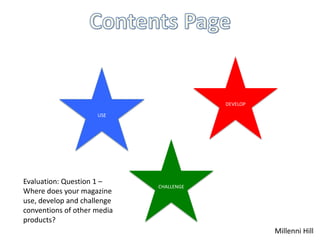
I used the idea of someone writing the name of the editor
instead of it just being printed in the same font as the rest
of the contents page, I think this helped to make my
contents page look more casual along with the genre of
pop.
I challenged
myself to
create a look
that I hadn't
seen on any
other pop
contents, whic
h was a messy
block effect, I
did this by
masking
images to
create a
wobbly but at
the same time
block effect.
This relates to
pop as
everything is a
bit out of
place on pop
magazines.
I challenged myself
by including text at
the top of my
contents page, this
was quite risky as I
didn't’t know
whether it would
be ok as it is the
biggest text on the
page however after
tweeking it, it
really grew on me
and now I like it.
I developed the idea of
images down the right hand
side of We Love Pop by
putting them down t the
bottom and making them not
have a straight edge around
them.