
Recommended
More Related Content
What's hot
What's hot (20)
Similar to Evaluation Question 5
Similar to Evaluation Question 5 (20)
More from michaelwilsonasmedia
Recently uploaded
Recently uploaded (20)
Evaluation Question 5
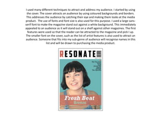
- 1. I used many different techniques to attract and address my audience. I started by using the cover. The cover attracts an audience by using coloured backgrounds and borders. This addresses the audience by catching their eye and making them looks at the media product. The use of fonts and font size is also used for this purpose. I used a large sans- serif font to make the magazine stand out against a white background. This immediately appealed to an audience as it will stand out on a shelf against other magazines. The first features were used so that the reader can be attracted to the magazine and pick I up. The smaller font on the cover, such as the list of artist features is also used to attract an audience. Someone that fits into my sub-genre of audience will recognise names in this list and will be drawn to purchasing the media product.
- 2. I then chose to keep a simplistic theme running throughout my entire product as due to my audience research I had learnt that this would attract a potential audience of ‘Indie Scenesters’ and ‘Creatives’, which I learnt from the UK Tribes website. My stylish design of magazine attracts my audience. This theme carried on into the contents. In which a potential buyer may turn to. My contents worked at attracting my audience by including many artists’ names that someone that fits into my sub-genre may have heard of. I also included photos on this page to work in the same way as the cover. The photos stand out due to a black border surrounding them. This draws attention to the artists in the photo that fit into the style of my magazine, meaning that people interested in this type of style may purchase the media product. I also included the names of artist that would feature in large articles in the largest font underneath the photos. This meant that the most famous names would be noticed and would attract the widest audience.
- 3. When interviewing the artist in my article I decided to use an informal tone and register, “That was some performance”. I did this so that so that a younger audience would feel more comfortable with reading it. When researching I decided using a less formal tone would relate to a younger audience greater than a formal register. This is presented on my double page spread, in which the article talks about and interviews the artist on the cover of the magazine. The use of the large, bold title also attracts an audience as they will be drawn in and the title will be the first thing they read on the page and it’ll make them want to read more, and maybe purchase the media product. The photos also work in a similar way to the title. Large colour photos attract an audience that fit into this sub-genre as they may be interested in the fashion or looks of this artist. I decided to use a quote from the article on the page as this gives the reader a snippet from the interview without them reading it. This may also make them want to read more as the small quote will give an insight into the topic of the article and interview.