Top Astrologer, Kala ilam specialist in USA and Bangali Amil baba in Saudi Ar...
How My Music Magazine Uses Real Conventions
1. In what ways does your media product use,
develop or challenge forms and conventions
of real media products?
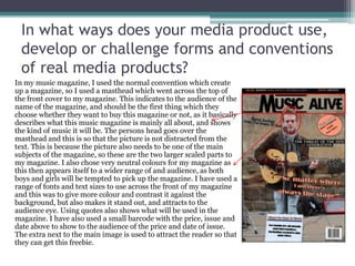
In my music magazine, I used the normal convention which create
up a magazine, so I used a masthead which went across the top of
the front cover to my magazine. This indicates to the audience of the
name of the magazine, and should be the first thing which they
choose whether they want to buy this magazine or not, as it basically
describes what this music magazine is mainly all about, and shows
the kind of music it will be. The persons head goes over the
masthead and this is so that the picture is not distracted from the
text. This is because the picture also needs to be one of the main
subjects of the magazine, so these are the two larger scaled parts to
my magazine. I also chose very neutral colours for my magazine as
this then appears itself to a wider range of and audience, as both
boys and girls will be tempted to pick up the magazine. I have used a
range of fonts and text sizes to use across the front of my magazine
and this was to give more colour and contrast it against the
background, but also makes it stand out, and attracts to the
audience eye. Using quotes also shows what will be used in the
magazine. I have also used a small barcode with the price, issue and
date above to show to the audience of the price and date of issue.
The extra next to the main image is used to attract the reader so that
they can get this freebie.
2. In what ways does your media product use,
develop or challenge forms and conventions
of real media products?
For the contents page I have chosen to follow on using the same
type of colours and font for my text, as this then linked in with the
front cover of my magazine. Using a bold „Contents‟ headline as it is
a common convention which will tell the readers directly what this
page is about. I then highlight the main stories which are followed
on from my front cover, and will be explaining to them what is
inside of the magazine. I have used bold numbers clearly stating
what page this article is on, and the colours again link with the
headline of the page. I have chosen that each number will have a
description so that the reader can see what will be included in this
article and then are able to choose to read what pages they would
like. Using four different sets of images which will be included in to
the articles I will be talking about, almost gives characteristics for
this article, and illustrates who will be in the article. This could
create more of an interest for the audience and may get them
wanting to know more if they can see what this band actually looks
like and how they are appeared to be. At the bottom of the page in
bold I have included „Also Featuring‟ which shows that besides the
already illustrated band there are a lot more, and this also tells
them that there is something very special coming in this magazine.
I have used a quote to get the reader more interested in the article.
3. In what ways does your media product use,
develop or challenge forms and conventions
of real media products?
In my double page spread I have used a large
quote for a headline as this tells the audience what
will be included in the article. But because this is a
quote „“Getting back on track was one of my most
difficult tasks”‟ it might engage more an audience
and mainly if they know who this artist, therefore
they will be more interested in this article. But also
because it is quite an interesting and heart felt
quote then many people might get drawn to the
article, but also if they can relate to what she is
saying. I have then began to start the article and
using the drop cap indicates that the „W‟ is where
the article will be starting. Putting the article into
two different columns gives an order for the
audience to read the article and gives it a bit more
organisation. I have also done this because of the
divide in the centre of the page. The two images on
the outsides of the pages, borderline where the text
is, and also illustrates the story and the headline. I
have chosen to use these two images because it
shows the difference between the two parts of her
life showing that before her recovery she was
hiding away from the world and unknown to the
audience, whereas now she has sorted her
differences out and is now happy again, „covering
herself from the rain‟. I have chosen to colour
coordinate the page by keeping some black and
white and other parts in colour.
4. In what ways does your media product use,
develop or challenge forms and conventions
of real media products?
I have decided to take a mixture of studio and also shoots in public/original environments,
and I have chosen to do this because, it then gives originality to the magazine. The first image I
have chosen to do was a close up image of a band member which were busking in York, and
the close up image gives a lot of characteristic for the front of a magazine. His face is the most
focus to the magazine and because he looks so inspired in to the music he is playing and
concentrating so much, it could make people want to pick the magazine up. On my contents
page I have chosen to use four different images because it then shows the different types of
bands and artists which will be involved in this weekly magazine update of news, and I have
used a mixture of two studio shoots and also two outdoor shoots, the studio shoots are used
with the people who the main article is about, which shows that she is quite significant, as the
photography may have had more time for her, compared to the ones which are in the streets.
5. How does your media product represent
particular social groups?
The clothing for the artists in my magazine aim to the young adults of my
audience, which is the main basis of people I have decided to aim my
magazine for. I think that my magazine appeals to the audience which I have
chosen because, of the genre of music which I have chosen to write about. This
is the type of music which mainly attracts a younger audience. Because the
people in the magazine are also quite young I chose that the more people that
pick up the magazine will be the people who relate to these younger people
and are more interested and this fits in the young adult bracket. This
represents both genders because it is not a more gendered stereotype of
music, and the magazine includes both of the genders. The artists in the
magazine are very stylish and wear the mainstream type of clothing, which
therefore fits into the audience bracket of young adults, because they will see
this and want to read it.
6. What kind of media institution might
distribute your media product and why?
I have chosen that like NME my magazine should be within the IPC media
institution and this is because it is a worldwide institutional, and has many
other companies of magazines, and it is a wide range. Therefore many people
will know about the company, as it is so successful they will want to buy it
more. Many of the brands which are involved with IPC are very well known,
and the audience is around 26million therefore, would be giving my magazine
a lot of publicity. I have also decided that choosing this company will help to
promote my magazine because of NME and the other magazines, and due to
their being not as many music magazines in this production it will make it
easier for me to sell a magazine. Because of the unique amount of magazines
which are included in this institution, it can bring a wider range of an
audience to buy my magazine as they would have already bought an IPC
media magazine.
7. Who would be the audience for your media
product?
The audience for my media magazine would probably be between a
bracket of 14-23 year olds mainly because this type of musical fits into
these age groups. I have also chosen to use this audience group
because I relate better to this group of audience due to me also fitting
within this group as well. But also due to these type of artists being
part of the new generations genre of music, and with this genre a lot of
the people who answered the questions on my survey monkey
questionnaire were and audience in between these brackets. I have
chosen that the audience should include many female artists due to
many of the people answering the questions were female, but I chose
to make it a mix of both genders as this was only a small sample of
what could be my audience for my music magazine.
8. How did you attract or address your
audience?
To attract my audience I used several different things on my music magazine
for instance the front cover was the main attraction to my magazine, as this
was the first thing that anyone would see before opening the magazine, and on
this I decided using a bold title was one of the main attractions to getting
people to buy a magazine, but also the picture does also do this too. By using a
young adult on the cover attracts the audience I have personally chosen to use,
but it is very likely for people to also buy this if they are aware and have
knowledge of who it is on the cover. Using this certain image also reverses the
male gaze and puts this onto women, as it is a stylish male used as the cover
therefore women might idolise him. But he is also putting himself towards
females.
9. What have you learnt about the
technologies from the process of
constructing this product?
In my magazine I used the following technologies:
Indesign
Photoshop
Word
Windows
Slideshare
Many of these elements were used mainly on presenting my research and planning. I
chose to use these because there were easy to organise and simple to use, as I have
previously used these before. Using the technologies for my magazine there were many
new techniques which I have gained. For instance on Photoshop there were many ways
of doing certain things which I didn‟t know if, for instance I gained the skill of taking
away a colour and changing it to black and white to create a different effect on my
magazine.
10. Looking back at your preliminary task, what
do you feel you have learnt in the
progression from it to the full product?
From the start to the end of making and planning the whole of my magazine I
found that I have developed my designing of magazines and products, due to
my first magazine being not well developed or made. For instance there were
many parts of production which I have improved because of the way the front
design and how the magazine is made. Because for instance in my final
magazine the masthead was placed underneath the image so that it does not
distract anything away from the image, but I did this by cutting the top of my
artists head and placing it over, and I did this because it gives more of a neater
cut rather than in my previous college magazine I used a reverse tool,
therefore it took away the certain parts which I didn‟t want to be seen over the
models head, this then was very un-neat and quite messy, because there were
certain parts of this which weren‟t straight.