
Recommended
More Related Content
Similar to POSTER ANALYSIS.pdf
Similar to POSTER ANALYSIS.pdf (20)
More from ClaraHennig
More from ClaraHennig (20)
Recently uploaded
Recently uploaded (20)
POSTER ANALYSIS.pdf
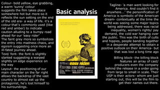
- 1. Basic analysis Colour- bold yellow, eye grabbing, a warm 'sunny' colour suggests the film takes place somewhere hot but more-so it reflects the sun setting on the end of the old era- a way of life. it’s a colour that’s commonly used (like red and amber) to indicate caution alluding to a bumpy road ahead for our 'easy rider’ The faint grey more so symbolizes the entry into madness chaos, and egoism suggesting once more an ill-fated journey ahead. Billing block- the billing block features an array of cast/ producers even the company behind the release in a order going from large to small in scale. Their USP is their actors- whom are just starting out, this will be the film to get their names out there. Text/ font- the font is slightly slanted suggesting a warped slightly on edge experience on the way Tagline- 'a man went looking for America. And couldn’t find it anywhere...’ the personification of America is symbolic of the American dream- contextually at the time the world was seeing some major topics being addressed, there was racial inequality, women's rights/ pay demand, the cold war hanging over the public. This was the birth of cults and hippies, people banding together in a desperate attempt to obtain a positive outlook on their America- but that was lost a long time ago Layout- the positioning of our main character on the far right allows the backdrop of the vast country to almost eat up the protagonist, he’s lost himself to his surroundings.
- 2. Genre: drama • Drama is quiet a broad genre, it usually goes hand in hand with another genre element; a drama/sci-fi, a drama/ romance. But at its core, a drama- whatever sub genre its attached to, is very focused on the human psyche and connection. Examples of this being: 1917 (2019), Call me by your name (2018), Taxi driver (1976) ; all dramas with elements of romance, crime or war but to their core following and observing the protagonist's character. • The best way I can describe the kind of drama I want to do is a slow-burn indie, like lost in translation, one night on earth or I'm thinking of ending things- all films that really don’t have a particular plot but take us on a journey.
- 3. Ideas/ conventions of a drama poster Looking into developing a poster, I quite like the idea of going down a drama/ slow-burn (romance?) route. Drama film posters are quite stylistic and though not exactly teasers, they tend to take more stylistic appearances to lure audiences in. If you look at drama posters, modern or old, majority feature the main protagonists/ anti- heroes in a close up or extreme close up; films like Silence of the lambs (1991), The Black swan (2010) or Her (2013). Sometimes the poster will use just a singular object that refers to something in the film or perfectly sums up the character e.g., Fight club with soap (1999), whiplash with drums (2014).
- 4. Zooming in on conventions The extreme close up- dramas alongside having symbolic objects may use their characters to draw audiences in, by using extreme close ups, the poster is immediately engaging us into an intimate connection with the protagonist or antagonist of their film. It makes us as an audience want to find out who they are. The poster for Cameron Crowe’s Almost Famous (2000) features one of the films most memorable characters; Penny lane. She is charismatic, extroverted, friendly and is the perfect introduction into the world of the film, like Patrick Fugit’s character William, we fall into the rock and roll rabbit hole through meeting Penny and her band. Overall extreme close ups invites us into the life of the person we share our gaze with on the poster, other posters like the Social Network (2010) uses Zuckerberg to draw us into the world of early Facebook or Nightcrawler (2014) into the world of gritty news journalism- the list goes on and on.
- 5. Zooming in on conventions The long shot- in complete contrast to the extreme close up/ close up, there’s the mid long shot/ long shot. Instead of inviting the audience in face to face, the characters are blocked in the distance luring audiences in. The poster for the Coen Brother’s Millers Crossing (1990) uses a wide long shot with the action taking place at a distant to intrigue audiences into wanting to take another step closer. Not only does it hook people in but more so is telling about what kind of character we will be following- without even seeing the film we can tell that Gabriel Byrne’s Tom Reagan is a secretive shadowy protagonist who instead of invites us into his business, keeps us at a distance. This a much more common style used within crime centred dramas but is occasionally used in other genres for that same ‘luring’ effect e.g. Parasite (2019), La La Land (2016), Gone girl (2014), Forest Gump (1994) and extra.
- 6. Zooming in on conventions Solid backdrop- the use of solid backdrops/ backgrounds is common within drama posters to allow more focus on the foreground/ main image. It gives the poster a sophisticated and clean look, while using its chosen colour to reflect the style of the film itself to set the tone for audiences, for example the poster of Jonathan Dayton and Valerie Faris’s Little miss sunshine (2006) incorporates the colour yellow- that is not only embolic of the Family’s van- but emulates the bright joyful atmosphere of the film. Yellow commonly symbolises positivity, optimism, loyalty and spontaneity (very in keeping of the films themes) and by having such a bold colour take up almost all the poster, it’s guaranteed to grab peoples attention. Yellow is a universally known ‘happy’ colour and its very likely that most audiences will feel comfortable and invited just by looking at it. To summarise, by using solid backdrops/ backgrounds, posters are able to efficiently and effectively grab audiences intention while symbolising its aesthetic; other examples of this can be seen in drama posters like The favourite (2018) with a royal grey/ cream, a solid black for Uncut Gems (2019) or the deep blue for Blue Velvet (1986)
- 7. Zooming in on conventions Iconography- Drama posters (whatever sub genre they go hand in hand with) tend use iconography as a way to represent/ symbolise their film and its characters into one singular object. Posters like Stanley Kubrick’s: Full Metal Jacket (1987) uses the helmet worn by the films protagonist James T Davis (Joker) in the film to summarise the film’s ideology on war in a simplistic yet memorable object. By doing this audiences will look at the poster before the film wondering “ what could that be/mean?” to then leave the theatre having it be what they think of every time they then look at an army helmet in the future. This has been done countless times such as the Bat symbol with the Nolan’s Batman trilogy, the mask from Scream, roses with American beauty (1999) and so on so forth.
- 8. Examples of 'drama' (romance) posters
- 9. Incorporating romantic implications As I go forth, I would like to introduce a romantic element into my posters- though I will be sticking with a more phycological drama motif rather than a full blown rom-com. I want to reflect the more sour, bitter side of the romantic genre with betrayal, death (loss) through a single character, and personally, most romantic themed posters, don’t exactly fit my theme and ideas as much as dramatic ones do
- 10. Example: (why I'm not considering a full-on romantic comedy) The general theme of a romantic comedy poster is a simplistic, polished composition where (majority of the time) the two leads are blocked either looking or standing with/ next to each other with text (the title) usually bellow them or in the middle of them. Most rom-com's USP is their all-star cast; for example, How To Lose a guy in 10 days (2003) poster puts a lot of focus and emphasis on Kate Hudson and Mathew McConaughey by using text of the actress and actors name at the top, and the blocking of the two right in the centre to show: not only who's in it (for those who might not know their names but faces), but more so the characters playful dynamic. The text at the top shows that the actors are the main priority here, as audiences' eyes are more likely to go up and then down as they study the poster. The use of bright happy colours- bright yellows and soft light greys within their costume conveys the films an easy watch This is not what I want for my 'intense character/ relationship' study
- 11. Image analysis:
- 12. • Format/ blocking- the back-to-back of the two characters is very symbolic of the relationship dynamic- it could allude to the two characters friendship, they have on another's back, or a rivalry, having John Cassavetes character holding a gun suspiciously glancing over into the distance of Peter Falks direction. Looking at it more simplistically, the use of the mid shot length they're both featured at accomplishes standard poster law of letting the audience know whom the film is following and showcases two stars of the time- it was around this time Peter Falk was at his height with columbo- though that being said, I think this is more intended for indie movie goers. • Colour- the use of neutral colours tells us this is not looking to grab the masses attention. We see so many movies of that time using bold colours like red and yellow in action or crime genres to hook audiences in, so having something like this displayed alongside them, it wouldn't stand out as much. The beige, chalky colour pallet is said to be spiritually: dependable, conservative, and flexible. Once again this is symbolic of the pairing's relationship in the film. They are dependent on one another for their individual goals but are flexible in the fact that they are willing to give one another up so easily. And both are conservative in the fact both are afraid of the changes that’s confronting them in their life and politically both traditional in their views). But more so having such a gentle colour it allows more focus on the foreground • images- the art style in which both Mikey and Nicky are drawn in resembles the artistic approach 70’s posters took, having images done in oil paintings for their posters. Having this allows more modern audiences to be intrigued as we don’t see much artistic works in mainstream posters today as we used to. The highlights being traded for shadows and shadows faded for highlights gives the whole ensemble an unfinished, broken piece. Again, I think this is reflective of their relationship and perfectly emulates the atmosphere of the film • Text- the font used is particularly scrawly in a messy handwriting style, you find this with most independent or indie flicks as it adds to the unpolished handmade aesthetic. More-so the format of both the names of the characters and the actors are in alignment to the pictures on the poster, it’s a nice touch. Overall, it demonstrates the gritty mess the characters experience through the film and suggests a more personal theme
- 14. • Format/ blocking- the use of blocking of the two leads having their heads overlap creates the effect that they are one in the same, the rim of Alma's nose in perfect aliment of Elisabeth's right eye- giving the illusion her nose is her eye- foreshadowing the pairs relationship within the film. The use of the extreme close up more so creates some intimacy between the poster/ characters and the audience. being so close up more so adds a layer of mystery- it makes the actresses/ character(s) undistinguishable and encourages audiences to watch to uncover who they are. • Colour- the lack of colour is used to concentrate the audiences focus onto the subject matter, having a nearly solid white backdrop allows the audience to analysis the imagery instead of being bombarded with an array of vibrant colors- so many action posters use this to cause excitement and create a sense of chaos, but here the lack of it slowly lures audiences in and sets a sophisticated and dark tone for the film. • Imagery- the chosen image is a renowned shot from the film itself in a way giving a little taste for the audience for what's to come. In saying that, seeming how this is a criterion release- a streaming site for old cult films, the shot on the poster might have been used to invite fans of the film into watching- using one of the many famous shots from the film make it recognizable at a single glance and therefore is more likely to grab potential viewers' attention. More-so looking back to the blocking of the models (actresses) it gives off a mysterious and intimate mood, for those unfamiliar with the film, it will entice them to watch with its strange, vague imagery. • Text- the text is slender and a solid black, very reminiscent of fonts horror movies sometimes use- implying a sinister undertone within the film. The title has plenty of room around it allowing it to be the center of the audience's attention. Moreover, as we can see other than the title and the directors name, there's no other text/ tagline/ billing block- partially due to the films establishment on criterion and therefore no need of it on the poster but further showcases that the narrative and the director (Ingmar Bergman)- who also directed other renowned films- is the poster’s USP
- 16. • Blocking and format- the use of blocking where the two share an intermate hug communicates to passive spectators the pairs relationship- but by (in editing) essentially cropping her/ him out it adds a layer of tragedy/ sorrowful tones that would intrigue such viewers to take a second glance. By having the images framed in a long/ mid shot, we are held distant from the couple- it adds a feeling of isolation and intrusion on the audience's behalf and perfectly encapsulates the unsettling tone of the film • The use of colour- the sandy/ white beige again allows optimal focus on the subject matter but more so reflects the films dreary bland setting- the uk. The use of this sandy beige symbolises purity, spiritual values and devotion- themes that pertain to the film's ideology. The two are devoted to one another- they have a spiritual bond, as do the countless other couples of this world, they stay together for purity from the transformation they will undergo if separated. Furthermore, If we stand back and look at it more simplistically- the colours are easy on the eyes- they are inviting and calm and promise a quiet ( though thought provoking and uneasy) watch. The two characters more so are left unsaturated compared to their backdrop- it adds an air of past to the poster, the characters tainted by the sorrowful nature of the film ( black and white is famously used for an old timey/ distressing effect) • Imagery- the imagery used of the pair hugging (one of which cropped out) adds a layer of complexity and communicates this isn't your run of the mill rom-com. the use of performance within the blocking where the hands are holding the other firmly incorporates themes of ressentiment, reluctance to let go)- it suggests the world they live in is a harsh one, they have to hold onto one another, cause their all the other one has. And then, by cropping the other out introduces themes of loose- they have lost what completes them. the pairs expression is the of contentment more so adds a layer of mystery to the pair. The weird calmness alludes to the fact that though tragic this is a fulfilling watch )- much like the characters having fulfilment through their pain. • The text used- the use of all caps/ bold/ black text for the title- acts as a major stand out compared to the serene imagery and colour pallet used in the poster. It communicates the most important element of the film that is; one of the title, but more so the message and overall theme of the film, as- if David can't find love, he will become a lobster. The following text is much softer and smaller (aside from the main players of the actors and actresses that slightly bolder) running below in the billing block and the client/ company above.
- 17. Zooming in : Zooming in on persona’s posters we can see the same motif of Elisabeth and alma’s relationship- the use of format and imagery in nearly all of them join the two as one, a blend of reality and fantasy. Things like the bottom poster with jigsaw pieces show us the pairs connection- done in a stylistic unique format. All four posters approach promoting the film in a distinctive new style and apart from a few reoccurring images, the four posters look like their own separate film. In my opinion, by doing this up to the release of the film, audiences will be subconsciously digesting content from the same film (via the posters) everywhere they go in different ways- and slowly, the name and certain images will become memorable, overall encouraging more people to watch. By also having different stylistic posters, the film shows different sides to the same tale, the intimacy with the criterion poster , the abstract themes with the top left and top right and playful qualities of the jigsaw pieces in the bottom right allowing audiences to connect and invest themselves into the film before even seeing it.
- 18. Running themes The idea of completing on another, the composition of all three implies that both parties are incomplete with the absence of the other. The blocking in persona- where the nostril is in alignment of the eye gives off the effect that they are one in the same. The use of imagery in Mikey and Nicky where the stylistic image has the background seep through giving off the effect both characters are from the same plane of existence. And the cropped-out body of each lover in lobster- leaving avoid in the other reflecting how they complete one another.
- 19. Campaign research When researching for film marketing I decided to look into a more modern release as it will give me a more in depth understanding of promotional campaigns in the present so I'm able to hit the brief for the client (channel Four). Netflix- though starting as a streaming platform, has gradually become a more renowned platform for major talents to develop feature films on the site (much like channel four). This in mind I chose to look at Noah Baumbach’s Marriage story for inspiration on how to promote my film. To showcase the parallel storylines within the film, BLT Communications (Marriage story’s marketing agency) utilized these pair of posters- whilst the trailer was released simultaneously. One shows the character of Nicole and the another of Charlie, both of their silhouettes set against light orange and blue backdrops with a photo of the city they live in shown within their cut-outs. Contrasting colours of orange and blue reflective of that of fire and ice (clash of personalities) USP of the actress and actor (text at the top) and more so the golden globe nomination the film received Noisy city contrasting the quiet suburban beach (again reflective of contrasting personalities) Netflix logo and ‘release date’ in bold to communicate when and where audiences can watch
- 20. Campaign research For its theatrical poster, the characters are shown in happier times through their performance- playfully embracing as their child Henry squirms at the bottom. It’s simplistic style not only gives the film a sophisticated look but is reminiscent of movie posters of the 70’s for a vintage effect and establishes the core dynamic of the story. The use of a beige/ eggshell colour for the backdrop effectively draws more focus on the image while symbolising the films modernism- the colour is known to have an engaging effect on people and so by using it, the film successfully draws people in. The poster makes it a point to have a line of its accomplishments at the top showing that the film has received multiple nominations and awards. This solidifies it as a critically acclaimed film, inclining more audiences to give it their time. The use of font is slick and thin- presenting the film as professional. By more so bolding certain text, it communicates key information to the audience- e.g. the title, the date of release and the streaming platform its available on (the is amplified by the use of Netflix's signature red colour)
- 21. Social media campaign (online marketing) Using social media platforms like Instagram/ Facebook and twitter- the movie’s promotional campaign can be reached by a global audience- it alerts spectators of upcoming events, dates of release and of new posters/ trailers.