SlideShare a Scribd company logo
1 of 11
Evaluation
How effective is the
combination of your main
product and ancilliary tasks?
Masthead/Brand Identity
The brand identity of my production piece is the masthead, which is on all of my production pieces consistently.
It is in all of the pages of my magazine as you can see below, as well as it being on the billboard at the top left
corner and the website, on every hyperlinked page at the very top also. The one thing you will notice by looking
at them all below is that they are not all the same colour. This however is really irrelevant because it isn't the
colour that defines , it is the unique font. Although the font itself came from DaFonts, I made it unique to my
own magazine my making the tail of the R longer. You cannot see it on the cover because Caitlin's head overlaps
it, however it is clearly seen on the contents page, the double page spread, as well as the two ancillaries. It is
only on the ancillaries that I have put magazine underneath. This is because otherwise, because it isn't paired
DIRECTLY with the magazine itself, without it saying “magazine” right underneath, people who don't know what it
is may think it is advertising or the website to a different kind of product that is not at all a magazine. All the sizes
are also exactly the same, there are none of them with different proportions or stretched or shortened.
Articles
Home Page
The articles are also the one feature that, from almost all of the pieces you can see a clear connection.
Obviously with my magazine all of the pages have ways in which the articles match one another. For
example, on the cover, the articles spoken about on there are all on the contents page with his own
section, as well as the contents page having two bits, the photo and the articles title referring to the
article on the double page spread. However, with the ancillaries, they are all referred to on the website.
There are no articles on the billboard mentioned apart from the ones on the cover page on the billboard
itself. As you can see from the pictures to the right, you can see that the website articles include articles
that have been mentioned on the contents page. The article on the contents page titled “YOU CAN
NEVER HAVE TOO MANY SHOES” refers to the article on the home page that says “YOU CAN NEVER
HAVE TOO MANY DOC MARTINS”. I think that if a certain shoe type is mentioned on a website, they are
most likely to click on it. My target fashion is Alternative, and I see people who wear alternative clothes as
them wearing Doc Martins as a stereotype. Either this or, generally, big brand shoes. So for my target
audience, I feel like they are more likely to click on something with a shoe brand they have. They will see
“DOC MARTINS” and think “I have them, I wonder what it says” and then click on it. That is usually how
your mind works, if you see a familiar word on it you are more likely to click on it. The article that says
“GETTING READY FOR SPRING IN STYLE” refers to the article on the website titled “WHAT'S HOT?
WHAT'S NOT?”. This talks about outfits that are perfect for the spring and the description for this makes it
more obvious that it is connected with the one in the contents page. In addition, one of the other articles
that is similar to one in the website is the “PRIMARK GIVAWAYS” articles. They both have the same title so
that it is really clear for people who want to enter the competition but only have the magazine. My plan is
that I was hoping that f they bought the magazine, there would be a page dedicated to instructions to
enter the competition and the first one will be to go onto the website where they can find the rest of the
entry requirements. It will also give them instructions to help guide them through the website if they find
it difficult, otherwise they can just carry on on the website. I will have put in the magazine as well that if
they have difficulty accessing the website or finding their way around it then there is a paper version they
can do. But of course I didn't have to make that page, but I wanted to consider it so that I could make it
flow a little better as well.
Articles
Home Page
The next one that is the same is the one that says in the contents page “CAFES GALORE!
WHICH ONE IS YOUR FAVOURITE?” which refers to, on the website, the article titled
“BEST CAFES IN LEICESTER”. I have done the reference to Leicester on the website to
restate the region this magazine is made for. Also I think that the people I am aiming my
magazine at would be coffee or tea lovers, or generally café lovers because I am into that
fashion, within my target audience age range and I love going into different cafés. I think
they would be interested at the cafés we include as well as the ones in their area, making
it relate more to them as individuals. Finally, The last article that is similar in both the
contents page and the website is the one that says in the contents page “GRAB THE BEST
SHOTS THIS SPRING - TUTORIALS INSIDE” and on the website it is titled “TUTORIALS FOR
THE BEST PHOTOS”. In the description of this article on the website, it states that it is for
“SPRING PICTURES” and not just armature pictures. I didn't put this in the contents page
as it was after I had edited it but I know that you don't have to include every single article
in every aspect. I have also along with these included articles for “WE GIVE YOU A
REVIEW OF DMU” titled exactly the same on the website. I felt that, as this is a regional
magazine and DMU is a place that promotes individuality and allows people to be unique
within their own rights, I felt like this was a good thing to bring up this high rated
university as it is a big part of the city of Leicester. I have also included a part on the
website for the article titled “WE KNOW YOU WILL LOVE THIS COFFEE”. This is because I
think that the people in my target audience will love coffee and if I talk about a certain
brand of coffee, like I have put in the description of the article on the website ten it will
attract more attention. I haven't included a picture for this next article but I included this,
again, to restate the region this magazine is based in and because it is a famous place in
Leicester. In the contents page, it says “WHY STOP WITH ONE HAIR COLOUR?” In the
website it is worded like it is on the cover “MAKE HEADS TURN!” but in the description for
this article it says more about the kind of thing it is talking about and how they are linked
to the alternative genre of fashion.
Articles
Fashion and Beauty
I have just a few of the fashion articles from the contents on my website. The first one is
once again the “YOU CAN NEVER HAVE TOO MANY SHOES” but in the website on this
hyperlinked page the title of the article is “THE PERFECT, QUIRKY SHOES”. The picture is
different but I this one and the one on the home page are both for the same article. In this
image, I include two different styles of Doc Martin shoes, both with quirky patterns on them,
and in the middle is a picture of some black and white Vans. Like I said before, I think that if I
either include the names of big brand shoes or show images of big brand shoes then they
are more likely to click on it. For this version of the article, I have done both for different
brands. I have included names of big brands or popular styles of shoes. The patterns or
styles are also quirky like it says in the title. It is all connected just in different ways. I have
already mentioned the “PRIMARK GIVAWAYS” article, however this one has a slightly
different description on it to make the reader see something slightly different every time
they read it. The next one is the article titled “HOW TO NAIL THE CAT-EYE LOOK” and on
the website it is “NAIL THE CAT-EYE LOOK”. I have shortened it on the website to make it
snappier and more catchy to the reader so they are more likely to remember it. I have also
put a striking image along with it of a perfect looking cat-eye winged liner. This makes it
clearer to the audience what is meant by “THE CAT-EYE LOOK” As it may mean different
things to different people. In the description I have also put that there is “hilarious footage”
of the staff trying it at the ABSTRACT office. This will most likely entice them to click on it as
soon as they read it because humour helps people relieve stress and, the age group I am
aiming at is a very stressful time because of exams as well as university choices and starting
university or even looking for jobs or apprenticeships. Finally, The article titled “LIPSTICK
COLOURS FOR YOUR COMPLEXION” and it is the same title on the website is the same. I
think it's important to have la second opinion if you like, but it's just clarification that it is
reliable and a good article. The one on the website will also include a description to make it
clearer what it includes.
Articles
Slides
The slides were something I knew I had to relate in some way to the contents page because of
the title I gave them of TOP STORIES. I think that this would mean that if this issue of magazine
is around this time then at least a few of them should be related to the articles in the contents
page. I have two of the three slides related to the articles in the contents page. The first one is
Caitlin's article. felt that this was important with the fact that Caitlin is featured on the cover of
the new issue. I also feel that because, on the double page spread you can see a box that
overlaps the image of Caitlin that says “SEE BEHIND THE SCENES! GO TO OUR WEBSITE!” with
the website next to it, and I have also used the photo looking through a camera, I felt it was
best to use this photo and this concept of behind the scenes footage and include it in the
website to make it clear where to find the footage of the special guest that issue. The next
article is the one titled in the contents page as “MAKE UP BRANDS WITH ALL THE SHADES”
and it is titled the same on the website. I really like how the photo looks in the background of
the one on the website, and I made this a top story just because it is in the contents page in
bold so I feel that having it on a website is good to boost it as well.
Articles
Caitlin
As you can see to the right, there is a collage of all the places in which Caitlin turns up
throughout all of the production pieces. I have included her in almost all aspects of my
production with the main reason being that to the young people she could be an
inspiration for their lives and so Caitlin being all over a popular Alternative regional
magazine, there is a lot that they can take from that. Also she is the star that is featured
on the cover, if Abstract want to get people to read their magazine, having a face like
Caitlin's on their platforms is a big way of getting people to read your content as well as
buy the magazine in the shops and in supermarkets in Leicester. You can also see where
the connections are. You can see which bits connect with the other through the titles and
through the outfits. For example, on the billboard, you can see the cover page. This is
also featured, obviously on the cover, as well as on the contents page and twice on the
website. Then if you look at the photo on the contents in grey, then you can see that
also in the photo in the perspective of the photographer and in the result picture on the
website. All the titles are in coordination with each other. For example there is on the
contents page “CAITLIN JONES REVEALS FASHION MOMENTS - EXCLUSIVE INTERVIEW”
and on the website it also says something along those lines. The other titles or pieces of
text relating to Caitlin and the issue she is in are all about downloading the issue or
going behind the scenes which is all essential to that particular issue.
Articles
Social and Download
I have colour coded the sections which I feel are important to repeat to the right.
The first is the fact that there is always a mention of downloading the issue of
Abstract that is out that month, shown in green. It is on the contents page in the
social/subscription box and on the website in the Contact Us section as well as on
the home page. This is important to include with the target audience I have
because my magazine is aimed at younger people and they are more likely to
download a magazine rather than go out and buy it anywhere. Next is the social
media platforms shown with which ones are included, shown in blue. It is on the
contents page, the website and the billboard. It is shown lots of times on the
website on every page that you can click on. It is important that, because I
included it so many times, I have to have the same amount of icons as well as the
same icons, they cannot all change depending on what you look at. To make it all
look like the same product, you have to have the right icons on all of them. I have
Twitter, Instagram, and Facebook. The icons shown all differ but it isn't always
important to have the same looking ones because they all change. Finally, the
social media addresses must be the same, shown in red. I had to make sure that it
was clear that they are all the same. I have chosen to keep them all as
@ABSTRACTofficial for all the social media platforms I have chosen to include. This
is so that they will remember which name they should use, they are all the same.
Also for all of the addresses shown, I have chosen to make ABSTRACT be in
capitols to remind them which magazine they are looking for.
Colour Scheme
Below and to the right are just a few examples of where the colour scheme is obviously the same. I have
tried to integrate this colour scheme into as many pieces of my production as possible. This is because this
colour scheme as well as other dark colours is what I feel defines this as an alternative magazine and not just
a typical fashion magazine. The website is quite bright but I think that makes the masthead more striking
and I cannot make the whole website dark because it may become difficult to read. The cover page
obviously is in this colour scheme and I think it is what sets the colour scheme example. Lots of magazine
websites also often change some of the colour according to the issue that is out at that time and the colour
scheme of that issue, and I think I really like this idea and it also suits my magazine quite a bit I think. I have
used it on the billboard greatly because it is advertising that issue so it would just make sense if it was in that
colour scheme to do it justice I think. I have also included an example of one of my subscription boxes to
show that I have also used this colour scheme on this as well so that it looks like it is subscription to this
magazine and not to any other. I must also point out that the masthead in this equation is the only thing
that really changes colour particularly. This is because of the different backgrounds it is on, I have had to
adjust to the background instead of the background adjusting to the masthead. This can be seen primarily
on the billboard against the black background.
Fonts
Throughout all of my production, I have tried to use the same font all the way through. This
was easy for all the production I did where I used Paint Net, however it became difficult to find
a font like Century Gothic on Wix as they didn't have the usual ones that you would get on
Word or PowerPoint or Paint.Net. All the text on the billboard and the magazine pages are all
Century Gothic, varying from bold to light. I like this font because it looks edgy and it has
sharp edges with a slight curve to it as well. I feel like this is pretty good for the genre I am
going for. If you look at Vogue covers, you will see that they also use this font a lot on
particular covers. I have used a different font for Caitlin's name on the cover and on the
website on the slides as well (shown below). The font for the masthead also stays the same all
the way through. I tried to find fonts that would match this or are the same for the headings I
felt were important, for example, Top Stories (below) I found a font that almost looks like it is
the same as the font for the masthead. It gives a classy tone to it and makes it stand out to the
reader a if it is on the same level of importance as the masthead.
Conclusion
In conclusion, through all of these things I have spoken about, I think I have been
successful in making all of my pieces of the media products connect to make sure they
all look like the same product. In general the masthead and the font of that and the
colour and the unique features of it like the extended “R” tail, makes the brand identity
of the whole magazine and the extra ancillaries clearer to distinguish. I am happy with
all of my final products and pieces and I think I have been successful with making them
look like real products as well as conforming to the conventions of a fashion and
lifestyle magazine as well as being able conform to the conventions of an Alternative
fashion and lifestyle over all.

More Related Content

What's hot

Creatingforanaudience
CreatingforanaudienceCreatingforanaudience
Creatingforanaudienceem-monsey
 
Factual project - initial plans
Factual project - initial plansFactual project - initial plans
Factual project - initial plansTigs0102
 
Evaluation question 1
Evaluation question 1 Evaluation question 1
Evaluation question 1 Rebeccahartx
 
Evaluation-Conventions
Evaluation-ConventionsEvaluation-Conventions
Evaluation-Conventionsemily_rhian18
 
Music Magazine Evaluation
Music Magazine Evaluation Music Magazine Evaluation
Music Magazine Evaluation katiebird1996
 
A2 media studies evaluation
A2 media studies evaluationA2 media studies evaluation
A2 media studies evaluationtaliagaye
 
My music magazine contents page flat plan analysis
My music magazine contents page flat plan analysisMy music magazine contents page flat plan analysis
My music magazine contents page flat plan analysisNamibiaM
 
Evaluation one
Evaluation oneEvaluation one
Evaluation oneelliott-b
 
A2 media studies evaluation
A2 media studies evaluationA2 media studies evaluation
A2 media studies evaluationtaliagayex
 

What's hot (18)

Fmp Research
Fmp Research Fmp Research
Fmp Research
 
Fmp research
Fmp researchFmp research
Fmp research
 
Print evaluation
Print evaluationPrint evaluation
Print evaluation
 
Storyboard
StoryboardStoryboard
Storyboard
 
Creatingforanaudience
CreatingforanaudienceCreatingforanaudience
Creatingforanaudience
 
Factual project - initial plans
Factual project - initial plansFactual project - initial plans
Factual project - initial plans
 
Question 1
Question 1Question 1
Question 1
 
Evaluation question 1
Evaluation question 1 Evaluation question 1
Evaluation question 1
 
Question 1
Question 1Question 1
Question 1
 
Page layout
Page layout Page layout
Page layout
 
Evaluation-Conventions
Evaluation-ConventionsEvaluation-Conventions
Evaluation-Conventions
 
Music Magazine Evaluation
Music Magazine Evaluation Music Magazine Evaluation
Music Magazine Evaluation
 
A2 media studies evaluation
A2 media studies evaluationA2 media studies evaluation
A2 media studies evaluation
 
Evaluation
EvaluationEvaluation
Evaluation
 
My music magazine contents page flat plan analysis
My music magazine contents page flat plan analysisMy music magazine contents page flat plan analysis
My music magazine contents page flat plan analysis
 
Evaluation one
Evaluation oneEvaluation one
Evaluation one
 
A2 media studies evaluation
A2 media studies evaluationA2 media studies evaluation
A2 media studies evaluation
 
Olivia media
Olivia mediaOlivia media
Olivia media
 

Similar to Evaluation 2 - Magazine and ancillaries

3. production experiments4.3
3. production experiments4.33. production experiments4.3
3. production experiments4.3aliceleeman
 
Article rationale
Article rationaleArticle rationale
Article rationaleSionyTatey
 
Double page spread Statement of Intent
Double page spread Statement of IntentDouble page spread Statement of Intent
Double page spread Statement of Intenttessfizzy
 
Question 1 of evaluation question slide two complete
Question 1 of evaluation question slide two completeQuestion 1 of evaluation question slide two complete
Question 1 of evaluation question slide two completeSionyTatey
 
My music based magazine evaluation
My music based magazine evaluationMy music based magazine evaluation
My music based magazine evaluationkamar95
 
Question 1 of evaluation question slide two complete
Question 1 of evaluation question slide two completeQuestion 1 of evaluation question slide two complete
Question 1 of evaluation question slide two completeSionyTatey
 
Magazine deconstruction
Magazine deconstructionMagazine deconstruction
Magazine deconstructionSionyTatey
 
Foundation portfolio: evaluation
Foundation portfolio: evaluationFoundation portfolio: evaluation
Foundation portfolio: evaluationRoss Miller
 
Finished evaluation
Finished evaluationFinished evaluation
Finished evaluationRian Doherty
 
Presentation 2
Presentation 2Presentation 2
Presentation 2ben_97
 
Construction contents page
Construction contents pageConstruction contents page
Construction contents pagemediafan
 

Similar to Evaluation 2 - Magazine and ancillaries (20)

Evaluation
EvaluationEvaluation
Evaluation
 
Evaluation
EvaluationEvaluation
Evaluation
 
3. production experiments4.3
3. production experiments4.33. production experiments4.3
3. production experiments4.3
 
Article rationale
Article rationaleArticle rationale
Article rationale
 
Double page spread Statement of Intent
Double page spread Statement of IntentDouble page spread Statement of Intent
Double page spread Statement of Intent
 
Question 1 of evaluation question slide two complete
Question 1 of evaluation question slide two completeQuestion 1 of evaluation question slide two complete
Question 1 of evaluation question slide two complete
 
My music based magazine evaluation
My music based magazine evaluationMy music based magazine evaluation
My music based magazine evaluation
 
Question 1 of evaluation question slide two complete
Question 1 of evaluation question slide two completeQuestion 1 of evaluation question slide two complete
Question 1 of evaluation question slide two complete
 
Magazine deconstruction
Magazine deconstructionMagazine deconstruction
Magazine deconstruction
 
Evaluation
EvaluationEvaluation
Evaluation
 
Plans
PlansPlans
Plans
 
Evaluation
EvaluationEvaluation
Evaluation
 
Foundation portfolio: evaluation
Foundation portfolio: evaluationFoundation portfolio: evaluation
Foundation portfolio: evaluation
 
Finished evaluation
Finished evaluationFinished evaluation
Finished evaluation
 
Presentation 2
Presentation 2Presentation 2
Presentation 2
 
Magazine plans
Magazine plansMagazine plans
Magazine plans
 
Drafting
DraftingDrafting
Drafting
 
Double Page Pp
Double Page PpDouble Page Pp
Double Page Pp
 
Construction contents page
Construction contents pageConstruction contents page
Construction contents page
 
7. evaluation(3)
7. evaluation(3)7. evaluation(3)
7. evaluation(3)
 

Recently uploaded

Concept of Vouching. B.Com(Hons) /B.Compdf
Concept of Vouching. B.Com(Hons) /B.CompdfConcept of Vouching. B.Com(Hons) /B.Compdf
Concept of Vouching. B.Com(Hons) /B.CompdfUmakantAnnand
 
SOCIAL AND HISTORICAL CONTEXT - LFTVD.pptx
SOCIAL AND HISTORICAL CONTEXT - LFTVD.pptxSOCIAL AND HISTORICAL CONTEXT - LFTVD.pptx
SOCIAL AND HISTORICAL CONTEXT - LFTVD.pptxiammrhaywood
 
Micromeritics - Fundamental and Derived Properties of Powders
Micromeritics - Fundamental and Derived Properties of PowdersMicromeritics - Fundamental and Derived Properties of Powders
Micromeritics - Fundamental and Derived Properties of PowdersChitralekhaTherkar
 
Presiding Officer Training module 2024 lok sabha elections
Presiding Officer Training module 2024 lok sabha electionsPresiding Officer Training module 2024 lok sabha elections
Presiding Officer Training module 2024 lok sabha electionsanshu789521
 
Contemporary philippine arts from the regions_PPT_Module_12 [Autosaved] (1).pptx
Contemporary philippine arts from the regions_PPT_Module_12 [Autosaved] (1).pptxContemporary philippine arts from the regions_PPT_Module_12 [Autosaved] (1).pptx
Contemporary philippine arts from the regions_PPT_Module_12 [Autosaved] (1).pptxRoyAbrique
 
Separation of Lanthanides/ Lanthanides and Actinides
Separation of Lanthanides/ Lanthanides and ActinidesSeparation of Lanthanides/ Lanthanides and Actinides
Separation of Lanthanides/ Lanthanides and ActinidesFatimaKhan178732
 
How to Make a Pirate ship Primary Education.pptx
How to Make a Pirate ship Primary Education.pptxHow to Make a Pirate ship Primary Education.pptx
How to Make a Pirate ship Primary Education.pptxmanuelaromero2013
 
Employee wellbeing at the workplace.pptx
Employee wellbeing at the workplace.pptxEmployee wellbeing at the workplace.pptx
Employee wellbeing at the workplace.pptxNirmalaLoungPoorunde1
 
Hybridoma Technology ( Production , Purification , and Application )
Hybridoma Technology  ( Production , Purification , and Application  ) Hybridoma Technology  ( Production , Purification , and Application  )
Hybridoma Technology ( Production , Purification , and Application ) Sakshi Ghasle
 
Mastering the Unannounced Regulatory Inspection
Mastering the Unannounced Regulatory InspectionMastering the Unannounced Regulatory Inspection
Mastering the Unannounced Regulatory InspectionSafetyChain Software
 
Science 7 - LAND and SEA BREEZE and its Characteristics
Science 7 - LAND and SEA BREEZE and its CharacteristicsScience 7 - LAND and SEA BREEZE and its Characteristics
Science 7 - LAND and SEA BREEZE and its CharacteristicsKarinaGenton
 
Grant Readiness 101 TechSoup and Remy Consulting
Grant Readiness 101 TechSoup and Remy ConsultingGrant Readiness 101 TechSoup and Remy Consulting
Grant Readiness 101 TechSoup and Remy ConsultingTechSoup
 
APM Welcome, APM North West Network Conference, Synergies Across Sectors
APM Welcome, APM North West Network Conference, Synergies Across SectorsAPM Welcome, APM North West Network Conference, Synergies Across Sectors
APM Welcome, APM North West Network Conference, Synergies Across SectorsAssociation for Project Management
 
The Most Excellent Way | 1 Corinthians 13
The Most Excellent Way | 1 Corinthians 13The Most Excellent Way | 1 Corinthians 13
The Most Excellent Way | 1 Corinthians 13Steve Thomason
 
Call Girls in Dwarka Mor Delhi Contact Us 9654467111
Call Girls in Dwarka Mor Delhi Contact Us 9654467111Call Girls in Dwarka Mor Delhi Contact Us 9654467111
Call Girls in Dwarka Mor Delhi Contact Us 9654467111Sapana Sha
 
Organic Name Reactions for the students and aspirants of Chemistry12th.pptx
Organic Name Reactions  for the students and aspirants of Chemistry12th.pptxOrganic Name Reactions  for the students and aspirants of Chemistry12th.pptx
Organic Name Reactions for the students and aspirants of Chemistry12th.pptxVS Mahajan Coaching Centre
 
URLs and Routing in the Odoo 17 Website App
URLs and Routing in the Odoo 17 Website AppURLs and Routing in the Odoo 17 Website App
URLs and Routing in the Odoo 17 Website AppCeline George
 
“Oh GOSH! Reflecting on Hackteria's Collaborative Practices in a Global Do-It...
“Oh GOSH! Reflecting on Hackteria's Collaborative Practices in a Global Do-It...“Oh GOSH! Reflecting on Hackteria's Collaborative Practices in a Global Do-It...
“Oh GOSH! Reflecting on Hackteria's Collaborative Practices in a Global Do-It...Marc Dusseiller Dusjagr
 

Recently uploaded (20)

Concept of Vouching. B.Com(Hons) /B.Compdf
Concept of Vouching. B.Com(Hons) /B.CompdfConcept of Vouching. B.Com(Hons) /B.Compdf
Concept of Vouching. B.Com(Hons) /B.Compdf
 
SOCIAL AND HISTORICAL CONTEXT - LFTVD.pptx
SOCIAL AND HISTORICAL CONTEXT - LFTVD.pptxSOCIAL AND HISTORICAL CONTEXT - LFTVD.pptx
SOCIAL AND HISTORICAL CONTEXT - LFTVD.pptx
 
Micromeritics - Fundamental and Derived Properties of Powders
Micromeritics - Fundamental and Derived Properties of PowdersMicromeritics - Fundamental and Derived Properties of Powders
Micromeritics - Fundamental and Derived Properties of Powders
 
Presiding Officer Training module 2024 lok sabha elections
Presiding Officer Training module 2024 lok sabha electionsPresiding Officer Training module 2024 lok sabha elections
Presiding Officer Training module 2024 lok sabha elections
 
Contemporary philippine arts from the regions_PPT_Module_12 [Autosaved] (1).pptx
Contemporary philippine arts from the regions_PPT_Module_12 [Autosaved] (1).pptxContemporary philippine arts from the regions_PPT_Module_12 [Autosaved] (1).pptx
Contemporary philippine arts from the regions_PPT_Module_12 [Autosaved] (1).pptx
 
Separation of Lanthanides/ Lanthanides and Actinides
Separation of Lanthanides/ Lanthanides and ActinidesSeparation of Lanthanides/ Lanthanides and Actinides
Separation of Lanthanides/ Lanthanides and Actinides
 
How to Make a Pirate ship Primary Education.pptx
How to Make a Pirate ship Primary Education.pptxHow to Make a Pirate ship Primary Education.pptx
How to Make a Pirate ship Primary Education.pptx
 
Employee wellbeing at the workplace.pptx
Employee wellbeing at the workplace.pptxEmployee wellbeing at the workplace.pptx
Employee wellbeing at the workplace.pptx
 
Hybridoma Technology ( Production , Purification , and Application )
Hybridoma Technology  ( Production , Purification , and Application  ) Hybridoma Technology  ( Production , Purification , and Application  )
Hybridoma Technology ( Production , Purification , and Application )
 
Mastering the Unannounced Regulatory Inspection
Mastering the Unannounced Regulatory InspectionMastering the Unannounced Regulatory Inspection
Mastering the Unannounced Regulatory Inspection
 
Science 7 - LAND and SEA BREEZE and its Characteristics
Science 7 - LAND and SEA BREEZE and its CharacteristicsScience 7 - LAND and SEA BREEZE and its Characteristics
Science 7 - LAND and SEA BREEZE and its Characteristics
 
Grant Readiness 101 TechSoup and Remy Consulting
Grant Readiness 101 TechSoup and Remy ConsultingGrant Readiness 101 TechSoup and Remy Consulting
Grant Readiness 101 TechSoup and Remy Consulting
 
Código Creativo y Arte de Software | Unidad 1
Código Creativo y Arte de Software | Unidad 1Código Creativo y Arte de Software | Unidad 1
Código Creativo y Arte de Software | Unidad 1
 
APM Welcome, APM North West Network Conference, Synergies Across Sectors
APM Welcome, APM North West Network Conference, Synergies Across SectorsAPM Welcome, APM North West Network Conference, Synergies Across Sectors
APM Welcome, APM North West Network Conference, Synergies Across Sectors
 
Model Call Girl in Tilak Nagar Delhi reach out to us at 🔝9953056974🔝
Model Call Girl in Tilak Nagar Delhi reach out to us at 🔝9953056974🔝Model Call Girl in Tilak Nagar Delhi reach out to us at 🔝9953056974🔝
Model Call Girl in Tilak Nagar Delhi reach out to us at 🔝9953056974🔝
 
The Most Excellent Way | 1 Corinthians 13
The Most Excellent Way | 1 Corinthians 13The Most Excellent Way | 1 Corinthians 13
The Most Excellent Way | 1 Corinthians 13
 
Call Girls in Dwarka Mor Delhi Contact Us 9654467111
Call Girls in Dwarka Mor Delhi Contact Us 9654467111Call Girls in Dwarka Mor Delhi Contact Us 9654467111
Call Girls in Dwarka Mor Delhi Contact Us 9654467111
 
Organic Name Reactions for the students and aspirants of Chemistry12th.pptx
Organic Name Reactions  for the students and aspirants of Chemistry12th.pptxOrganic Name Reactions  for the students and aspirants of Chemistry12th.pptx
Organic Name Reactions for the students and aspirants of Chemistry12th.pptx
 
URLs and Routing in the Odoo 17 Website App
URLs and Routing in the Odoo 17 Website AppURLs and Routing in the Odoo 17 Website App
URLs and Routing in the Odoo 17 Website App
 
“Oh GOSH! Reflecting on Hackteria's Collaborative Practices in a Global Do-It...
“Oh GOSH! Reflecting on Hackteria's Collaborative Practices in a Global Do-It...“Oh GOSH! Reflecting on Hackteria's Collaborative Practices in a Global Do-It...
“Oh GOSH! Reflecting on Hackteria's Collaborative Practices in a Global Do-It...
 

Evaluation 2 - Magazine and ancillaries

  • 1. Evaluation How effective is the combination of your main product and ancilliary tasks?
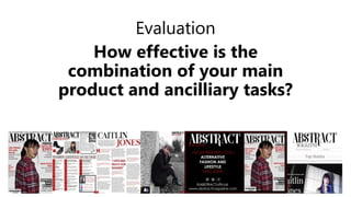
  • 2. Masthead/Brand Identity The brand identity of my production piece is the masthead, which is on all of my production pieces consistently. It is in all of the pages of my magazine as you can see below, as well as it being on the billboard at the top left corner and the website, on every hyperlinked page at the very top also. The one thing you will notice by looking at them all below is that they are not all the same colour. This however is really irrelevant because it isn't the colour that defines , it is the unique font. Although the font itself came from DaFonts, I made it unique to my own magazine my making the tail of the R longer. You cannot see it on the cover because Caitlin's head overlaps it, however it is clearly seen on the contents page, the double page spread, as well as the two ancillaries. It is only on the ancillaries that I have put magazine underneath. This is because otherwise, because it isn't paired DIRECTLY with the magazine itself, without it saying “magazine” right underneath, people who don't know what it is may think it is advertising or the website to a different kind of product that is not at all a magazine. All the sizes are also exactly the same, there are none of them with different proportions or stretched or shortened.
  • 3. Articles Home Page The articles are also the one feature that, from almost all of the pieces you can see a clear connection. Obviously with my magazine all of the pages have ways in which the articles match one another. For example, on the cover, the articles spoken about on there are all on the contents page with his own section, as well as the contents page having two bits, the photo and the articles title referring to the article on the double page spread. However, with the ancillaries, they are all referred to on the website. There are no articles on the billboard mentioned apart from the ones on the cover page on the billboard itself. As you can see from the pictures to the right, you can see that the website articles include articles that have been mentioned on the contents page. The article on the contents page titled “YOU CAN NEVER HAVE TOO MANY SHOES” refers to the article on the home page that says “YOU CAN NEVER HAVE TOO MANY DOC MARTINS”. I think that if a certain shoe type is mentioned on a website, they are most likely to click on it. My target fashion is Alternative, and I see people who wear alternative clothes as them wearing Doc Martins as a stereotype. Either this or, generally, big brand shoes. So for my target audience, I feel like they are more likely to click on something with a shoe brand they have. They will see “DOC MARTINS” and think “I have them, I wonder what it says” and then click on it. That is usually how your mind works, if you see a familiar word on it you are more likely to click on it. The article that says “GETTING READY FOR SPRING IN STYLE” refers to the article on the website titled “WHAT'S HOT? WHAT'S NOT?”. This talks about outfits that are perfect for the spring and the description for this makes it more obvious that it is connected with the one in the contents page. In addition, one of the other articles that is similar to one in the website is the “PRIMARK GIVAWAYS” articles. They both have the same title so that it is really clear for people who want to enter the competition but only have the magazine. My plan is that I was hoping that f they bought the magazine, there would be a page dedicated to instructions to enter the competition and the first one will be to go onto the website where they can find the rest of the entry requirements. It will also give them instructions to help guide them through the website if they find it difficult, otherwise they can just carry on on the website. I will have put in the magazine as well that if they have difficulty accessing the website or finding their way around it then there is a paper version they can do. But of course I didn't have to make that page, but I wanted to consider it so that I could make it flow a little better as well.
  • 4. Articles Home Page The next one that is the same is the one that says in the contents page “CAFES GALORE! WHICH ONE IS YOUR FAVOURITE?” which refers to, on the website, the article titled “BEST CAFES IN LEICESTER”. I have done the reference to Leicester on the website to restate the region this magazine is made for. Also I think that the people I am aiming my magazine at would be coffee or tea lovers, or generally café lovers because I am into that fashion, within my target audience age range and I love going into different cafés. I think they would be interested at the cafés we include as well as the ones in their area, making it relate more to them as individuals. Finally, The last article that is similar in both the contents page and the website is the one that says in the contents page “GRAB THE BEST SHOTS THIS SPRING - TUTORIALS INSIDE” and on the website it is titled “TUTORIALS FOR THE BEST PHOTOS”. In the description of this article on the website, it states that it is for “SPRING PICTURES” and not just armature pictures. I didn't put this in the contents page as it was after I had edited it but I know that you don't have to include every single article in every aspect. I have also along with these included articles for “WE GIVE YOU A REVIEW OF DMU” titled exactly the same on the website. I felt that, as this is a regional magazine and DMU is a place that promotes individuality and allows people to be unique within their own rights, I felt like this was a good thing to bring up this high rated university as it is a big part of the city of Leicester. I have also included a part on the website for the article titled “WE KNOW YOU WILL LOVE THIS COFFEE”. This is because I think that the people in my target audience will love coffee and if I talk about a certain brand of coffee, like I have put in the description of the article on the website ten it will attract more attention. I haven't included a picture for this next article but I included this, again, to restate the region this magazine is based in and because it is a famous place in Leicester. In the contents page, it says “WHY STOP WITH ONE HAIR COLOUR?” In the website it is worded like it is on the cover “MAKE HEADS TURN!” but in the description for this article it says more about the kind of thing it is talking about and how they are linked to the alternative genre of fashion.
  • 5. Articles Fashion and Beauty I have just a few of the fashion articles from the contents on my website. The first one is once again the “YOU CAN NEVER HAVE TOO MANY SHOES” but in the website on this hyperlinked page the title of the article is “THE PERFECT, QUIRKY SHOES”. The picture is different but I this one and the one on the home page are both for the same article. In this image, I include two different styles of Doc Martin shoes, both with quirky patterns on them, and in the middle is a picture of some black and white Vans. Like I said before, I think that if I either include the names of big brand shoes or show images of big brand shoes then they are more likely to click on it. For this version of the article, I have done both for different brands. I have included names of big brands or popular styles of shoes. The patterns or styles are also quirky like it says in the title. It is all connected just in different ways. I have already mentioned the “PRIMARK GIVAWAYS” article, however this one has a slightly different description on it to make the reader see something slightly different every time they read it. The next one is the article titled “HOW TO NAIL THE CAT-EYE LOOK” and on the website it is “NAIL THE CAT-EYE LOOK”. I have shortened it on the website to make it snappier and more catchy to the reader so they are more likely to remember it. I have also put a striking image along with it of a perfect looking cat-eye winged liner. This makes it clearer to the audience what is meant by “THE CAT-EYE LOOK” As it may mean different things to different people. In the description I have also put that there is “hilarious footage” of the staff trying it at the ABSTRACT office. This will most likely entice them to click on it as soon as they read it because humour helps people relieve stress and, the age group I am aiming at is a very stressful time because of exams as well as university choices and starting university or even looking for jobs or apprenticeships. Finally, The article titled “LIPSTICK COLOURS FOR YOUR COMPLEXION” and it is the same title on the website is the same. I think it's important to have la second opinion if you like, but it's just clarification that it is reliable and a good article. The one on the website will also include a description to make it clearer what it includes.
  • 6. Articles Slides The slides were something I knew I had to relate in some way to the contents page because of the title I gave them of TOP STORIES. I think that this would mean that if this issue of magazine is around this time then at least a few of them should be related to the articles in the contents page. I have two of the three slides related to the articles in the contents page. The first one is Caitlin's article. felt that this was important with the fact that Caitlin is featured on the cover of the new issue. I also feel that because, on the double page spread you can see a box that overlaps the image of Caitlin that says “SEE BEHIND THE SCENES! GO TO OUR WEBSITE!” with the website next to it, and I have also used the photo looking through a camera, I felt it was best to use this photo and this concept of behind the scenes footage and include it in the website to make it clear where to find the footage of the special guest that issue. The next article is the one titled in the contents page as “MAKE UP BRANDS WITH ALL THE SHADES” and it is titled the same on the website. I really like how the photo looks in the background of the one on the website, and I made this a top story just because it is in the contents page in bold so I feel that having it on a website is good to boost it as well.
  • 7. Articles Caitlin As you can see to the right, there is a collage of all the places in which Caitlin turns up throughout all of the production pieces. I have included her in almost all aspects of my production with the main reason being that to the young people she could be an inspiration for their lives and so Caitlin being all over a popular Alternative regional magazine, there is a lot that they can take from that. Also she is the star that is featured on the cover, if Abstract want to get people to read their magazine, having a face like Caitlin's on their platforms is a big way of getting people to read your content as well as buy the magazine in the shops and in supermarkets in Leicester. You can also see where the connections are. You can see which bits connect with the other through the titles and through the outfits. For example, on the billboard, you can see the cover page. This is also featured, obviously on the cover, as well as on the contents page and twice on the website. Then if you look at the photo on the contents in grey, then you can see that also in the photo in the perspective of the photographer and in the result picture on the website. All the titles are in coordination with each other. For example there is on the contents page “CAITLIN JONES REVEALS FASHION MOMENTS - EXCLUSIVE INTERVIEW” and on the website it also says something along those lines. The other titles or pieces of text relating to Caitlin and the issue she is in are all about downloading the issue or going behind the scenes which is all essential to that particular issue.
  • 8. Articles Social and Download I have colour coded the sections which I feel are important to repeat to the right. The first is the fact that there is always a mention of downloading the issue of Abstract that is out that month, shown in green. It is on the contents page in the social/subscription box and on the website in the Contact Us section as well as on the home page. This is important to include with the target audience I have because my magazine is aimed at younger people and they are more likely to download a magazine rather than go out and buy it anywhere. Next is the social media platforms shown with which ones are included, shown in blue. It is on the contents page, the website and the billboard. It is shown lots of times on the website on every page that you can click on. It is important that, because I included it so many times, I have to have the same amount of icons as well as the same icons, they cannot all change depending on what you look at. To make it all look like the same product, you have to have the right icons on all of them. I have Twitter, Instagram, and Facebook. The icons shown all differ but it isn't always important to have the same looking ones because they all change. Finally, the social media addresses must be the same, shown in red. I had to make sure that it was clear that they are all the same. I have chosen to keep them all as @ABSTRACTofficial for all the social media platforms I have chosen to include. This is so that they will remember which name they should use, they are all the same. Also for all of the addresses shown, I have chosen to make ABSTRACT be in capitols to remind them which magazine they are looking for.
  • 9. Colour Scheme Below and to the right are just a few examples of where the colour scheme is obviously the same. I have tried to integrate this colour scheme into as many pieces of my production as possible. This is because this colour scheme as well as other dark colours is what I feel defines this as an alternative magazine and not just a typical fashion magazine. The website is quite bright but I think that makes the masthead more striking and I cannot make the whole website dark because it may become difficult to read. The cover page obviously is in this colour scheme and I think it is what sets the colour scheme example. Lots of magazine websites also often change some of the colour according to the issue that is out at that time and the colour scheme of that issue, and I think I really like this idea and it also suits my magazine quite a bit I think. I have used it on the billboard greatly because it is advertising that issue so it would just make sense if it was in that colour scheme to do it justice I think. I have also included an example of one of my subscription boxes to show that I have also used this colour scheme on this as well so that it looks like it is subscription to this magazine and not to any other. I must also point out that the masthead in this equation is the only thing that really changes colour particularly. This is because of the different backgrounds it is on, I have had to adjust to the background instead of the background adjusting to the masthead. This can be seen primarily on the billboard against the black background.
  • 10. Fonts Throughout all of my production, I have tried to use the same font all the way through. This was easy for all the production I did where I used Paint Net, however it became difficult to find a font like Century Gothic on Wix as they didn't have the usual ones that you would get on Word or PowerPoint or Paint.Net. All the text on the billboard and the magazine pages are all Century Gothic, varying from bold to light. I like this font because it looks edgy and it has sharp edges with a slight curve to it as well. I feel like this is pretty good for the genre I am going for. If you look at Vogue covers, you will see that they also use this font a lot on particular covers. I have used a different font for Caitlin's name on the cover and on the website on the slides as well (shown below). The font for the masthead also stays the same all the way through. I tried to find fonts that would match this or are the same for the headings I felt were important, for example, Top Stories (below) I found a font that almost looks like it is the same as the font for the masthead. It gives a classy tone to it and makes it stand out to the reader a if it is on the same level of importance as the masthead.
  • 11. Conclusion In conclusion, through all of these things I have spoken about, I think I have been successful in making all of my pieces of the media products connect to make sure they all look like the same product. In general the masthead and the font of that and the colour and the unique features of it like the extended “R” tail, makes the brand identity of the whole magazine and the extra ancillaries clearer to distinguish. I am happy with all of my final products and pieces and I think I have been successful with making them look like real products as well as conforming to the conventions of a fashion and lifestyle magazine as well as being able conform to the conventions of an Alternative fashion and lifestyle over all.