
Recommended
Recommended
More Related Content
What's hot
What's hot (18)
Similar to Ms baker screenshot2
Similar to Ms baker screenshot2 (20)
More from mbenj005
Recently uploaded
Recently uploaded (20)
Ms baker screenshot2
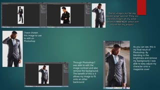
- 1. I have chosen this image to use to edit on Photoshop Through Photoshop I was able to edit the image contrast and also remove the background. The benefit of this is it allows my image to fit onto an other backround As you can see, this is my final result of Photoshop. By blending in the brightness and remove my background. I was able to easy adjust my character onto a magazine cover
- 2. In this picture I am cropping the image. The reason for this is it become more easier to take away the white background In this two image, I am colour correcting and adding brightness to the image To give a refine finish, I removed spots and bags under the eyes. This gives a professional look
- 3. In my spread I required columns so in the image I have correctly selected the type of layout i want, I done
- 4. For my double page spread, to ensure that I did not have multiple spelling mistakes and errors I initially wrote my piece onto word to eliminate this. Furthermore it was much easier to use as I would have simply copied and pasted my work onto InDesign This is a sample for the type of fonts that I used for my spread. I particurly chose this as it will give a great effect towards my action based magazine. I done this by downloading it from dafont then onvce placed into the nexus I was able to use it indesign Dafont served as an anchor for me to obtain all different style fonts. I was able to download it freely and place it in the nexus. Saved file of font
- 5. I stored all work for this assignment within my drive. The highlighted information is the work I completed on InDesign, and the other is my screenshots and peer assessment
- 6. This is the exported pdf file of my work, in which I incorporated different fonts to grab the audience attention I used highlighted arrow to convey the impression to keep reading on, which is engaging the audience Using pull quotes, helps engage the audience I added by- lines to give a professional finish
- 7. By understanding the form of my work. It was clear what I had to do. I added columns because double page spread has them, and it was also required of me. I added images to contrast the text. I conducted an interview . Which engaged my characters and the audience.
- 8. By adding puns. This made the spread interesting, furthermore this pun engaged the audience which is an effective tool to have. By unique page numbers it kept my work with a sense of formality and organised