
Recommended
More Related Content
What's hot
What's hot (20)
Similar to PHOTOS I DIDN'T USE
Similar to PHOTOS I DIDN'T USE (20)
More from lucyclaytonmedia
More from lucyclaytonmedia (20)
Recently uploaded
Recently uploaded (20)
PHOTOS I DIDN'T USE
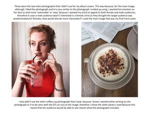
- 1. These were the two main photographs that I didn’t use for my album covers. This was because, for the main image, although I liked this photograph and it is very similar to the photograph I ended up using, I wanted her emotion on her face to look more ‘vulnerable’ or ‘sexy’ because I wanted my artist to appeal to both female and male audiences, therefore in case a male audience wasn’t interested in a female artist as they thought the target audience was predominately for females, they would also be more interested if I used the main image that was my final front cover. I also didn’t use the other coffee cup photograph that I took, because I knew I wanted either writing on the photograph or it to be seen with the CD cut out on the image, therefore I chose the other photo I used because this meant that the audience would be able to see clearer what the photograph included.