2. GOOGLE MOCK-UP| FRONT COVER
This is Taylor Swift’s Album cover for her release of
‘1989’. It is set out a bit like a Polaroid picture which
makes you think that the songs are going to be about
something in the past or memories, which fits in with
Taylor Swift’s façade of writing songs about past
relationships. This is minimalist and the colour scheme
is very neutral and is therefore appealing at first
glance and isn’t too heavy. I like the little use of text
and the fact it doesn’t state her name shows that
maybe her fan-base is so vast, people instantly
recognise her work. For my real Digipak, I will use my
artists full name to promote her as independent.
This is my google mock-up front cover Digipak. As you can
see, I have followed the above conventions of being
minimalist. However, I have taken a darker approach in
regards to the colour scheme because I think she looks
very mysterious and that makes it alluring. I have used to
idea of a polaroid and created a white border alongside
the understated use of text to show the album name. I
followed colour scheme continuity throughout my google
mock-up Digipak.
3. GOOGLE MOCK-UP| SPINE
This is the spine for Taylor Swift’s new
album release ‘1989’. As you can see
it is very minimalistic, which I like as it
isn’t too fussy and over the top.
Therefore, the audience’s focus can
be primarily on the text-font.
Simplistic idea like these are good
because they’re easy and refined and
enable you to create a product on a
lower budget – which is what you
need for an independent artist.
I also like the colour scheme of black
on white with a hint of orange; this
collaborates well, as again, it is simple
yet definitive to the eye. You can
clearly see the record label, artist
name and the name of the album;
therefore, it’s really easy to read.
This is my final spine for my
digipak Google mock-up. As
you can see, I have stuck with
the simplistic theme of dark-
blue on white which also
coincides with the front cover
colour theme and back cover,
therefore keeping continuity
throughout the whole digipak
and making it visually
appealing. This also adheres to
my budget as colours are very
easy to manipulate, but good
photography can be very
expensive. Even though these
are google-found images, I
need to take this into account
for my final Digipak product.
4. GOOGLE MOCK-UP| BACK COVEER
The colours again on the back follow the conventions of
Taylor Swift’s album release of ‘1989’ and therefore,
when creating my own Digipak can take into account that
my front, back and spine all need to follow similar colour
schemes in order to look simple yet refined. I also like
how the photo of Taylor is out of focus and therefore
could be re-created by myself as it doesn’t look like it was
taken on a high-budget camera. Therefore it gives the
piece a raw, homemade feel and also creates a
connection with the audience that may not be as rich as
Taylor or other music producers.
For my Mock-up back cover, I have gone for an even
simpler design – taking the colour from the front
cover keeps continuity but is also easy to make look
like it is a part of the same Digipak. I have also taken
the most similar font-type to the ‘1989’ on the front
cover to make sure as a whole, the digipak makes
visual sense. Conventions such as the barcode, record
label and record label rights which need to be evident
on my final Digipak to make it look professional.
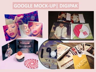
5. GOOGLE MOCK-UP| CD
This is Taylor Swift’s CD cover
for the release of her album
‘1989’. As you can see, it
shows continuity with the
front cover as it features the
picture on her jumper. I do like
this idea however it would be
very difficult to re-create due
to not as much advancement
in my creative photographic
techniques.
As you can see, for my google mock-up CDs, I have kept it
extremely simple but still taken the colour from the front and
back for the rim. This encloses the CD and gives it a more
professional look. As one would be the music video DVD and
one would be the soundtrack, I have differentiated them with
‘T.S.’ and ‘1989’ and not specified which is which to kept the
visuals sound. Not looking at practicality, more about how it
looks on a whole which I think you need in order to create a
successful product that people want to buy.
6. GOOGLE MOCK-UP| INSIDE
Taylor Swift Features 13
polaroids in her new album
release ‘1989’, this is good
because it’s an incentive to buy
the product knowing you get an
extra gift inside (a bit like a
magazine with a free gift). I
think this is a good idea when
promoting the album,
especially if it’s an independent
artist such as Marika Hackman.
This is my google mock-up of the inside of my Digipak. I have used the
idea of the polaroids but in a picture format. Primarily because I felt like
actual polaroids in every cd package could be quite expensive and
when catering for an independent or niche audience, expense isn’t
really an option as my budget is very low. Also, it is easy to Photoshop
polaroids, so for my final product, I could create shapes to place the
photographs in a polaroid setting. This also shows continuity between
the past and the present aspects of my music video. Also, the colour of
red was sampled from Taylor Swift’s red lipstick on the front cover,
therefore still keeping continuity with the correct colour scheme.