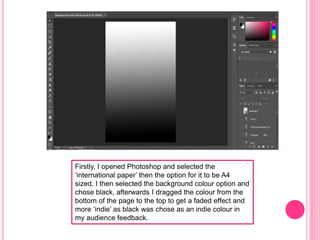
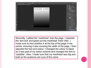
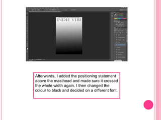
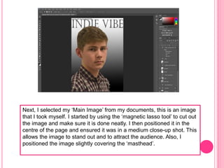
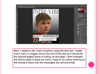
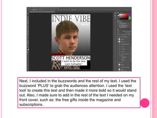
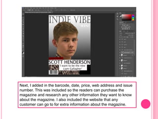
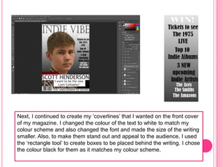
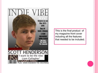
SCREENSHOTS OF FINAL MAGAZINE FRONT
COVER
Firstly, I opened Photoshop and selected the
‘international paper’ then the option for it to be A4
sized. I then selected the background colour option and
chose black, afterwards I dragged the colour from the
bottom of the page to the top to get a faded effect and
more ‘indie’ as black was chose as an indie colour in
my audience feedback.
Secondly, I added the ‘masthead’ onto the page. I selected
the ‘text tool’ and typed out the masthead ‘Indie Vibe’. I
made sure to then position it at the top of the page in the
centre, ensuring it was covering the width of the page. I then
adjusted the font and colour; I changed the colour to black
as it was part of my colour scheme and changed the font to
‘castellar’. Also, I made sure that my masthead was big and
bold so the audience are sure of the name.
Afterwards, I added the positioning statement
above the masthead and made sure it crossed
the whole width again. I then changed the
colour to black and decided on a different font.
Next, I selected my ‘Main Image’ from my documents, this is an image
that I took myself. I started by using the ‘magnetic lasso tool’ to cut out
the image and make sure it is done neatly. I then positioned it in the
centre of the page and ensured it was in a medium close-up shot. This
allows the image to stand out and to attract the audience. Also, I
positioned the image slightly covering the ‘masthead’.
Next, I added in the ‘main coverline’ using the text tool. I made
sure it was in a bigger size to the rest of the text as it should be
the second largest piece of writing on the page. I then changed
the font to make it stand out more. I kept to my colour scheme as
the writing is black and the rectangles are red and white.
Next, I included in the buzzwords and the rest of my text. I used the
buzzword ‘PLUS’ to grab the audiences attention. I used the ‘text
tool’ to create this text and then made it more bold so it would stand
out. Also, I made sure to add in the rest of the text I needed on my
front cover, such as: the free gifts inside the magazine and
subscriptions.
Next, I added in the barcode, date, price, web address and issue
number. This was included so the readers can purchase the
magazine and research any other information they want to know
about the magazine. I also included the website that any
customer can go to for extra information about the magazine.
Next, I continued to create my ‘coverlines’ that I wanted on the front cover
of my magazine. I changed the colour of the text to white to match my
colour scheme and also changed the font and made the size of the writing
smaller. Also, to make them stand out and appeal to the audience, I used
the ‘rectangle tool’ to create boxes to be placed behind the writing. I chose
the colour black for them as it matches my colour scheme.
This is the final product of
my magazine front cover
including all the features
that needed to be included.

Final screenshots for front cover

  • 1.
    SCREENSHOTS OF FINALMAGAZINE FRONT COVER
  • 2.
    Firstly, I openedPhotoshop and selected the ‘international paper’ then the option for it to be A4 sized. I then selected the background colour option and chose black, afterwards I dragged the colour from the bottom of the page to the top to get a faded effect and more ‘indie’ as black was chose as an indie colour in my audience feedback.
  • 3.
    Secondly, I addedthe ‘masthead’ onto the page. I selected the ‘text tool’ and typed out the masthead ‘Indie Vibe’. I made sure to then position it at the top of the page in the centre, ensuring it was covering the width of the page. I then adjusted the font and colour; I changed the colour to black as it was part of my colour scheme and changed the font to ‘castellar’. Also, I made sure that my masthead was big and bold so the audience are sure of the name.
  • 4.
    Afterwards, I addedthe positioning statement above the masthead and made sure it crossed the whole width again. I then changed the colour to black and decided on a different font.
  • 5.
    Next, I selectedmy ‘Main Image’ from my documents, this is an image that I took myself. I started by using the ‘magnetic lasso tool’ to cut out the image and make sure it is done neatly. I then positioned it in the centre of the page and ensured it was in a medium close-up shot. This allows the image to stand out and to attract the audience. Also, I positioned the image slightly covering the ‘masthead’.
  • 6.
    Next, I addedin the ‘main coverline’ using the text tool. I made sure it was in a bigger size to the rest of the text as it should be the second largest piece of writing on the page. I then changed the font to make it stand out more. I kept to my colour scheme as the writing is black and the rectangles are red and white.
  • 7.
    Next, I includedin the buzzwords and the rest of my text. I used the buzzword ‘PLUS’ to grab the audiences attention. I used the ‘text tool’ to create this text and then made it more bold so it would stand out. Also, I made sure to add in the rest of the text I needed on my front cover, such as: the free gifts inside the magazine and subscriptions.
  • 8.
    Next, I addedin the barcode, date, price, web address and issue number. This was included so the readers can purchase the magazine and research any other information they want to know about the magazine. I also included the website that any customer can go to for extra information about the magazine.
  • 9.
    Next, I continuedto create my ‘coverlines’ that I wanted on the front cover of my magazine. I changed the colour of the text to white to match my colour scheme and also changed the font and made the size of the writing smaller. Also, to make them stand out and appeal to the audience, I used the ‘rectangle tool’ to create boxes to be placed behind the writing. I chose the colour black for them as it matches my colour scheme.
  • 10.
    This is thefinal product of my magazine front cover including all the features that needed to be included.