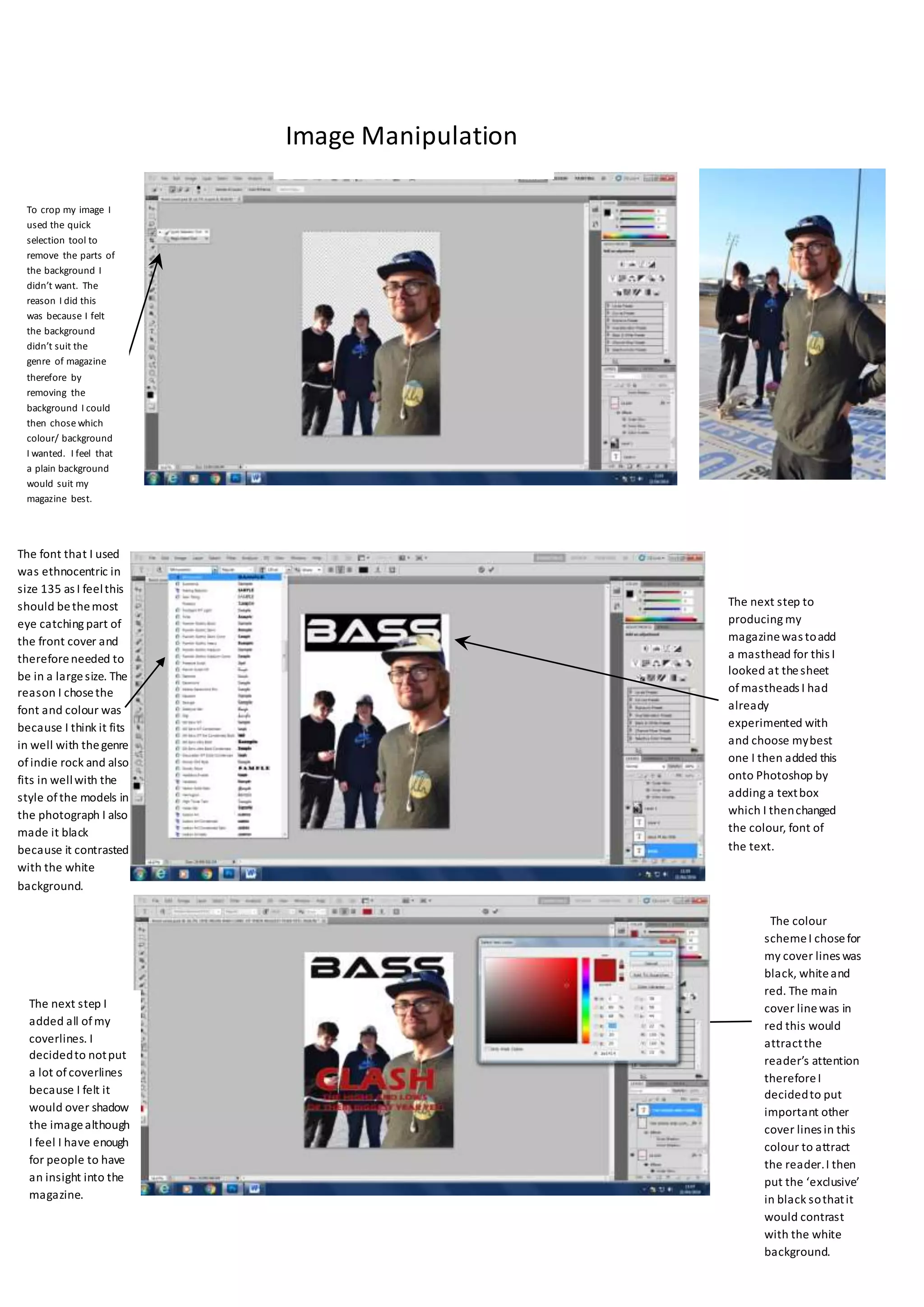
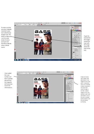
The font that I used
was ethnocentric in
size 135 as I feelthis
should bethemost
eye catching part of
the front cover and
thereforeneeded to
be in a largesize. The
reason I chosethe
font and colour was
because I think it fits
in well with thegenre
ofindie rock and also
fits in wellwith the
style ofthe models in
the photograph I also
made it black
because it contrasted
with the white
background.
The next step to
producing my
magazinewas toadd
a masthead for this I
looked at thesheet
ofmastheads I had
already
experimented with
and choose mybest
one I then added this
onto Photoshop by
adding a textbox
which I thenchanged
the colour, font of
the text.
To crop my image I
used the quick
selection tool to
remove the parts of
the background I
didn’t want. The
reason I did this
was because I felt
the background
didn’t suit the
genre of magazine
therefore by
removing the
background I could
then chose which
colour/ background
I wanted. I feel that
a plain background
would suit my
magazine best.
The colour
schemeI chosefor
my cover lines was
black, whiteand
red. The main
cover linewas in
red this would
attractthe
reader’s attention
thereforeI
decidedto put
important other
cover lines in this
colour to attract
the reader.I then
put the ‘exclusive’
in black sothatit
would contrast
with the white
background.
The next step I
added all ofmy
coverlines. I
decidedto notput
a lot ofcoverlines
because I felt it
would over shadow
the imagealthough
I feel I have enough
for people to have
an insight into the
magazine.
Image Manipulation
To make surethat
my colour schemed
matchedI useda
tool calledtheeye
dropper tool. This
helps to makesure
I use the same
shade ofredon
each part and
thereforemake the
colour scheme
match.
To get the
text behind
the imageI
moved the
layer with
the image
above the
layer ofthe
text.
Finally for the last
step I added small
adjustments to my
magazine front cover
which I used photo-
shop to do. I decided
to place a barcode in
the bottom left
corner to make it
look like a realistic
magazine and I also
decided to add small
information such as
the price so people
would be able to see
the price before
purchasing.
I then added
the issue
number and
date so people
who will buy
the magazine
will know how
recent the
information is.

Evaluation lottie

  • 1.
    The font thatI used was ethnocentric in size 135 as I feelthis should bethemost eye catching part of the front cover and thereforeneeded to be in a largesize. The reason I chosethe font and colour was because I think it fits in well with thegenre ofindie rock and also fits in wellwith the style ofthe models in the photograph I also made it black because it contrasted with the white background. The next step to producing my magazinewas toadd a masthead for this I looked at thesheet ofmastheads I had already experimented with and choose mybest one I then added this onto Photoshop by adding a textbox which I thenchanged the colour, font of the text. To crop my image I used the quick selection tool to remove the parts of the background I didn’t want. The reason I did this was because I felt the background didn’t suit the genre of magazine therefore by removing the background I could then chose which colour/ background I wanted. I feel that a plain background would suit my magazine best. The colour schemeI chosefor my cover lines was black, whiteand red. The main cover linewas in red this would attractthe reader’s attention thereforeI decidedto put important other cover lines in this colour to attract the reader.I then put the ‘exclusive’ in black sothatit would contrast with the white background. The next step I added all ofmy coverlines. I decidedto notput a lot ofcoverlines because I felt it would over shadow the imagealthough I feel I have enough for people to have an insight into the magazine. Image Manipulation
  • 2.
    To make surethat mycolour schemed matchedI useda tool calledtheeye dropper tool. This helps to makesure I use the same shade ofredon each part and thereforemake the colour scheme match. To get the text behind the imageI moved the layer with the image above the layer ofthe text. Finally for the last step I added small adjustments to my magazine front cover which I used photo- shop to do. I decided to place a barcode in the bottom left corner to make it look like a realistic magazine and I also decided to add small information such as the price so people would be able to see the price before purchasing. I then added the issue number and date so people who will buy the magazine will know how recent the information is.