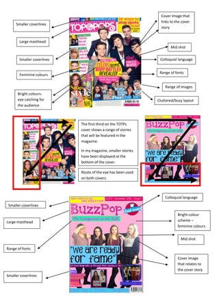
1. Cover Image that
links to the cover
story
Range of fonts
Range of images
Cluttered/busy layout
Smaller coverlines
Large masthead
Mid shot
Feminine colours
Bright colours-
eye catching for
the audience
Colloquial languageSmaller coverlines
Route of the eye has been used
on both covers.
The first third on the TOTPs
cover shows a range of stories
that will be featured in the
magazine.
In my magazine, smaller stories
have been displayed at the
bottom of the cover.
Colloquial language
Bright colour
scheme –
feminine colours
Mid shot
Cover image
that relates to
the cover story
Smaller coverlines
Range of fonts
Large masthead
Smaller coverlines
2. Large masthead
Editor’s letter
Columns to
categorise
features in the
magazine
Image of the
front cover
Colloquial language
Page numbers
Smaller related images
Front cover
image
Columns of the
magazines
contents
Editor’s letter
Subscription box
Page numbers
Large masthead
Colloquial language
Range of
bright colours
3. Pull quote
for the
headline
Standfirst to
explain the
article
Smaller image
to break up the
text
Q&A
format
Range of
fonts
Large
image of
featured
artist
Image
caption
Pull quote for the
headline
Standfirst to
explain the article
Smaller image to
break up the text
related to part of
the article
Q&A format
Range of fonts
Image caption
Large image of
featured artist