
Recommended
More Related Content
What's hot
What's hot (18)
Viewers also liked
Viewers also liked (18)
Similar to Identifying double page spread
Similar to Identifying double page spread (20)
Recently uploaded
Recently uploaded (20)
Identifying double page spread
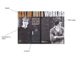
- 1. Header Main image 5 colums Introduction to article
- 2. Two columns out of six placed in the middle, the other four are replaced by the main image The main image is a mid shot of the band members The Header takes up a fifth of the page Picture black and white Text white and small6 columns, 2 used by text the others used by the main image Title white, orange and light Contents and double page spread Use of colour identifies the difference of both the orange text and the white text The introduction gives the reader a taste of what is in the article
- 3. Puff Masthead Main image (close up) Main cover line House style – red, white and black Front page-Identify
- 4. Front cover- Describe Frustrated face, close up due to main header The rest of the headers are squashed into the corners due to the close up as they would not put headers all over the close up Their house style colours are red, black and yellow. The colours contrast as yellow on red or red on yellow stands out Plug relates to the magazine . Picture relates to the header and interests the readers if they don’t like foo fighters or any of the other topics Text is large and worn which relates to the house style but also relates to the genre magazine as Kerrang also use a similar large worn font. The text is large as it is a main header and a selling point The tag line covered by picture as the front cover is that squashed.
- 5. The index has a list of bands and has the page number next to the band, this interests the read if they don’t like any of the bands featured in pictures The magazine has topics such as News and Reviews. The topics give the reader an idea where to find specific news story. The main image is in the middle of the page as it is the lead attraction and grabs the readers attention
- 6. The index has a list of bands and has the page number next to the band, this interests the read if they don’t like any of the bands featured in pictures The magazine has topics such as News and Reviews. The topics give the reader an idea where to find specific news story. The main image is in the middle of the page as it is the lead attraction and grabs the readers attention
Editor's Notes
- {"5":"","1":"","2":"","3":"","4":""}