Content magazine by Zigns 2015
•
2 likes•721 views

Magasine about content, trends and graphic design

Recommended
Recommended
More Related Content
What's hot
What's hot (20)
Viewers also liked
Viewers also liked (10)
Similar to Content magazine by Zigns 2015
Similar to Content magazine by Zigns 2015 (20)
Recently uploaded
Recently uploaded (20)
Content magazine by Zigns 2015
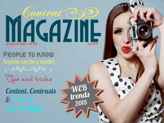
- 1. Magazine Content by Zigns 1st edition • RETRO Year2015 Content, Contrasts Cool graphic People to know Anyone can be a model øØ Tips and tricks WEB trends 2015
- 2. The rumour has it ...Tools to create great Content Know these names Joe Pulizzi Ann Handley Seth Godin Jonah Berger Consider developing Podcasts Movies E-books (singles and whitepapers) Apps Learn these abilities Storytelling in writing SEO friendly copy writing News feed writing Show don’t tell techniques Master at least 3 of these platformes Facebook LinkedIn Instagram Pinterest Twitter A blog An e-mail marketing solution Understand these tools Personas Viral marketing Strategic planning Content curation Social selling
- 3. Web trends 2015 Flat design No shadows or highlights in icons. No‘plastic’or glass look. Icons are full, rich coloured and so are backgrounds. Full screen pictures This looks amazing when the right photo or picture is used. Don’t over do it, as it is heavy for both eye and download rate. Mobile and tablet focus It’s not really necessary to say, but no one with a serious business can do without responsive or mobile friendly web designs anymore. 1-page design For the last 2-3 years everything important has been‘above the fold’. This is changing as more web sites are looong and scrollable. 1-page design is a consequence of mobile friendly design.The smaller menu, the easier it is to use. 1-page design is cut into chunks of information by graphics, full screen pictures and colour blocks. Parallax scrolling A new way of making 3D feels on backgrounds. Parallax is based on HTML5 and CSS3. No longer any need for Flash sites. See 5o beautiful sites here:http://www.creativebloq.com Card design You know, like Pinterest. Small boxes of graphic and short information. This way of presenting different subjects is highly visual and easy on the eye.
- 4. Content Marketing – this is what you have Writing Tell a simple story Make it valuable Make it relevant Make it clear Talk to 1 person Tell the truth Check your spelling and grammar Text On Blogs On Facebook, Google+ and Twitter In white papers and e-books In e-magazines and articles In forums and for Public Relation . On Blogs On Facebook, Instagram and Pinterest For e-magazines and e-books For LinkedIn, Google+ and e-news For Flickr, Tumblr etc. Composing Use photos Use infographic Use technical drawings and sketches Use icons Use good quality selfies Do still compress for fast loading. Use colours to match your own design. Don’t steal from the internet, but use Canva for instance Movies Use Youtube, Google Hangouts, Vimeo or similar Make videos of stills Make educational videos with yourself Make animations Record conferences Record and share webinars Or combine the above Make sure the sound is immaculate Make videos no longer than 3 minutes unless it is educational - Make Podcasts Make music Read aloud Make sound-bits for movie effects (thunder, dog barks etc.) Share sound-bits for information (sound of a Starling etc.) Text Graphic Video Sound
- 5. There is NO MORE selling! Only helping and providing service. Teach yourself more about: { push and pull sale } { storytelling } { social selling }
- 6. Using contrasts in graphic design Rules: • There can never be more than 1 focus per page • All other things must be less important and ordered according to that • Using contrast shows your viewer what’s important and what to pay attention to Contrast can be made of: • Form (circles to squares, triangles to organic and so on) • Size (small to big) • Numbers (few to many) • Colour (light to dark, warm to cold, strong to faded etc.) • Placement (top to bottom, right to left etc.) If there is no contrast, it’s a so called ‘wallpaper’ effect. This is best as ... wallpaper and backgrounds. Colour contrast but also light dark contrast. The light green circle is definitely the one getting our attention. Form contrast. We see the circle immediately. Size contrast. The bigger square jumps out from all the small ones. The bigger square is also the only one, which emphasises the contrast by its number. The pictures uses placement contrast. There is nothing above the girls head, but a lot is going on on the floor. To further strengthen the attention to the records, the girls is looking down.
- 7. Anyone can be a model Before 10yearsyoungerafter1hourinPhotoshop DOVE are very good at showing us, what photo manipulation is about. That is great, viral content. See the Body Evolution here: www. youtube/dove Wrinklesgone Aminoreye-lift Makeupandhighlight This photo was taken with a smart phone in a pretty bad light. Tools used in Photoshop: Healing Brush for wrinkles Filter Liquify for eye lift Brushes for make up Burn tool for shadows Dodge tool for highlights And a stolen hairstyle and dress Just for fun ...
- 8. Starting the strategy 1, 7, 30, 4, 2, 1 1 What you must publish every day? Perhaps Facebook, Instagram, Twitter 7 What you must publish every week? LinkedIn, Google+, Pinterest, blog post? 30 What you must publish once a month? LinkedIn, blog post, film, podcast? Remember all the above is just suggestions. Add whatever platform suits your business 4 What you must publish quarterly? Blog post, reports, whitepaper, film? 2 What you must publish every six months? E-books, whitepaper, film, updated homepage? 1 What you must publish once a year? Reports, e-books, whitepaper, updated home- page? Curation: For every 1 post you make with your own content, you should share 4 other peoples content and comment at least 6 other peoples posts wisely. You have to give and share, to be shared yourself.
- 9. Final words I’ve been working with graphic design for almost two decades. I love good graphic and I’m a geek when it comes to typography. And since I was a child, I’ve been writing stories. Short stories and novels. A bunch of stories were in my head for many years, until in 2008 when I started to write for real. I wrote five novels for my desk drawer, before I finally published a book. Actually two. One non-fiction and one fiction. I nourish on words. I devour anything related to the writing process as I find it interesting and exiting on a thriller like level. As Danish is my native language, I may slip in the English grammar or punctuation. I hope you’ll forgive me for that. Being able to combine graphic design with writing in Content Marketing seemed like a dream come through, and therefore my heart is with the online media and it’s possibilities. Nothing has ever made more sense than adding service and sharing your expertise with your customers. Join me in that! About the front page Using typography as graphic elements can work very fine. But don’t do it when you are actually writing serious text. Stick to one or two fonts and use them wisely. That’s all for now, folks. See you in cyberspace. ZignsGrafik, tekst og Content Marketing Kim Hansen Møllevej 4 5792 Årslev Tlf.: 28 43 37 38 info@zigns.dk www.zigns.dk Stick with me: Facebook.com/zignsDK instagram.com/#zignsdk google.com/+ZignsDk Youtube.com