
Recommended
More Related Content
What's hot
What's hot (20)
Viewers also liked
Viewers also liked (20)
Similar to Photography for my Front Cover
Similar to Photography for my Front Cover (20)
More from khalfyard
More from khalfyard (20)
Recently uploaded
Recently uploaded (20)
Photography for my Front Cover
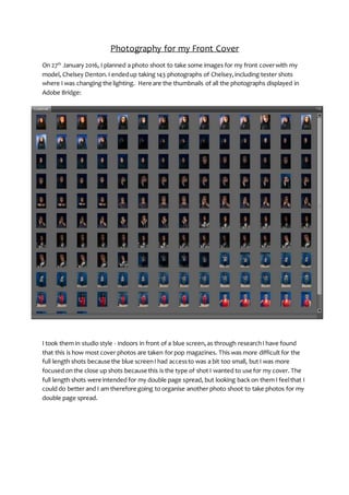
- 1. Photography for my Front Cover On 27th January 2016, I planned a photo shoot to take some images for my front coverwith my model, Chelsey Denton. I endedup taking 143 photographs of Chelsey,including tester shots where I was changing the lighting. Here are the thumbnails of all the photographs displayed in Adobe Bridge: I took them in studio style - indoors in front of a blue screen,as through researchI have found that this is how most cover photos are taken for pop magazines. This was more difficult for the full length shots because the blue screenI had accessto was a bit too small, but I was more focused on the close up shots because this is the type of shot I wanted to use for my cover. The full length shots were intended for my double page spread, but looking back on them I feelthat I could do better and I am therefore going to organise another photo shoot to take photos for my double page spread.
- 2. These are some of the first photographs I took of Chelsey, where I am playing with the different lighting techniquesI learnt about prior to the shoot to see which ones suited her face the best. As you can see from the above photographs, the soft lighting made Chelsey look orange and therefore I quickly decidednot to use this type of lighting in the shoot anymore. When trying out the different lighting techniqueswith the hard lights, I discovered that it was difficult to light Chelsey’sface because her hair is so big and fluffy that her hair created shadows, or looked ‘see through’, so it took me a number of test shots to achieve what I wanted to. The hard lights were the only light source I used – I had no natural lighting and the big lights of the room off to create the striking photos that I wanted to. In these photographs I am still playing around with lighting to try and eliminate the light shining through herhair on the left hand side of her face. The lighting technique I was trying to achieve was split lighting, as it is a bold and effective technique often used by musicians. Furthermore, I
- 3. am also playing around with Chelsey’spositioning – more specifically her distance from the camera – to see which framing was most effective, bearing in mind the image will be placed on the A4 cover of my magazine. In these photos I am playing around with Chelsey’spositioning evenmore, and adjusting the lighting and framing for eachshot as I go along. I have based her positioning on other photos on the covers of music magazines similar to the genre I am creating such as these:
- 4. The above images are some of the full shots I took of Chelsey. Theyshow how I have changed her body positioning and outfits, and also the framing of the shot. However,I am not happy with the results as you can see the outline of the blue screen and therefore I am going to organise another photo shoot to take photos for my double page spread. Also, from looking at these photographs I have realised that I needto make them based around music more, as she is a pop star, not a model so this is something I will consider when planning my nextphoto shoot for my double page spread.
- 5. Again, these images demonstrate how I changed Chelsey’sbody positioning to try out new things. This position with herhands crossed is something I came up with myself as I felt it was bold and eye catching, but it turned out not to be the most effective photograph, partly because of her plain, dark top, but also because the lighting in this position caused some shadows on her face.
- 6. The above photos show me adjusting the frame to create a close up that would fill the whole of an A4 page for the cover of my magazine. I feelthat the second photo is far more effective because it fills the whole frame better,and the audience can see Chelsey’s facial expression far more clearly. It also resemblesother examplesof pop magazine covers that I have seen before more. The positioning is inspired by the Grace Jones coverfeatured above, but I have put my own twist on it. Chelsey’shands are up against both sides of herface to frame her face and attract the audience’sgaze to her facial expression,as herfacial expression is essential to the composition of the shot. This is one of my favourite photographs from the shoot. I like Chelsey’spositioning, facial expression as it is serious, and her fixedgaze on the camera. She gave me exactly what I asked for. I also feelthat her 80s style fur coat contributes effectivelyto the mise enscene and the texture and white colouring provides something more interesting and vibrant for the audience to look at. However, as her hair is in front of her face slightly to frame it, there is some shadowing on the photograph. I noticed this at the time and tried to eliminate the shadows by repositioning her hair and body angle:
- 7. However,I was unable to completely eliminate the shadows and I feel that the photograph from this angle is slightly less effective.Totackle the issue of Chelsey’shair creating shadows, I asked her to put her hair up.This was planned prior to the shoot and so Chelsey was prepared for this. These photographs demonstrate the change in her hair styling: In the end these are the photographs I came up with in the end:
- 8. In these photographs there aren’t any problems with shadowing as Chelsey has herhair up, and I have used what I learned about effective framing from other photographs I took and reviewed earlier on in the shoot to make Chelseyfill the frame. Furthermore, I have used the hand positioning that I felt worked best earlier on in the shoot because it draws the audience’sgaze to where I want it to be – on her face.I am also happy with Chelsey’sstyling in this photograph. I think that the red jumpsuit is effective because it is bright and vibrant and will attract the audience’sattention, and it will also fit in with the bright and vibrant nature of 80s fashion, demonstrating how ChelseyDenton,the up and coming pop star, has beeninfluencedby the 80s, making my photographs fit my genre. This is the photograph I am going to use for my front cover: