Analyzing Film Posters for Effective Visual Storytelling
•Download as PPTX, PDF•
0 likes•221 views


Recommended
More Related Content
What's hot
What's hot (19)
Similar to Analyzing Film Posters for Effective Visual Storytelling
Similar to Analyzing Film Posters for Effective Visual Storytelling (20)
More from Harry Hancock
Recently uploaded
Recently uploaded (20)
Analyzing Film Posters for Effective Visual Storytelling
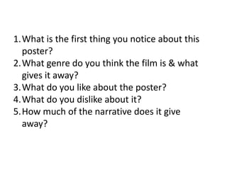
- 1. 1.What is the first thing you notice about this poster? 2.What genre do you think the film is & what gives it away? 3.What do you like about the poster? 4.What do you dislike about it? 5.How much of the narrative does it give away?
- 2. Anatomy 1 • • • • The body The body The body Names of actors 4 • • • • None Bottom half, disjointed Boring yellow 2 • • • • Horror - body Crime - body Horror – body Thriller – jagged lines 5 • • • • 3 • • • • The word placement Type, body, simplicity Top half Colourful Very little None – that’s bad General Not much, could use more
- 3. Elizabethtown 1 • • • • Main picture Guys face – orlando bloom Main picture Business of it 4 • • • • 2 • • • • Romcom Comedy/romance Teen romcom Fun, romance Too hectic & cheesy – tries to hard No dislikes None All of it 5 • • • • 3 • • • • Too much General plot Quite a lot Not too much Bright, looks fun None Like pictures That there is a central image among the collage
- 4. Jaws 1 • • • • 2 • • • • Shark Shark Shark title 4 • • • • Horror – shark Horror – shark Horror – red writing horror Tagline Person looks fakes Shark Love it all 5 • • • • 3 • • • • Yes obvious Quite a lot A lot Main point of film good Colours Title Colour contrast White/blue - simple font
- 5. Drive 1 • • • • 2 • • • • Hammer Tagline Car hammer 4 • • • • None Plain Title not obvious none 3 • • • • Action Action Action thriller 5 • • • • Almost none Not much None – good mystery none Tagline Colour contrast Simplicity clever
- 6. Vertigo 1 • • • • Spirals Red Nothing Central image 4 • • • • 2 • • • • Sexist poster Patterns Red dot Plain, no point Mystery – disorientating typeface No idea Crime – stabbing Romantic thriller 5 • • • • 3 • • • • Colours Colour Don’t like Colour font hand drawn Nothing None – good mysterious Nothing good Don’t give anything away
- 7. RESULTS • People didn’t like confusion, for example Vertigo was ‘disorientating’ and too ‘red’ • The liked simplicity, Elizabethtown was ‘too hectic’ • The most liked poster was Drive which was simple but used a clever double image • Obvious titles are important, Drive & Anatomy have unclear titles • People liked the simplicity of Jaws, its clear contrasting colours and hint at the storyline
- 8. OUR POSTER SHOULD BE • Simple but interesting, perhaps a double picture meaning • A clear title • Not too cluttered or cheesy • Clear of the film genre – social realist/arthouse • Not unclear text, things need to obvious enough