
Recommended
More Related Content
What's hot
What's hot (20)
Viewers also liked
Similar to Magazine Contents analysis
Similar to Magazine Contents analysis (20)
More from 10marmir
More from 10marmir (7)
Recently uploaded
Recently uploaded (20)
Magazine Contents analysis
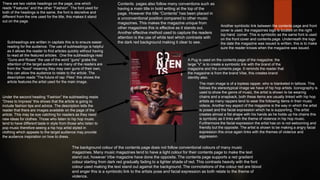
- 1. Contents pages also follow many conventions such as having a main title in bold writing at the top of the page. However the title “Contents” has been placed in a unconventional position compared to other music magazines. This makes the magazine unique from other magazines this is effective as it stands out. Another effective method used to capture the readers attention is the use of white text which contrasts with the dark red background making it clear to see. A Pug is used on the contents page of the magazine; the large “V” is to create a symbiotic link with the brand of the magazine and the contents page. It reminds the reader that the magazine is from the brand Vibe, this creates brand identity also. Another symbiotic link between the contents page and front cover is used, the magazines logo is located on the right top hand corner. This is symbiotic as the same font is used on the front cover and contents page. Underneath the logo the date the magazine was issued is written, this is to make sure the reader knows when the magazine was issued. The main image is of a topless rapper, who is blanketed in tattoos. This follows the stereotypical image we have of hip hop artists. Iconography is used to show the genre of music, the artist is shown to be wearing chains and a snapback, both these items are usually linked with hip hop artists as many rappers tend to wear the following items in their music videos. Another key aspect of the magazine is the way in which the artist is posed and the facial expression which he is supporting. The artist creates almost a fist shape with his hands as he holds up his chains this is symbolic as it links with the theme of violence in hip hop music. Furthermore the facial expression the artist has on is not welcoming and friendly but the opposite. The artist is shown to be making a angry facial expression this once again links with the themes of violence and aggression. The background colour of the contents page does not follow conventional colours of many music magazines. Many music magazines tend to have a light colour for their contents page to make the text stand out, however Vibe magazine have done the opposite. The contents page supports a red gradient colour starting from dark red gradually fading to a lighter shade of red. This contrasts heavily with the font colour used making the text stand out against the background. The connotations of the colour red are blood and anger this is a symbiotic link to the artists pose and facial expression as both relate to the theme of violence. There are two visible headings on the page, one which reads “Features” and the other “Fashion”. The font used for both of the headings is the same, the font is decretive and different from the one used for the title, this makes it stand out on the page. Subheadings are written in capitals this is to ensure easier reading for the audience. The use of subheadings is helpful as it allows the reader to find articles quickly without having to read all the featured articles. One the subheadings read “Guns and Roses” the use of the word “guns” grabs the attention of the target audience as many of the readers are from the “hood” meaning they may own guns of their own, this can allow the audience to relate to the article. The description reads “The future of rap: Piles” this shows the article features the artist used for the main image. Under the second heading “Fashion” the subheading reads “Dress to Impress” this shows that the article is going to include fashion tips and advice. The description tells the reader that there are images available on the page of the article. This may be eye catching for readers as they need new ideas for clothes. Those who listen to hip hop music tend to have different taste in style from those who listen to pop music therefore seeing a hip hop artist styled in clothing which appeals to the target audience may provide the audience inspiration on how to dress.
- 2. General layout : The layout of XXL is different from vibe magazine but is still highly effective as it contains all the information on the left hand side of the page, it is more effective than Vibe magazine as it displays more information and details . The featured articles are displayed on the left hand side making it easier to read with the main image on the right hand side. Mast Head: Instead of naming the page “contents” it is names “The A-Side” this is to create originality and make the magazine feel exclusive. The magazine only has this title this enables the reader to identify which magazine they are reading. The use of the red colour in between the black contrasts with the rest of the writing drawing the readers attention towards it. The logo : which was visible on the front page is also made visible on the contents page. The XXL logo is situated at the top right hand corner in a smaller font than the mast head. The use of the logo on the contents page is symbiotic as it links to the front page creating brand identity, Heading : The word “Features” is used as a heading, the font is decretive and different from the one used for the masthead, this makes it stand out on the page. The heading uses bold red brackets to make it stand out against the dark black colours on the page. Symbol : The use of the red fast forward button at the bottom left hand corner symbolises that there is more information on the next page. This is an effective method as many of the readers will recognise the button as it is well known. Contents: The main content or information has been placed on the left side of the page, this leaves room for the main image on the right. This is effective as all the content is designated on one side making it easier to read and find. The use of capital letters and bold font makes the subheading stand out implying that these are key features or stories that the magazine will include. Furthermore the page numbers are also made in bold to make them stand out against the writing allowing readers to identify certain pages at ease. In between the content on the left the use of a black rectangle is placed as a divider. This is an effective method as It makes it easier for the reader to digest information, as it creates the impression of less text on the page. Contents: The main cover story heading is larger in font compared to the other stories. This is to ensure quick access to the main story as many readers will have purchased the magazine in order to read the main story. Main Image: The main image is of two well known rappers(50 Cent & Soulja Boy) the use of well known artists is key as it attracts readers attention and also appeals to the target audience of XXL. In addition the positioning of the two rappers is shown to be back to back this links with the sell quote “ If there wasn’t no 50 Cent there would be no Soulja Boy.” This shows the close bond with one another. Furthermore the use of a sell quote from one of the rappers is enticing as it leads to readers wanting to find out more. The costume both rappers are wearing is conventional for there genre as the are expected to dress “Hood”. The use of items such as a gold chain, rings and also a snapback is a use of iconography as it is a representation of the genre Colour Scheme: The general colour scheme is red, white and black with the exception of the grey background. The use of colour is simple yet highly effective, the colours used for the page are also the key colours of the logo. The red is bright and bold colour contrasting with the background and black and white font. This attracts the audience.