
Recommended
More Related Content
Viewers also liked
Viewers also liked (18)
More from hannahwood88
Recently uploaded
Recently uploaded (20)
Rihanna – ‘loud’
- 1. Rihanna – ‘Loud’ Digipack Analysis
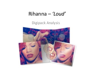
- 2. The resting point for the eye is the bold red lips. They are surrounded by a contrasting beige colour allowing them to stand out No eye contact is used from the artist; she is looking down which could be suggesting a relaxed nature or on the other hand, an unnerved, restrained attitude. Typography is a huge contributor to the overall look of this page. The simple yet effective font is used to print the two words, Rihanna and Loud in the colour white. The colour red has connotations of sex and love. Her face is heavily made up and her hair is perfectly styled; The photo oozes sex appeal, catching the audiences attention. The house style of the colour red is maintained throughout the page as the red hair bordering the image ties with the lips in the centre There is a classical structure to the image as the face is centred. No other objects are obstructing it, giving no distractions or other view points Front
- 3. The background is a bed of roses; green leafs with scattered roses adding pops of bright red colour. This flower choice contributes to the red house style, making the colour a common theme throughout the digipack. Inside The same person is printed inside as on the cover, the artist, Rihanna. However, this shot inside contrasts hugely with the front cover image. This is a medium long shot where as the cover is a close up, here we can see more of her outfit to get a bit more of a feel for the artist. Roses flowers and the colour red have connotations of love which may tease the style of the music inside. Just like on the front cover Rihanna is not looking at the camera, her head is tilted away and eye contact is avoided. This could portray shyness however her sexual fashion style contrasts with this as it is very forward. I think that her flowing dress and relaxed laying down stance portray a princess-like status, she appears to be comfortably dreaming, this may have reference to some of the songs on the album.
- 4. Back The colour red is again, continued on this back page. Red is a bold striking colour which has connotations of ‘Loud’ which is the album title, the style is very complimentary. Here we can see the first full length shot of Rihanna and she is in a different outfit. The clothing coverage is very minimal and a lot of skin is shown. This has sexual connotations to attract the audiences attention. The light red/pink colour tones are a lot softer on this page and this may be because the audience must read the important track listing here. Less vibrant colours are unlikely to disrupt the audience reading and makes it easier for them to concentrate. There is almost blank space behind the text track listing making it stand out more and easier for the audience to read. All text is placed on the right hand side which makes the cover neatly organised and easy to navigate. The typography is the same font as on the front cover which sticks to the house style.