Hybridoma Technology ( Production , Purification , and Application )
In what ways does your media product use
1. In what ways does your media product use, develop or challenge forms and
conventions of real media products?
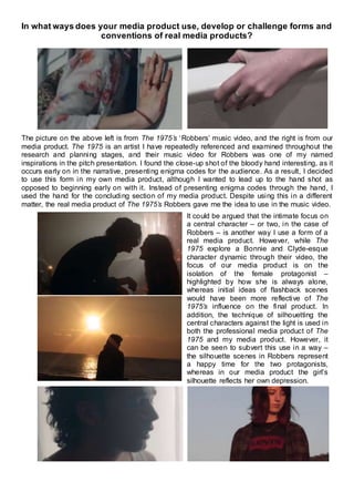
The picture on the above left is from The 1975’s ‘Robbers’ music video, and the right is from our
media product. The 1975 is an artist I have repeatedly referenced and examined throughout the
research and planning stages, and their music video for Robbers was one of my named
inspirations in the pitch presentation. I found the close-up shot of the bloody hand interesting, as it
occurs early on in the narrative, presenting enigma codes for the audience. As a result, I decided
to use this form in my own media product, although I wanted to lead up to the hand shot as
opposed to beginning early on with it. Instead of presenting enigma codes through the hand, I
used the hand for the concluding section of my media product. Despite using this in a different
matter, the real media product of The 1975’s Robbers gave me the idea to use in the music video.
It could be argued that the intimate focus on
a central character – or two, in the case of
Robbers – is another way I use a form of a
real media product. However, while The
1975 explore a Bonnie and Clyde-esque
character dynamic through their video, the
focus of our media product is on the
isolation of the female protagonist –
highlighted by how she is always alone,
whereas initial ideas of flashback scenes
would have been more reflective of The
1975’s influence on the final product. In
addition, the technique of silhouetting the
central characters against the light is used in
both the professional media product of The
1975 and my media product. However, it
can be seen to subvert this use in a way –
the silhouette scenes in Robbers represent
a happy time for the two protagonists,
whereas in our media product the girl’s
silhouette reflects her own depression.
2. With the exception of the bottom left
digipak, all of the indie rock digipak
back covers are a darker colour than
my final product, most likely
indicative of the genre as a whole.
However, Bastille’s back cover is
another that focuses on light behind
the song names, which is something I
wanted merely because it is the
setting of our music video and
therefore shows synergy throughout
all of our media products.
By not showing instruments in our media product, a link could be made (again) to The 1975’s
Robbers, where the lead singer only sings through a microphone to the girl, not with instruments.
All of this is still within the narrative, as it appears to the audience as if he is singing karaoke or
merely playing around with his girlfriend, and keeps the focus on the central protagonists.
I have also followed the conventions of indie rock digipaks through the simplicity of the final back
covers (that is, the listing of the songs on the album and not a complicated image to focus on). The
four images above are all examples of real media products from different artists within our genre.
Arguably the most significant out of the four is the artist we are using a song for in our music video
– Imagine Dragons is the top image on the left. I didn’t want anything too intricate for the back
cover of our media product digipak, and have therefore used this convention in my final product,
pictured below, as it didn’t provide a distraction from the information.
I have also challenged the indie rock convention of
showing instruments within the video; while rock
videos tend to either be focused on performance (with
rock instruments included or the visage of a live
performance) rather than narrative, or combine both,
my final media product does not show a guitar or a
drumkit at any point – instead, it keeps focus on the
central character. And the performance scenes we do
include all take place within a studio, rather than an
indie rock setting. This challenges one of the many
conventions of indie rock videos.
3. Our media product has also used the form explored
in Pink’s official video for ‘Perfect’, using the
medium to tackle darker ideologies of depression as
opposed to using it merely for music. The strong
narrative focus is something we wanted to use in
our music video from the beginning, and while
Pink’s music is not in our chosen genre, it could be
argued that there is still a link that can be made
between the similar ideologies being represented.
Both characters, in the chosen screenshots to the
right, are shown as being depressed through the
smeared mascara and the bleak expressions.
To some extent, it could also be suggested that
our front cover has elements of the form that
The 1975 uses – that is, keeping the artist
faceless from the potential consumer. However,
The 1975’s album cover for their digipak holds
no image at all, only stage-lit rectangle with
their name. This implies that they are either
recognisable to their chosen target audience, or that they just chose a simplistic front cover. Our
front cover does keep the artist faceless, but there is still an image for a consumer to focus on –
the girl is facing away from the audience and to the light, referencing various scenes in the video.
Our front cover is simple in a similar way – the main focus is
on the typography, which is emphasised by the dark silhouette
of the girl as she faces away from the camera lens. The light in
front of her, from the sun and the calm waves, is focused on in
the music video at several points. We felt that using one of the
central settings of the music video for the digipak reinforced
synergy throughout, despite being perhaps overly simplistic.
I have also used the convention of adding a black and white effect in post-production. However, I
have only used this form for the performance sections of the media product, and by placing it
through these lip-synching scenes it adds a contrast to the bright and dark of the rest of the video –
amplified by the concluding shot of the beach overlaying and cross dissolving with the black and
white image of the girl looking up. The black and white shots are not as dark as indie rock
conventions usually show, and have a blue-ish hue to them rather than simple black.