1. As I have decided to design and make a poster to advertise my
newspaper I need to research some other newspaper posters to help
me with mine.
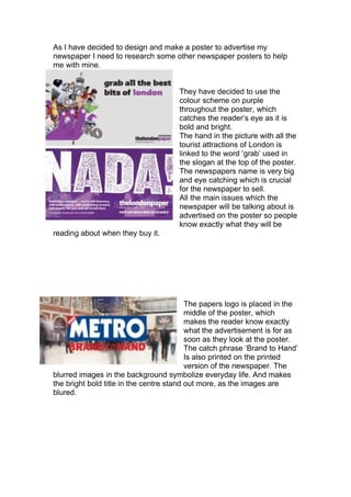
They have decided to use the
colour scheme on purple
throughout the poster, which
catches the reader’s eye as it is
bold and bright.
The hand in the picture with all the
tourist attractions of London is
linked to the word ‘grab’ used in
the slogan at the top of the poster.
The newspapers name is very big
and eye catching which is crucial
for the newspaper to sell.
All the main issues which the
newspaper will be talking about is
advertised on the poster so people
know exactly what they will be
reading about when they buy it.
The papers logo is placed in the
middle of the poster, which
makes the reader know exactly
what the advertisement is for as
soon as they look at the poster.
The catch phrase ‘Brand to Hand’
Is also printed on the printed
version of the newspaper. The
blurred images in the background symbolize everyday life. And makes
the bright bold title in the centre stand out more, as the images are
blured.