
Recommended
More Related Content
More from Fran Orton
More from Fran Orton (20)
Recently uploaded
Recently uploaded (20)
editing old john
- 1. *
- 2. *
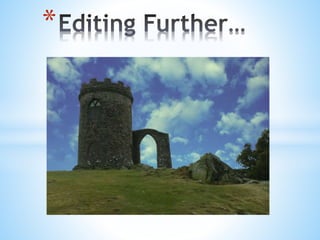
- 3. • The image was too big and would not look right on the front cover • There were still white areas that needed to be edited off • The grass looked quite dull and needed brightening up *
- 4. So I cropped the whole image and deleted the trees from the shot - It is far more rectangular now and will be easier to place into the front cover *
- 5. I edited the image further and made sure there was no white in the places I found. Now the grass looks a lot healthier and looks better in contrast to the sky. I also duplicated a few layers in order to put a brown tint on the rock, I did the same to Old John and put an orange tint on top of that. Now the whole image looks vibrant and looks very effective compared to the first image. *
- 6. *
- 7. *
- 8. *