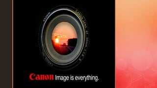
SlideShare a Scribd company logo
1 of 21
z
z
Canon Project.
Post Production.
Magazine Cover.
z
Canon Project.
Post Production.
Magazine Cover.
The reason why I picked this picture over
others which I took is because I feel like this fits
the brief better as it shows the journey. It shows
this because the light shining on the actor
shows the possibilities in the future because of
the journey. It shows the mystery where the
journey can take you if you pick up the camera
and start the journey. Also the actor matches
with the audience age range so this should
inspire my audience to be like the actor and
start the journey it also shows that my audience
will have the hope and possibilities (shown in
the light) because they can be like the actor.
z
Canon Project.
Post Production.
Magazine Cover.
The first stage of my editing for my magazine cover
was color/photo filter or tint. I experimented with many
different colors but found that blue was the best. This
is because the original light that was already there
looked good however it wasn’t bright enough and
count really tell what it was however with the blue it
made it stand out more and also in my opinion it
almost looks like the moon in shining on him and gives
that mysterious effect. I wanted to portray this effect
because it suggest that your journey will be
mysterious and it’s a mystery where your journey can
take you so the blue tint helps me achieve this. I
wanted this effect as I believe the mysteriousness will
make my client intrigued and want to read the news
paper cover which is my main focus. I turned the
density up to 75% this is because I wanted the blue to
stand out but also look realistic and not take over the
full picture so 75% had the best balance and the blue
only really affected the white light which is my aim.
z
Canon Project.
Post Production.
Magazine Cover.
Next I adjusted the brightness and contrast. First I
adjusted the brightness to -10 I did this because it
actually makes the main image stand out more as it
darkness the background mainly and also it helps dims
the blue tint so it looks more realistic and makes it looks
like the moon or something mysterious is shining on him.
After that I adjusted the contrast to -15 this helps the
image stand out because as the light is shining on the
main part of the image when I take the brightness down it
makes the light contrasts against the brightness to the
light stands out more so because of this the actor stands
out more and looks more detailed and high quality. Good
quality is a big factor for me as canon is a big company
so needs to maintain that high standards of producing
good images with the cameras. I deiced to make the
image stand out more so it is eye catching and the
audience can look at the magazine and it pops out
straight away and makes them grab it which will help
achieve my goal of getting my client more clients.
z
Canon Project.
Post Production.
Magazine Cover.
For this stage of my advert was making sure the
vibrancy and saturation was perfect. I ended up
changing the vibrancy to +50 this was because it
brought out the facial features of the actor a bit more
and made him look higher quality and more detailed.
Also it brought the blue out of the light as well so it give
it a nice glow effect on the lighting. This glow effect adds
to the meaning behind the advert of that your journey is
mysterious and canon cameras and being creative can
take you anywhere. The saturation also did a similar job
to the vibrancy but it had more of the effect on the blue
that’s why I only changed it to +15 as the blue isn’t
meant to look too blue and is supposed to just look like
a slight glow on the white light. As well as the blue the
saturation also had a effect on the actors face as it
brought the colors out as well so the actors face didn’t
get sucked into the background and still stands out so
the main image is still eye catching.
z
Canon Project.
Post Production.
Magazine Cover.
At this point I was finished editing the original
image as I was pleased how it looked and it was
now time to add text and more detail to the advert.
I started with the main text/title. For a magazine
advert it needs a big title to stand out and show
what it is about so I did this however I didn't want
it to cover the image and the actors emotion as I
wanted to convey meaning with his emotion so if it
was covered up then it is pointless. To make sure I
got the right balance between big stand out text
and getting all the image was to put some of the
text behind his head. To do this I first duplicated
the image and made a copy of it. Next I used the
polygonal tool to cut around the top of the actors
head where the text would go. I then got rid of that
and put my text underneath the duplicate layer but
above the original layer and then it was behind is
head but also standing out and it looked perfect.
z
Canon Project.
Post Production.
Magazine Cover.
I was now happy with the positioning of the text however I
thought it looked a bit boring and didn’t stand out which is a
big part of a magazine advert so to change this I added
some color which one stood out but also fitted with my
advert. I choose a royal blue but to use a gradient. To do
this I used the gradient overlay tool which is selected the
range of gradient I wanted so from white slowly up to blue.
Then I choose the angle I wanted the gradient at. For this I
choose -85 as it matches the direction the light is shining in
so the blue light coming into he image also looks like its
reflecting onto he text and I really like how it looked at this
angle. I experimented with other colors but as blue is a
primary color it means the eye is naturally attracted to this
colored light so as a result it means it will stand out even
more than any other color. Also it matches the color scheme
of the full advert. Also the blue connotations of blue is
imaginative and power so this shows that canon is a
powerful company so it shows my client n a good light and it
also shows imagination which will make my audience
imagine there journey and future.
z
Canon Project.
Post Production.
Magazine Cover.
As you can see from the advice, majority of my
audience believed there wasn’t enough to show that is
canon, I believe with this statement so because of that
I deiced to change the main part of the advert which is
the big text. I changed it to the classic canon text as
this font is known by many many people around the
world and if you saw it on a magazine you'd realize
that it is a canon advert straight away which is
important as my audience couldn’t tell it was canon
before this. To get this text I used DaFont.com to
download it then I copied over all the color and
gradient effects I did on the previous text.
z
Canon Project.
Post Production.
Magazine Cover.
After more feedback I got told that my work was more like a print advert than a
magazine cover so I decided to change it. I then researched magazines and
found out they were really busy with text, mini stories and quick incites to what
will be in the newspaper. They also have little features such as prices, bar
codes, issue number and publishing date. I decided to add in my own versions
of these. To do the text I used a simple text tool and changed the foots, for the
big bold texts I changed the colors and used the stroke effect to make the white
border I chose to only use +5 on depth of the border as it gave it a subtle
outline without taking to much space. As well magazines include a lot of images
so I used a mixture of my images and pngs from online to add to each part of
the text. I also used different colors for each part this is because all of the bright
colors will help stand out to my audience as it is quite young and also these
colors are eye catching anyway. I created my own price sticker using the
circular shape tool then filing it in and adding text. For the barcode I
downloaded a simple png from google and then added it to my cover. Also most
magazines have a trim along the bottom advertising the rest of the magazine
so I also created my own version using the rectangular shape tool then adding
text and changing the size.
z
Canon Project.
Post Production.
Magazine Cover.
Before After
z
Canon Project.
Post Production.
z
Canon Project.
Post Production.
Print Advert.
The reason why I choose this picture is
because its an establishing shot (which I
was looking for) so it shows off the beautiful
scenery so it shows to my audience where
the journey can take them. This will
hopefully inspire my audience to start and
pick up a camera. Also this picture really
shows off the brief on journey as the actor is
in the wild and has the perfect costume on
which really adds more to the affect of the
journey.
z
Canon Project.
Post Production.
Print Advert.
This is the first stage of my print advert edit. For this part I
edited the brightness and contrast of the picture. I changed the
brightness to +46 this is because I want the image to look as
colorful and vibrant as possible and as it is based outdoors the
plants and trees look so much better being bright. As it looks
more colorful it means it is more eye catching and attracting to
my audience meaning they are more likely to look at it. For the
contrast I actually brought this down as I believe it actually
makes the image stand out more having the contrasting colors
pop more as it makes things look more detailed and high
quality. So once again if it standing out more it means it will
have more eyes on it and my audience will be more likely to
see it meaning my client will be getting more clients which is
my goal. Also as mentioned it makes the quality look better and
having a high quality and professional looking advert is a main
focus for me as I know how big and important my client is and if
they are seen creating low quality images no one will want to
buy there products so I need to make sure my advert is top
quality.
z
Canon Project.
Post Production.
Print Advert.
The next part of my print advert edit is the exposure and offset.
For the exposure I slightly reduced it this is because it reduces
any bright light and because I was outdoors it was already
naturally bright and by only slightly reducing it means that the
image still looks bright colorful and vibrant but it also looks
higher quality because any light that is too bright and making
the image looking blurry has been removed by reducing the
exposure. As mentioned before high quality is crucial for me
with this advert so doing this to the exposure really helped my
image look the way I wanted it to. I actually increased the offset
this is because it gives a dark fade effect to the edge of the
image this effect actually makes the rest of the image stand out
more as the bright green colors look more vibrant as they
contrast with the black/dark edge. Also it is only slightly this is
because I didn't want the black edge to completely take over
my image so only slightly upping it makes sure this doesn’t
happen.
z
Canon Project.
Post Production.
Print Advert.
Now at this point I had to adjust the vibrancy and
saturation for my image. I wanted my image to stand out
to my audience and as my audience is young (15-25) I
knew bright colors would be good for them because of
this I decided to increase the vibrancy as this brings out
all of the color from my image an makes everything look
brighter and makes the image stand out more and makes
it eye catching to my audience so that’s why I turned it up
to +26. This is the same case for the saturation, I wanted
the green in plants look more green and stand out more
so by upping the saturation it makes them stand out even
which once again makes the image look visually better
and also means my audience will be more likely to see
and watch the advert as it is bright and colorful and
because they are young this will attract them.
z
Canon Project.
Post Production.
Print Advert.
This is my final stage of editing the actual image, for this
stage I added a color tint to my image. For this I
experimented with many different colors I thought would
work. I knew I wanted to make the image stand out more
and wanted the plants and tress to look better so I tried
colors such as green, blue and yellow. Yellow did look
nice however after receiving feedback from my audience
it wasn’t there favorite. For blue I actually decided it
wasn’t the correct color as it made the plants look fake
and unrealistic which wasn’t the goal for my add.
Because of the results I decided to sue green. Once
again this made the advert look more vibrant and colorful
it also made the plants look more detailed and better
quality and as I've mentioned that’s one of my main goals
for the advert to look professional.
z
Canon Project.
Post Production.
Print Advert.
At this stage I was finished editing the original
image and this is where I started to design my
advert. I wanted to include a background for
my advert. The advert is going to be the
original image just blurred out so its hardly
visible. To do this I used the smart blur tool. I
put the radius as 3 as it blurs the image but
doesn’t completely ruin the image where you
can't see it anymore. I love the effect this has
as it makes the advert stand out more and is
more eye catching than a regular boring
background.
z
Canon Project.
Post Production.
Print Advert.
Now at this point I had the image done and fully edited and
was now time to design the advert. First I downloaded and
added the canon camera this gives off the perspective that
the audience is taking the image which shows they can
create fantastic pictures on there journey. Next I copied the
original image then resized it so it could fit inside the
camera to once again show on your journey my audience
can create great images. Next I added the tag line which I
used DaFont.com to download the canon font and then
used regular photoshop font for the “you can”. This is
because the tag line will inspire my audience to begin
there journey and pick up a camera because “they can”
create images like this. Finally I added the detail about the
camera in the bottom left this is featured on all canon
adverts so I stayed with the codes and conventions and
added my own version which I used regular text tool and a
png of a camera This detail is so people can recognize
who the client is but also learn about the camera and
because my audience is young and inexperienced it will
help.
z
Canon Project.
Post Production.
Before After
z
Canon Project.
Post Production.
Challenges I Overcame.
One problem I overcame was that I initially made my
advert landscape after feedback I learnt that this would
not work as an insert into a magazine because of this I
had to re create my full advert so that it was usable. To
overcome this I had to edit it all again and re size
different features, I also put my tag line into the middle
as it looked stupid being on the side of a portrait
picture. This problem was very time consuming as my
editing was very detailed and in depth so I had to re
organize and plan the rest of my project around this
change.

More Related Content

Similar to canon edit powerpoint.pptx

6. fmp production reflection
6. fmp production reflection6. fmp production reflection
6. fmp production reflectionjack-morton
 
How i created my film poster
How i created my film posterHow i created my film poster
How i created my film posterjemimawright97
 
Making my magazine cover
Making my magazine coverMaking my magazine cover
Making my magazine coverowenlandon
 
Screen caps for fc !!
Screen caps for fc !!Screen caps for fc !!
Screen caps for fc !!Leah Hancox
 
Anciliary text front cover screen shots
Anciliary text front cover screen shotsAnciliary text front cover screen shots
Anciliary text front cover screen shotsnusuribibi
 
6. production reflection(3) (1)
6. production reflection(3) (1)6. production reflection(3) (1)
6. production reflection(3) (1)NathanMillett
 
6. production reflection(1) 1
6. production reflection(1) 16. production reflection(1) 1
6. production reflection(1) 1jackedwards46
 
final evalaution.pptx
final evalaution.pptxfinal evalaution.pptx
final evalaution.pptxflynnjohnson
 
Image manipulation
Image manipulationImage manipulation
Image manipulationJody Evans
 
Image manipulation (best one)
Image manipulation (best one)Image manipulation (best one)
Image manipulation (best one)Jody Evans
 
Image manipulation
Image manipulationImage manipulation
Image manipulationJody Evans
 
Evaluation -Question 7
Evaluation -Question 7Evaluation -Question 7
Evaluation -Question 7Zak Benammor
 
Evaluation - Question 7
Evaluation - Question 7Evaluation - Question 7
Evaluation - Question 7Zak Benammor
 
Construction
ConstructionConstruction
Constructionsalaffina
 

Similar to canon edit powerpoint.pptx (20)

6. fmp production reflection
6. fmp production reflection6. fmp production reflection
6. fmp production reflection
 
Poster Design Process
Poster Design ProcessPoster Design Process
Poster Design Process
 
How i created my film poster
How i created my film posterHow i created my film poster
How i created my film poster
 
Making my magazine cover
Making my magazine coverMaking my magazine cover
Making my magazine cover
 
Screen caps for fc !!
Screen caps for fc !!Screen caps for fc !!
Screen caps for fc !!
 
Step by Step
Step by StepStep by Step
Step by Step
 
Anciliary text front cover screen shots
Anciliary text front cover screen shotsAnciliary text front cover screen shots
Anciliary text front cover screen shots
 
Print screen front cover
Print screen front coverPrint screen front cover
Print screen front cover
 
6. production reflection(3) (1)
6. production reflection(3) (1)6. production reflection(3) (1)
6. production reflection(3) (1)
 
6. production reflection(1) 1
6. production reflection(1) 16. production reflection(1) 1
6. production reflection(1) 1
 
final evalaution.pptx
final evalaution.pptxfinal evalaution.pptx
final evalaution.pptx
 
Image manipulation
Image manipulationImage manipulation
Image manipulation
 
Print screen front cover
Print screen front coverPrint screen front cover
Print screen front cover
 
Image manipulation (best one)
Image manipulation (best one)Image manipulation (best one)
Image manipulation (best one)
 
Image manipulation
Image manipulationImage manipulation
Image manipulation
 
Evaluation -Question 7
Evaluation -Question 7Evaluation -Question 7
Evaluation -Question 7
 
Evaluation - Question 7
Evaluation - Question 7Evaluation - Question 7
Evaluation - Question 7
 
Print screen front cover
Print screen front cover Print screen front cover
Print screen front cover
 
Evaluation
EvaluationEvaluation
Evaluation
 
Construction
ConstructionConstruction
Construction
 

More from flynnjohnson

BBC Evaluation.pptx
BBC Evaluation.pptxBBC Evaluation.pptx
BBC Evaluation.pptxflynnjohnson
 
Main and post prod.pptx
Main and post prod.pptxMain and post prod.pptx
Main and post prod.pptxflynnjohnson
 
cretaive pre BBC.pptx
cretaive pre BBC.pptxcretaive pre BBC.pptx
cretaive pre BBC.pptxflynnjohnson
 
BBC Project breif.pptx
BBC Project breif.pptxBBC Project breif.pptx
BBC Project breif.pptxflynnjohnson
 
Client Research BBC.pptx
Client Research BBC.pptxClient Research BBC.pptx
Client Research BBC.pptxflynnjohnson
 
Final evaluation .pptx
Final evaluation .pptxFinal evaluation .pptx
Final evaluation .pptxflynnjohnson
 
pre prod tv advert.pptx
pre prod tv advert.pptxpre prod tv advert.pptx
pre prod tv advert.pptxflynnjohnson
 
pre production script ect.pptx
pre production script ect.pptxpre production script ect.pptx
pre production script ect.pptxflynnjohnson
 
pre production.pptx
pre production.pptxpre production.pptx
pre production.pptxflynnjohnson
 
NHS Better Health Campaign Pitch.pptx
NHS Better Health Campaign Pitch.pptxNHS Better Health Campaign Pitch.pptx
NHS Better Health Campaign Pitch.pptxflynnjohnson
 
College Promotional Presentation .pptx
College Promotional Presentation .pptxCollege Promotional Presentation .pptx
College Promotional Presentation .pptxflynnjohnson
 

More from flynnjohnson (18)

BBC Evaluation.pptx
BBC Evaluation.pptxBBC Evaluation.pptx
BBC Evaluation.pptx
 
Main and post prod.pptx
Main and post prod.pptxMain and post prod.pptx
Main and post prod.pptx
 
BBC Pre.pptx
BBC Pre.pptxBBC Pre.pptx
BBC Pre.pptx
 
cretaive pre BBC.pptx
cretaive pre BBC.pptxcretaive pre BBC.pptx
cretaive pre BBC.pptx
 
Madison.pptx
Madison.pptxMadison.pptx
Madison.pptx
 
bbc audienec.pptx
bbc audienec.pptxbbc audienec.pptx
bbc audienec.pptx
 
BBC Project breif.pptx
BBC Project breif.pptxBBC Project breif.pptx
BBC Project breif.pptx
 
Client Research BBC.pptx
Client Research BBC.pptxClient Research BBC.pptx
Client Research BBC.pptx
 
pitch Canon.pptx
pitch Canon.pptxpitch Canon.pptx
pitch Canon.pptx
 
canon client.pptx
canon client.pptxcanon client.pptx
canon client.pptx
 
Final evaluation .pptx
Final evaluation .pptxFinal evaluation .pptx
Final evaluation .pptx
 
Madison.pptx
Madison.pptxMadison.pptx
Madison.pptx
 
pre prod tv advert.pptx
pre prod tv advert.pptxpre prod tv advert.pptx
pre prod tv advert.pptx
 
pre production script ect.pptx
pre production script ect.pptxpre production script ect.pptx
pre production script ect.pptx
 
pre production.pptx
pre production.pptxpre production.pptx
pre production.pptx
 
NHS Better Health Campaign Pitch.pptx
NHS Better Health Campaign Pitch.pptxNHS Better Health Campaign Pitch.pptx
NHS Better Health Campaign Pitch.pptx
 
Photoshoot.pptx
Photoshoot.pptxPhotoshoot.pptx
Photoshoot.pptx
 
College Promotional Presentation .pptx
College Promotional Presentation .pptxCollege Promotional Presentation .pptx
College Promotional Presentation .pptx
 

Recently uploaded

Downtown Call Girls O5O91O128O Pakistani Call Girls in Downtown
Downtown Call Girls O5O91O128O Pakistani Call Girls in DowntownDowntown Call Girls O5O91O128O Pakistani Call Girls in Downtown
Downtown Call Girls O5O91O128O Pakistani Call Girls in Downtowndajasot375
 
Call Girls in Islamabad | 03274100048 | Call Girl Service
Call Girls in Islamabad | 03274100048 | Call Girl ServiceCall Girls in Islamabad | 03274100048 | Call Girl Service
Call Girls in Islamabad | 03274100048 | Call Girl ServiceAyesha Khan
 
FULL ENJOY - 9953040155 Call Girls in Shahdara | Delhi
FULL ENJOY - 9953040155 Call Girls in Shahdara | DelhiFULL ENJOY - 9953040155 Call Girls in Shahdara | Delhi
FULL ENJOY - 9953040155 Call Girls in Shahdara | DelhiMalviyaNagarCallGirl
 
Call Girl in Bur Dubai O5286O4116 Indian Call Girls in Bur Dubai By VIP Bur D...
Call Girl in Bur Dubai O5286O4116 Indian Call Girls in Bur Dubai By VIP Bur D...Call Girl in Bur Dubai O5286O4116 Indian Call Girls in Bur Dubai By VIP Bur D...
Call Girl in Bur Dubai O5286O4116 Indian Call Girls in Bur Dubai By VIP Bur D...dajasot375
 
Laxmi Nagar Call Girls : ☎ 8527673949, Low rate Call Girls
Laxmi Nagar Call Girls : ☎ 8527673949, Low rate Call GirlsLaxmi Nagar Call Girls : ☎ 8527673949, Low rate Call Girls
Laxmi Nagar Call Girls : ☎ 8527673949, Low rate Call Girlsashishs7044
 
Mandi House Call Girls : ☎ 8527673949, Low rate Call Girls
Mandi House Call Girls : ☎ 8527673949, Low rate Call GirlsMandi House Call Girls : ☎ 8527673949, Low rate Call Girls
Mandi House Call Girls : ☎ 8527673949, Low rate Call Girlsashishs7044
 
The First Date by Daniel Johnson (Inspired By True Events)
The First Date by Daniel Johnson (Inspired By True Events)The First Date by Daniel Johnson (Inspired By True Events)
The First Date by Daniel Johnson (Inspired By True Events)thephillipta
 
Greater Noida Call Girls : ☎ 8527673949, Low rate Call Girls
Greater Noida Call Girls : ☎ 8527673949, Low rate Call GirlsGreater Noida Call Girls : ☎ 8527673949, Low rate Call Girls
Greater Noida Call Girls : ☎ 8527673949, Low rate Call Girlsashishs7044
 
Karachi Escorts | +923070433345 | Escort Service in Karachi
Karachi Escorts | +923070433345 | Escort Service in KarachiKarachi Escorts | +923070433345 | Escort Service in Karachi
Karachi Escorts | +923070433345 | Escort Service in KarachiAyesha Khan
 
Olivia Cox. intertextual references.pptx
Olivia Cox. intertextual references.pptxOlivia Cox. intertextual references.pptx
Olivia Cox. intertextual references.pptxLauraFagan6
 
Faridabad Call Girls : ☎ 8527673949, Low rate Call Girls
Faridabad Call Girls : ☎ 8527673949, Low rate Call GirlsFaridabad Call Girls : ☎ 8527673949, Low rate Call Girls
Faridabad Call Girls : ☎ 8527673949, Low rate Call Girlsashishs7044
 
Call Girl Service in Karachi +923081633338 Karachi Call Girls
Call Girl Service in Karachi +923081633338 Karachi Call GirlsCall Girl Service in Karachi +923081633338 Karachi Call Girls
Call Girl Service in Karachi +923081633338 Karachi Call GirlsAyesha Khan
 
How Can You Get Dubai Call Girls +971564860409 Call Girls Dubai?
How Can You Get Dubai Call Girls +971564860409 Call Girls Dubai?How Can You Get Dubai Call Girls +971564860409 Call Girls Dubai?
How Can You Get Dubai Call Girls +971564860409 Call Girls Dubai?kexey39068
 
Govindpuri Call Girls : ☎ 8527673949, Low rate Call Girls
Govindpuri Call Girls : ☎ 8527673949, Low rate Call GirlsGovindpuri Call Girls : ☎ 8527673949, Low rate Call Girls
Govindpuri Call Girls : ☎ 8527673949, Low rate Call Girlsashishs7044
 
FULL ENJOY - 9953040155 Call Girls in Moti Nagar | Delhi
FULL ENJOY - 9953040155 Call Girls in Moti Nagar | DelhiFULL ENJOY - 9953040155 Call Girls in Moti Nagar | Delhi
FULL ENJOY - 9953040155 Call Girls in Moti Nagar | DelhiMalviyaNagarCallGirl
 
MinSheng Gaofeng Estate commercial storyboard
MinSheng Gaofeng Estate commercial storyboardMinSheng Gaofeng Estate commercial storyboard
MinSheng Gaofeng Estate commercial storyboardjessica288382
 
Bur Dubai Call Girls O58993O4O2 Call Girls in Bur Dubai
Bur Dubai Call Girls O58993O4O2 Call Girls in Bur DubaiBur Dubai Call Girls O58993O4O2 Call Girls in Bur Dubai
Bur Dubai Call Girls O58993O4O2 Call Girls in Bur Dubaidajasot375
 
Pragati Maidan Call Girls : ☎ 8527673949, Low rate Call Girls
Pragati Maidan Call Girls : ☎ 8527673949, Low rate Call GirlsPragati Maidan Call Girls : ☎ 8527673949, Low rate Call Girls
Pragati Maidan Call Girls : ☎ 8527673949, Low rate Call Girlsashishs7044
 

Recently uploaded (20)

Downtown Call Girls O5O91O128O Pakistani Call Girls in Downtown
Downtown Call Girls O5O91O128O Pakistani Call Girls in DowntownDowntown Call Girls O5O91O128O Pakistani Call Girls in Downtown
Downtown Call Girls O5O91O128O Pakistani Call Girls in Downtown
 
Call Girls in Islamabad | 03274100048 | Call Girl Service
Call Girls in Islamabad | 03274100048 | Call Girl ServiceCall Girls in Islamabad | 03274100048 | Call Girl Service
Call Girls in Islamabad | 03274100048 | Call Girl Service
 
FULL ENJOY - 9953040155 Call Girls in Shahdara | Delhi
FULL ENJOY - 9953040155 Call Girls in Shahdara | DelhiFULL ENJOY - 9953040155 Call Girls in Shahdara | Delhi
FULL ENJOY - 9953040155 Call Girls in Shahdara | Delhi
 
Call Girl in Bur Dubai O5286O4116 Indian Call Girls in Bur Dubai By VIP Bur D...
Call Girl in Bur Dubai O5286O4116 Indian Call Girls in Bur Dubai By VIP Bur D...Call Girl in Bur Dubai O5286O4116 Indian Call Girls in Bur Dubai By VIP Bur D...
Call Girl in Bur Dubai O5286O4116 Indian Call Girls in Bur Dubai By VIP Bur D...
 
Bur Dubai Call Girls # 971504361175 # Call Girls In Bur Dubai || (UAE)
Bur Dubai Call Girls # 971504361175 # Call Girls In Bur Dubai || (UAE)Bur Dubai Call Girls # 971504361175 # Call Girls In Bur Dubai || (UAE)
Bur Dubai Call Girls # 971504361175 # Call Girls In Bur Dubai || (UAE)
 
Laxmi Nagar Call Girls : ☎ 8527673949, Low rate Call Girls
Laxmi Nagar Call Girls : ☎ 8527673949, Low rate Call GirlsLaxmi Nagar Call Girls : ☎ 8527673949, Low rate Call Girls
Laxmi Nagar Call Girls : ☎ 8527673949, Low rate Call Girls
 
Mandi House Call Girls : ☎ 8527673949, Low rate Call Girls
Mandi House Call Girls : ☎ 8527673949, Low rate Call GirlsMandi House Call Girls : ☎ 8527673949, Low rate Call Girls
Mandi House Call Girls : ☎ 8527673949, Low rate Call Girls
 
The First Date by Daniel Johnson (Inspired By True Events)
The First Date by Daniel Johnson (Inspired By True Events)The First Date by Daniel Johnson (Inspired By True Events)
The First Date by Daniel Johnson (Inspired By True Events)
 
Greater Noida Call Girls : ☎ 8527673949, Low rate Call Girls
Greater Noida Call Girls : ☎ 8527673949, Low rate Call GirlsGreater Noida Call Girls : ☎ 8527673949, Low rate Call Girls
Greater Noida Call Girls : ☎ 8527673949, Low rate Call Girls
 
Karachi Escorts | +923070433345 | Escort Service in Karachi
Karachi Escorts | +923070433345 | Escort Service in KarachiKarachi Escorts | +923070433345 | Escort Service in Karachi
Karachi Escorts | +923070433345 | Escort Service in Karachi
 
Dxb Call Girls # +971529501107 # Call Girls In Dxb Dubai || (UAE)
Dxb Call Girls # +971529501107 # Call Girls In Dxb Dubai || (UAE)Dxb Call Girls # +971529501107 # Call Girls In Dxb Dubai || (UAE)
Dxb Call Girls # +971529501107 # Call Girls In Dxb Dubai || (UAE)
 
Olivia Cox. intertextual references.pptx
Olivia Cox. intertextual references.pptxOlivia Cox. intertextual references.pptx
Olivia Cox. intertextual references.pptx
 
Faridabad Call Girls : ☎ 8527673949, Low rate Call Girls
Faridabad Call Girls : ☎ 8527673949, Low rate Call GirlsFaridabad Call Girls : ☎ 8527673949, Low rate Call Girls
Faridabad Call Girls : ☎ 8527673949, Low rate Call Girls
 
Call Girl Service in Karachi +923081633338 Karachi Call Girls
Call Girl Service in Karachi +923081633338 Karachi Call GirlsCall Girl Service in Karachi +923081633338 Karachi Call Girls
Call Girl Service in Karachi +923081633338 Karachi Call Girls
 
How Can You Get Dubai Call Girls +971564860409 Call Girls Dubai?
How Can You Get Dubai Call Girls +971564860409 Call Girls Dubai?How Can You Get Dubai Call Girls +971564860409 Call Girls Dubai?
How Can You Get Dubai Call Girls +971564860409 Call Girls Dubai?
 
Govindpuri Call Girls : ☎ 8527673949, Low rate Call Girls
Govindpuri Call Girls : ☎ 8527673949, Low rate Call GirlsGovindpuri Call Girls : ☎ 8527673949, Low rate Call Girls
Govindpuri Call Girls : ☎ 8527673949, Low rate Call Girls
 
FULL ENJOY - 9953040155 Call Girls in Moti Nagar | Delhi
FULL ENJOY - 9953040155 Call Girls in Moti Nagar | DelhiFULL ENJOY - 9953040155 Call Girls in Moti Nagar | Delhi
FULL ENJOY - 9953040155 Call Girls in Moti Nagar | Delhi
 
MinSheng Gaofeng Estate commercial storyboard
MinSheng Gaofeng Estate commercial storyboardMinSheng Gaofeng Estate commercial storyboard
MinSheng Gaofeng Estate commercial storyboard
 
Bur Dubai Call Girls O58993O4O2 Call Girls in Bur Dubai
Bur Dubai Call Girls O58993O4O2 Call Girls in Bur DubaiBur Dubai Call Girls O58993O4O2 Call Girls in Bur Dubai
Bur Dubai Call Girls O58993O4O2 Call Girls in Bur Dubai
 
Pragati Maidan Call Girls : ☎ 8527673949, Low rate Call Girls
Pragati Maidan Call Girls : ☎ 8527673949, Low rate Call GirlsPragati Maidan Call Girls : ☎ 8527673949, Low rate Call Girls
Pragati Maidan Call Girls : ☎ 8527673949, Low rate Call Girls
 

canon edit powerpoint.pptx

  • 1. z
  • 3. z Canon Project. Post Production. Magazine Cover. The reason why I picked this picture over others which I took is because I feel like this fits the brief better as it shows the journey. It shows this because the light shining on the actor shows the possibilities in the future because of the journey. It shows the mystery where the journey can take you if you pick up the camera and start the journey. Also the actor matches with the audience age range so this should inspire my audience to be like the actor and start the journey it also shows that my audience will have the hope and possibilities (shown in the light) because they can be like the actor.
  • 4. z Canon Project. Post Production. Magazine Cover. The first stage of my editing for my magazine cover was color/photo filter or tint. I experimented with many different colors but found that blue was the best. This is because the original light that was already there looked good however it wasn’t bright enough and count really tell what it was however with the blue it made it stand out more and also in my opinion it almost looks like the moon in shining on him and gives that mysterious effect. I wanted to portray this effect because it suggest that your journey will be mysterious and it’s a mystery where your journey can take you so the blue tint helps me achieve this. I wanted this effect as I believe the mysteriousness will make my client intrigued and want to read the news paper cover which is my main focus. I turned the density up to 75% this is because I wanted the blue to stand out but also look realistic and not take over the full picture so 75% had the best balance and the blue only really affected the white light which is my aim.
  • 5. z Canon Project. Post Production. Magazine Cover. Next I adjusted the brightness and contrast. First I adjusted the brightness to -10 I did this because it actually makes the main image stand out more as it darkness the background mainly and also it helps dims the blue tint so it looks more realistic and makes it looks like the moon or something mysterious is shining on him. After that I adjusted the contrast to -15 this helps the image stand out because as the light is shining on the main part of the image when I take the brightness down it makes the light contrasts against the brightness to the light stands out more so because of this the actor stands out more and looks more detailed and high quality. Good quality is a big factor for me as canon is a big company so needs to maintain that high standards of producing good images with the cameras. I deiced to make the image stand out more so it is eye catching and the audience can look at the magazine and it pops out straight away and makes them grab it which will help achieve my goal of getting my client more clients.
  • 6. z Canon Project. Post Production. Magazine Cover. For this stage of my advert was making sure the vibrancy and saturation was perfect. I ended up changing the vibrancy to +50 this was because it brought out the facial features of the actor a bit more and made him look higher quality and more detailed. Also it brought the blue out of the light as well so it give it a nice glow effect on the lighting. This glow effect adds to the meaning behind the advert of that your journey is mysterious and canon cameras and being creative can take you anywhere. The saturation also did a similar job to the vibrancy but it had more of the effect on the blue that’s why I only changed it to +15 as the blue isn’t meant to look too blue and is supposed to just look like a slight glow on the white light. As well as the blue the saturation also had a effect on the actors face as it brought the colors out as well so the actors face didn’t get sucked into the background and still stands out so the main image is still eye catching.
  • 7. z Canon Project. Post Production. Magazine Cover. At this point I was finished editing the original image as I was pleased how it looked and it was now time to add text and more detail to the advert. I started with the main text/title. For a magazine advert it needs a big title to stand out and show what it is about so I did this however I didn't want it to cover the image and the actors emotion as I wanted to convey meaning with his emotion so if it was covered up then it is pointless. To make sure I got the right balance between big stand out text and getting all the image was to put some of the text behind his head. To do this I first duplicated the image and made a copy of it. Next I used the polygonal tool to cut around the top of the actors head where the text would go. I then got rid of that and put my text underneath the duplicate layer but above the original layer and then it was behind is head but also standing out and it looked perfect.
  • 8. z Canon Project. Post Production. Magazine Cover. I was now happy with the positioning of the text however I thought it looked a bit boring and didn’t stand out which is a big part of a magazine advert so to change this I added some color which one stood out but also fitted with my advert. I choose a royal blue but to use a gradient. To do this I used the gradient overlay tool which is selected the range of gradient I wanted so from white slowly up to blue. Then I choose the angle I wanted the gradient at. For this I choose -85 as it matches the direction the light is shining in so the blue light coming into he image also looks like its reflecting onto he text and I really like how it looked at this angle. I experimented with other colors but as blue is a primary color it means the eye is naturally attracted to this colored light so as a result it means it will stand out even more than any other color. Also it matches the color scheme of the full advert. Also the blue connotations of blue is imaginative and power so this shows that canon is a powerful company so it shows my client n a good light and it also shows imagination which will make my audience imagine there journey and future.
  • 9. z Canon Project. Post Production. Magazine Cover. As you can see from the advice, majority of my audience believed there wasn’t enough to show that is canon, I believe with this statement so because of that I deiced to change the main part of the advert which is the big text. I changed it to the classic canon text as this font is known by many many people around the world and if you saw it on a magazine you'd realize that it is a canon advert straight away which is important as my audience couldn’t tell it was canon before this. To get this text I used DaFont.com to download it then I copied over all the color and gradient effects I did on the previous text.
  • 10. z Canon Project. Post Production. Magazine Cover. After more feedback I got told that my work was more like a print advert than a magazine cover so I decided to change it. I then researched magazines and found out they were really busy with text, mini stories and quick incites to what will be in the newspaper. They also have little features such as prices, bar codes, issue number and publishing date. I decided to add in my own versions of these. To do the text I used a simple text tool and changed the foots, for the big bold texts I changed the colors and used the stroke effect to make the white border I chose to only use +5 on depth of the border as it gave it a subtle outline without taking to much space. As well magazines include a lot of images so I used a mixture of my images and pngs from online to add to each part of the text. I also used different colors for each part this is because all of the bright colors will help stand out to my audience as it is quite young and also these colors are eye catching anyway. I created my own price sticker using the circular shape tool then filing it in and adding text. For the barcode I downloaded a simple png from google and then added it to my cover. Also most magazines have a trim along the bottom advertising the rest of the magazine so I also created my own version using the rectangular shape tool then adding text and changing the size.
  • 13. z Canon Project. Post Production. Print Advert. The reason why I choose this picture is because its an establishing shot (which I was looking for) so it shows off the beautiful scenery so it shows to my audience where the journey can take them. This will hopefully inspire my audience to start and pick up a camera. Also this picture really shows off the brief on journey as the actor is in the wild and has the perfect costume on which really adds more to the affect of the journey.
  • 14. z Canon Project. Post Production. Print Advert. This is the first stage of my print advert edit. For this part I edited the brightness and contrast of the picture. I changed the brightness to +46 this is because I want the image to look as colorful and vibrant as possible and as it is based outdoors the plants and trees look so much better being bright. As it looks more colorful it means it is more eye catching and attracting to my audience meaning they are more likely to look at it. For the contrast I actually brought this down as I believe it actually makes the image stand out more having the contrasting colors pop more as it makes things look more detailed and high quality. So once again if it standing out more it means it will have more eyes on it and my audience will be more likely to see it meaning my client will be getting more clients which is my goal. Also as mentioned it makes the quality look better and having a high quality and professional looking advert is a main focus for me as I know how big and important my client is and if they are seen creating low quality images no one will want to buy there products so I need to make sure my advert is top quality.
  • 15. z Canon Project. Post Production. Print Advert. The next part of my print advert edit is the exposure and offset. For the exposure I slightly reduced it this is because it reduces any bright light and because I was outdoors it was already naturally bright and by only slightly reducing it means that the image still looks bright colorful and vibrant but it also looks higher quality because any light that is too bright and making the image looking blurry has been removed by reducing the exposure. As mentioned before high quality is crucial for me with this advert so doing this to the exposure really helped my image look the way I wanted it to. I actually increased the offset this is because it gives a dark fade effect to the edge of the image this effect actually makes the rest of the image stand out more as the bright green colors look more vibrant as they contrast with the black/dark edge. Also it is only slightly this is because I didn't want the black edge to completely take over my image so only slightly upping it makes sure this doesn’t happen.
  • 16. z Canon Project. Post Production. Print Advert. Now at this point I had to adjust the vibrancy and saturation for my image. I wanted my image to stand out to my audience and as my audience is young (15-25) I knew bright colors would be good for them because of this I decided to increase the vibrancy as this brings out all of the color from my image an makes everything look brighter and makes the image stand out more and makes it eye catching to my audience so that’s why I turned it up to +26. This is the same case for the saturation, I wanted the green in plants look more green and stand out more so by upping the saturation it makes them stand out even which once again makes the image look visually better and also means my audience will be more likely to see and watch the advert as it is bright and colorful and because they are young this will attract them.
  • 17. z Canon Project. Post Production. Print Advert. This is my final stage of editing the actual image, for this stage I added a color tint to my image. For this I experimented with many different colors I thought would work. I knew I wanted to make the image stand out more and wanted the plants and tress to look better so I tried colors such as green, blue and yellow. Yellow did look nice however after receiving feedback from my audience it wasn’t there favorite. For blue I actually decided it wasn’t the correct color as it made the plants look fake and unrealistic which wasn’t the goal for my add. Because of the results I decided to sue green. Once again this made the advert look more vibrant and colorful it also made the plants look more detailed and better quality and as I've mentioned that’s one of my main goals for the advert to look professional.
  • 18. z Canon Project. Post Production. Print Advert. At this stage I was finished editing the original image and this is where I started to design my advert. I wanted to include a background for my advert. The advert is going to be the original image just blurred out so its hardly visible. To do this I used the smart blur tool. I put the radius as 3 as it blurs the image but doesn’t completely ruin the image where you can't see it anymore. I love the effect this has as it makes the advert stand out more and is more eye catching than a regular boring background.
  • 19. z Canon Project. Post Production. Print Advert. Now at this point I had the image done and fully edited and was now time to design the advert. First I downloaded and added the canon camera this gives off the perspective that the audience is taking the image which shows they can create fantastic pictures on there journey. Next I copied the original image then resized it so it could fit inside the camera to once again show on your journey my audience can create great images. Next I added the tag line which I used DaFont.com to download the canon font and then used regular photoshop font for the “you can”. This is because the tag line will inspire my audience to begin there journey and pick up a camera because “they can” create images like this. Finally I added the detail about the camera in the bottom left this is featured on all canon adverts so I stayed with the codes and conventions and added my own version which I used regular text tool and a png of a camera This detail is so people can recognize who the client is but also learn about the camera and because my audience is young and inexperienced it will help.
  • 21. z Canon Project. Post Production. Challenges I Overcame. One problem I overcame was that I initially made my advert landscape after feedback I learnt that this would not work as an insert into a magazine because of this I had to re create my full advert so that it was usable. To overcome this I had to edit it all again and re size different features, I also put my tag line into the middle as it looked stupid being on the side of a portrait picture. This problem was very time consuming as my editing was very detailed and in depth so I had to re organize and plan the rest of my project around this change.