3. Basic conventions of a double page spread:
•a large, focal image
•a pull quote
•main star name in bold
•stand first
•text arranged in columns
•other, relevant images
•colour scheme
•page numbers
•first letter of first text is enlarged
4. Main pull quote which doesn’t
usually tell the reader what the
article is about. It is catchy and
striking to grab attention
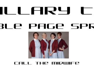
Large image which is the focal point of
the spread and takes up the majority of
the space, it either takes up one whole
page or bleeds in between the two
Smaller, relevant images which add to
the allure of the double page spread, and
are just as captivating as the first, these
are situated around the spread to break
up the text and add consistency
Consistent
colour scheme
which usually
matches the
topic of the
double page
spread. For
example pink and
blue is used here
as babies are the
topic of the
spread, pink and
blue connote
new born
children so are
very significant
here
First letter
enlarged of the
text which is
arranged in
columns which is a
common in
formation
Page numbers on
the spread makes it
very professional
looking
Picture enhanced by fading the
colour around the image so that it
stands out and is striking
Picture engaging subject is
smiling greatly and looking directly
at the audience captivating them and
creating eye contact drawing them
into the page
Feminine font
reflects the
feminine nature
of the spread -
giving birth,
female actor, all
connotates
towards women
and is very
female friendly