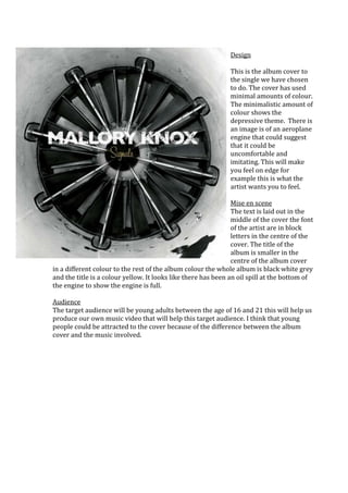
1. Design
This is the album cover to
the single we have chosen
to do. The cover has used
minimal amounts of colour.
The minimalistic amount of
colour shows the
depressive theme. There is
an image is of an aeroplane
engine that could suggest
that it could be
uncomfortable and
imitating. This will make
you feel on edge for
example this is what the
artist wants you to feel.
Mise en scene
The text is laid out in the
middle of the cover the font
of the artist are in block
letters in the centre of the
cover. The title of the
album is smaller in the
centre of the album cover
in a different colour to the rest of the album colour the whole album is black white grey
and the title is a colour yellow. It looks like there has been an oil spill at the bottom of
the engine to show the engine is full.
Audience
The target audience will be young adults between the age of 16 and 21 this will help us
produce our own music video that will help this target audience. I think that young
people could be attracted to the cover because of the difference between the album
cover and the music involved.