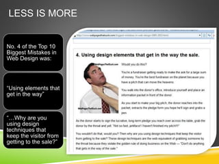
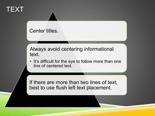
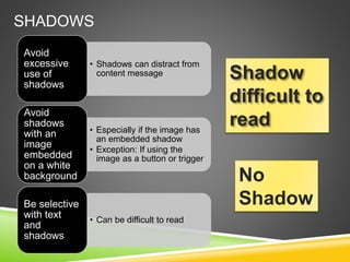
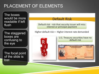
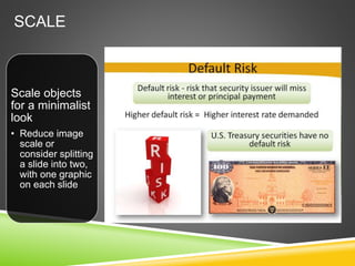
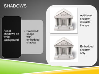
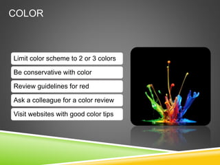
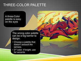
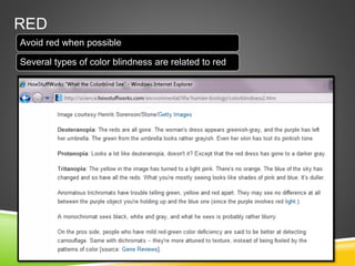
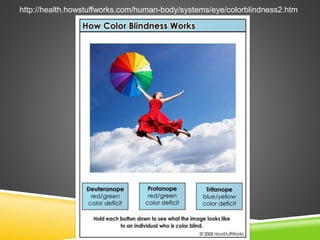
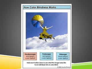
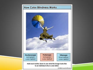
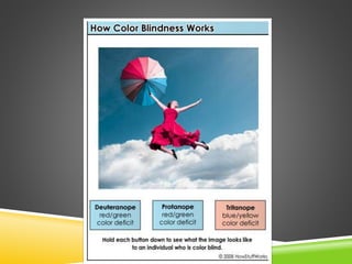
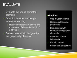
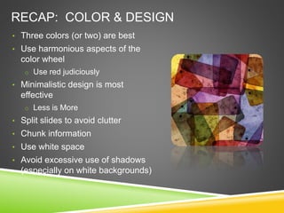
VISUAL DESIGN
TIPS
FOR POWERPOINT
By: Diane Western
October 2012
DESIGN TIPS: SPLITTING SLIDES
• Consider splitting the action or idea of a concept into
separate slides
• Cues that signal a potential slide split:
o The slide contains more than one concept, idea, or action
o The slide is cluttered
o You code the exit effect for the disappearance of a line of text
o You code the entrance effect for the introduction of a new line
of text or element
DESIGN AND VISUAL TIPS
Balancing form and function | white space speaks | less is more
DESIGN
• Make sure that the reader’s eye
easily flows down the page
o Is the focal point emphasizing
the crucial point?
• Minimalist design is most
effective
o “Less is more”
o The “white space” speaks as
much as the content!
• Avoid clutter
o Split slides as needed
• Chunk information into logical
chunks
• Avoid excessive use of shadows
LESS IS MORE
No. 4 of the Top 10
Biggest Mistakes in
Web Design was:
“Using elements that
get in the way”
“…Why are you
using design
techniques that
keep the visitor from
getting to the sale?”
TEXT
Center titles.
Always avoid centering informational
text.
• It’s difficult for the eye to follow more than one
line of centered text.
If there are more than two lines of text,
best to use flush left text placement.
TEXT PLACEMENT
Non-Titles:
• Flush left is
best
SHADOWS
• Shadows can distract from
content message
Avoid
excessive
use of
shadows
• Especially if the image has
an embedded shadow
• Exception: If using the
image as a button or trigger
Avoid
shadows
with an
image
embedded
on a white
background
• Can be difficult to read
Be selective
with text
and
shadows
Shadow
difficult to
read
No
Shadow
SHADOWS – BE SELECTIVE
Avoid shadows
on white
background
• Preferred: An
image with an
embedded
shadow
PLACEMENT OF ELEMENTS
The boxes
would be more
readable if left
flush
The staggered
boxes are
confusing to
the eye
The focal point
of the slide is
lost
SCALE
Scale objects
for a minimalist
look
• Reduce image
scale or
consider splitting
a slide into two,
with one graphic
on each slide
SHADOWS
• Preferred:
Image
with
embedded
shadow
Avoid
shadows on
white
background
Embedded
shadow
only
Additional
shadow
distracts
the eye
Color
COLOR
Limit color scheme to 2 or 3 colors
Be conservative with color
Review guidelines for red
Ask a colleague for a color review
Visit websites with good color tips
THREE-COLOR PALETTE
A three-Color
palette is easy
on the eyes
The wrong color palette
can be a big barrier to
design.
• Choose a palette that
doesn’t assault the
senses.
• 3rd color: If bright, use
for accents
RULE OF THREE
• Of the three, one should
be the background color
(usually the lightest of the
three), and the other two
should break up the
sections.
If picking a
color palette
is difficult for
you, use the
rule of three:
Choose three
primary
colors.
• This will keep the palette
cohesive and calming,
rather than jarring.
If you need to
add other
colors, use
shades of the
three main
colors.
THE COLOR WHEEL
Complementary
uses colors located
opposite each other
on the color wheel
like red and green,
yellow and purple,
orange and blue.
Opposites really
attract.
THE COLOR WHEEL
Two colors opposite of
each other on the
Color Wheel are
harmonious.
Any three colors
equally spaced
around the Color
Wheel forming a
triangle are
harmonious.
Any four colors
forming a rectangle,
each opposite of each
other on the Color
Wheel are
harmonious.
RED
Avoid red when possible
Several types of color blindness are related to red
http://health.howstuffworks.com/human-body/systems/eye/colorblindness2.htm
RECAP
EVALUATE
• Evaluate the use of animated
elements
• Question whether the design
enhances learning
o Reduce unnecessary effects and
movement of elements that don’t
add value
• Deliver minimalistic designs that
are graphically pleasing
 Graphics
• Use 3-Color Theme
• Choose color using
guidelines
• Be judicious with
shadows and graphic
elements
• Avoid red or use
judiciously
• Chunk content
• Follow text guidelines
RECAP: COLOR & DESIGN
• Three colors (or two) are best
• Use harmonious aspects of the
color wheel
o Use red judiciously
• Minimalistic design is most
effective
o Less is More
• Split slides to avoid clutter
• Chunk information
• Use white space
• Avoid excessive use of shadows
(especially on white backgrounds)

Visual Design Tips for PowerPoint

  • 1.
    VISUAL DESIGN TIPS FOR POWERPOINT By:Diane Western October 2012
  • 2.
  • 3.
    DESIGN TIPS: SPLITTINGSLIDES • Consider splitting the action or idea of a concept into separate slides • Cues that signal a potential slide split: o The slide contains more than one concept, idea, or action o The slide is cluttered o You code the exit effect for the disappearance of a line of text o You code the entrance effect for the introduction of a new line of text or element
  • 4.
    DESIGN AND VISUALTIPS Balancing form and function | white space speaks | less is more
  • 5.
    DESIGN • Make surethat the reader’s eye easily flows down the page o Is the focal point emphasizing the crucial point? • Minimalist design is most effective o “Less is more” o The “white space” speaks as much as the content! • Avoid clutter o Split slides as needed • Chunk information into logical chunks • Avoid excessive use of shadows
  • 6.
    LESS IS MORE No.4 of the Top 10 Biggest Mistakes in Web Design was: “Using elements that get in the way” “…Why are you using design techniques that keep the visitor from getting to the sale?”
  • 7.
    TEXT Center titles. Always avoidcentering informational text. • It’s difficult for the eye to follow more than one line of centered text. If there are more than two lines of text, best to use flush left text placement.
  • 8.
  • 9.
    SHADOWS • Shadows candistract from content message Avoid excessive use of shadows • Especially if the image has an embedded shadow • Exception: If using the image as a button or trigger Avoid shadows with an image embedded on a white background • Can be difficult to read Be selective with text and shadows Shadow difficult to read No Shadow
  • 10.
    SHADOWS – BESELECTIVE Avoid shadows on white background • Preferred: An image with an embedded shadow
  • 11.
    PLACEMENT OF ELEMENTS Theboxes would be more readable if left flush The staggered boxes are confusing to the eye The focal point of the slide is lost
  • 12.
    SCALE Scale objects for aminimalist look • Reduce image scale or consider splitting a slide into two, with one graphic on each slide
  • 13.
  • 14.
  • 15.
    COLOR Limit color schemeto 2 or 3 colors Be conservative with color Review guidelines for red Ask a colleague for a color review Visit websites with good color tips
  • 16.
    THREE-COLOR PALETTE A three-Color paletteis easy on the eyes The wrong color palette can be a big barrier to design. • Choose a palette that doesn’t assault the senses. • 3rd color: If bright, use for accents
  • 17.
    RULE OF THREE •Of the three, one should be the background color (usually the lightest of the three), and the other two should break up the sections. If picking a color palette is difficult for you, use the rule of three: Choose three primary colors. • This will keep the palette cohesive and calming, rather than jarring. If you need to add other colors, use shades of the three main colors.
  • 18.
    THE COLOR WHEEL Complementary usescolors located opposite each other on the color wheel like red and green, yellow and purple, orange and blue. Opposites really attract.
  • 19.
    THE COLOR WHEEL Twocolors opposite of each other on the Color Wheel are harmonious. Any three colors equally spaced around the Color Wheel forming a triangle are harmonious. Any four colors forming a rectangle, each opposite of each other on the Color Wheel are harmonious.
  • 20.
    RED Avoid red whenpossible Several types of color blindness are related to red
  • 21.
  • 25.
  • 26.
    EVALUATE • Evaluate theuse of animated elements • Question whether the design enhances learning o Reduce unnecessary effects and movement of elements that don’t add value • Deliver minimalistic designs that are graphically pleasing  Graphics • Use 3-Color Theme • Choose color using guidelines • Be judicious with shadows and graphic elements • Avoid red or use judiciously • Chunk content • Follow text guidelines
  • 27.
    RECAP: COLOR &DESIGN • Three colors (or two) are best • Use harmonious aspects of the color wheel o Use red judiciously • Minimalistic design is most effective o Less is More • Split slides to avoid clutter • Chunk information • Use white space • Avoid excessive use of shadows (especially on white backgrounds)

Editor's Notes

  • #2 Sound001b_REVISED 002_a_split#1 Build Dice and ?: the percentage change Dollar: buying power of a dollar Erase images fast: as such Ruler and shopper: measures society’s relative time preference Thought bubble “Should I buy now or later?”: for consuming today Thought bubble changes to “I want this car NOW!”: the higher society’s preference Arrow by measure: the higher society’s preference $: time value of money Replace $ with RIR: which is called “RIR”
  • #9 Flush left text unless the text is a title
  • #11 As you can see, this slide is cluttered and distracting.
  • #12 The text is difficult to read