Hifi Laxmi Nagar Call Girls Service WhatsApp -> 9999965857 Available 24x7 ^ D...
Dps decons
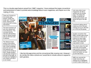
1. This is a double page feature spread from ‘NME’ magazine. I have analysed the pages conventions
and subversions in order to provide extra knowledge about music magazines, and inspire me in the
making of mine.
Like many other music
magazines, the title is
spread over the double
page. This allows the
reader to identify the
double page spread, and
attract the eye to the title
first.
“everyone's talking about”
makes you think that your
missing out so you will read
on to find out the gossip.
The band members all
look very relaxed and
not at all serious. This
connotes that the
interview will therefore
also be relaxed aswell,
with an informal mode
of address.
The column down the right
hand side of the double
page spread includes new
or existing bands/artists
which the reader can look
up and read about.
Another convention that
NME’s double page spread
conforms to is the use of
columns on each page.
This displays the writing
clearer, and makes the
copy easier to read.
I like the full page photo and the conventional title crossing over. However I
do not like the colour scheme as I would like to include colours to appeal to
both genders.
There are 5 photos on
this double page
spread, mostly very
small, with 1 full page
photo, featuring the
main band who is being
interviewed.
The ‘Need to know’
section at the bottom
provides the consumer
with a brief knowledge
about the band for first
time listeners who
would not be familiar to
them. People wouldn’t
naturally look straight at
this part of the page, so
the blue box highlights it
and makes sure that it
is not missed.
NME.com reminds the
reader what they are
reading and is highlighted
in red to make it stand out.
2. This is a double page feature spread from ‘Kerrang’ magazine. I have analysed the pages
conventions and subversions in order to provide extra knowledge about music magazines, and
inspire me in the making of mine.
‘MCR’ is used in the title as only
regular readers, or rock listeners
will understand this mode of
address. This works as it creates
a community within the magazine
for readers.
On the right, a column is used
to advertise new tracks.
Words such as ‘epic’ are used
to excite the fans about
upcoming music, and make
them want it.
Another convention which this
magazine conforms to is that
the title is slanted. It works
well in this context as it
compliments the rock genre,
and hints at informality.
The red font connotes anger and
death, like the band.
Humorous captions have been
added to contrast the serious
photos. This adds an appeal to
the younger audience.
More than one photograph is
used in contrast to a small
amount of text. The photographs
have been changed into black
and white to conform to the rock
genre.
I don't like the colour scheme in this magazine as it is too dark
although it is simple. However, I do like the black and white
effect on the photos and the layout of the page.
The title of this double page
spread is conventionally
spread over the two pages.
This is common to most
music magazines as it
identifies the pages as a
double page spread, and
makes the consumer read
both pages.
The producer has used a
warn out font style, which also
compliments the genre.
Unlike many other music
magazines photos, on this page,
all the singers featured aren't
making eye contact with the
reader. This could connote an
uninviting response to the reader.
In the title they have claimed
themselves as ‘The best’.
This is a positive promotion of
the band because of the
ideology of the genre. Having
this in the title makes the
reader want to read on to see
why they think they describe
themselves this way.
3. This is a double page feature spread from a music magazine. I have analysed the pages conventions
and subversions in order to provide extra knowledge about music magazines, and inspire me in the
making of mine.
‘Exclusivity’ is used to
make the reader believe
that this is magazine is
unique and that they won’t
be able to find this
anywhere else.
The first five lines of copy
are shown in a larger font
size compared to the rest.
This will catch the reader’s
attention, making them read
the first few lines. From
then on, they will feel
compelled to read on.
‘Perth Band’ is
highlighted in a red font
colour. This makes it
stand out, which will
subconsciously stay in
the readers mind.
I think there is too many photo's on this page, and will not be using this
technique of page layout in my music magazine. I also do not like the red tint
to all the pictures as it does not look good with the blue colour scheme. I like
the slanted writing on the left hand side of this page and how it conforms to
the genre.
One convention of a
typical music magazine,
which this one conforms
to, is that at least one
thing on the double page
spread is crossing over
both pages. In this
example, two
photographs are
crossing over. This
allows the consumer to
recognise that it is a
double page spread and
relate the two pages
together.
The main three colours on
this double page spread are
blue, black and red. The
black and red colours
conform to the rock genre,
and the blue tones are used
to highlight points of interest
and attract the eye, such as
the borders and captions.
The sub title to this page
is slanted, which doesn’t
occur very regularly, but
when it does, it is usually
found in rock magazines
as it conforms to the
edgy genre.